Game On at the Metropolitan Museum of Art
No ads. No AI. So many bats.
For me, paintings and other images are a visual cue to a longer narrative. They’re a kick to the imagination, not an end unto themselves. When I went to the Metropolitan Museum of Art the other week, I couldn’t help but see other stories in the paintings. In fact, I saw videogames everywhere I looked.
Some of these paintings directly influenced game developers. Others are just uncanny coincidence.
Sometimes it’s just a single painting that evokes a comparison to a game, like Georgia O’Keefe’s Black Abstraction. Sometimes it’s the entirety of an artist’s work, like the multifaceted images of city life depicted by George Bellows. And some games intentionally evoke entire styles or movements, like ukiyo-e, the woodblock prints of early modern Japan.
Dishonored and the work of George Bellows
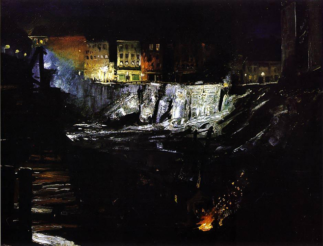
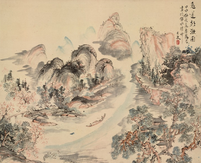
We were at the Met for the Matisse exhibition, but we also caught the tail end of the George Bellows exhibit, now closed. George Bellows was an athlete-turned-painter who lived and worked in New York City in the early 1900s. Many of his paintings capture the beauty and sophistication of the unofficial capital of the world, others examine squalor and poverty. Together, he captured the two sides of the city, something that resonates in the design of Dishonored.
Bellows did a lot of commissions for the upper classes of New York, but he also sought out the city’s harsher angles. “Excavation at Night” reminds me of dropping from the gentrified Clavering Boulevard into the harsh alleyways below in Dishonored.
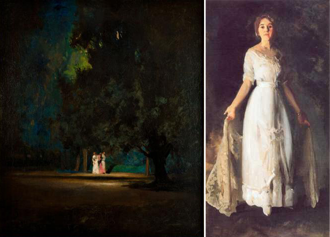
In “Night Scene,” (left) several well-dressed young women walk through a park after dark, something I doubt was ever safe to do in New York. Bellows’ urban landscapes could be screenshots from Dishonored, but he also painted portraits of individual people. And again, Bellows’ real life subjects are as diverse as the characters in the game. This portrait of a wealthy New York citizen, “Mrs. Albert M. Miller” (right) could be a Sokolov painting…
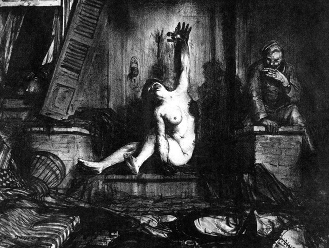
…while “The Cigarette” looks just like one of the many plague-ridden apartment rooms found a few blocks from The Golden Cat or the Boyle Mansion. All it lacks is graffiti on the walls.
Dear Esther and French Impressionists’ renderings of the Beaches at Etretat
The beaches of Etretat in Normandy, France, were a popular subject of painting among French impressionists around the turn of the 20th century. Maybe it’s the cliffs, the colors, the light on the ocean, or maybe just the loneliness, but so many of the paintings of Etretat, by artists such as Claude Monet and Gustave Loiseau, remind me of Dear Esther.
There’s one series in particular, though, that makes me think of Dear Esther. Henri Matisse had a habit of repainting the same scene multiple times, sometimes with little to no discernible difference. It made his critics furious, but it also gives art enthusiasts an interesting look at Matisse’s method as well as his personality.
Like many of his contemporaries, Matisse painted fairly often at Etretat, but in 1920 he produced three paintings of the exact same view, with only slight differences, all called “Large Cliff.”
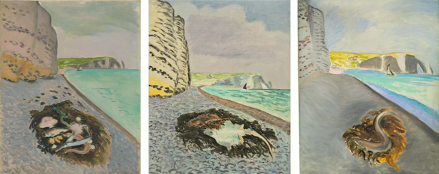
The style of the “Large Cliff” paintings is a bit more cartoonish than the realism you see in Dear Esther, which started off as a mod for Half-Life 2. There are other Impressionist renderings of Etretat that look more akin to a Dear Esther screenshot, but this series of three paintings most strongly evoked the feeling of playing Dear Esther. It’s a game that doesn’t let you do much but look. The only interaction is movement, the only player influence on the story is the order in which the lonely, obsessive main character’s monologues are triggered. And yet, every time I walk around the island of Dear Esther, it feels like something is different.
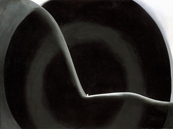
Limbo and Georgia O’Keefe’s “Black Abstraction”
At this point in my wanderings through the Met, I’d begun consciously looking for paintings that reminded me of videogames. I don’t think it’s a stretch to say that this painting looks – or feels – exactly like 2011 indie platformer Limbo. The black and grey, the loneliness, the way that, as with so many platformers, we can only keep going right – just replace the little white ball with the little boy and “Black Abstraction” could be a screenshot. There’s something so right about rendering the hero of Limbo as a little white speck in a shadowy world.
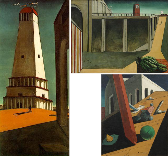
Ico and Giorgio de Chirico’s “Nostalgia of the Infinite”
This one is actually well-documented: Team Ico’s Fumito Ueda has talked about how “Nostalgia of the Infinite” by Giorgio de Chirico (left) inspired the Japanese box art for Ico. De Chirico was a painter, sculptor and architect from the early 20th century. Much like a game designer, he brought an architect’s sense of space and dimension to his paintings.
I’m sure Ueda also looked at de Chirico’s “Gare Montparnasse (The Melancholy of Departure)” (top right) and “The Evil Genius of a King” (bottom right) while developing the feel and space of Ico.
The Bridge and M. C. Escher’s “Ascending and Descending”
The Bridge is a new indie game from developers Ty Taylor and Mario Castañeda that does to perspective what Braid did to time: throw it all to hell. They’re pretty obvious about their artistic inspirations – the game describes itself as “Isaac Newton meets M.C. Escher.” If you’ve played the game, you’ll probably agree with me that, somewhere upstairs, Newton and Escher are high-fiving each other.

Okami and the styles of Sumi-e and Ukiyo-e
Okami is the rare case where a game not only intentionally mimics an art style, it centers its entire mechanic around it. The game begins and ends with Japanese-style painting, from the narrative of gods and magic to the mechanic of painting to defeat enemies and solve puzzles.
The blank inked tree and house in Ike Taiga’s “Enjoying the Moon in a Riverside Cottage” (left) might not be as colorful as Okami, but the thick lines and landscape that mixes wilderness and civilization still reminds me of the game. The painting is from the 18th century, and done in the sumi-e style, also known as ink wash painting.
The chaotic ukiyo-e print by Kuniteru Gozu (right) looks like a boss fight to me. It’s done in ukiyo-e, or woodblock printing, a Japanese style that became popular a few decades after sumi-e. The black lines are still there, but ukiyo-e employs vivid colors, and its subject material is more human-centric than the nature landscapes of sumi-e.
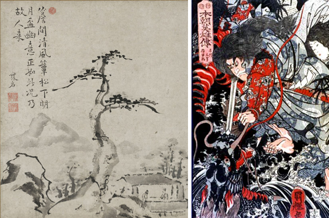
I know even less about Japanese painting than I do European and American painting. I just think there’s something about the sleek black lines and curves in paintings like “Morning View of the Uji River” that remind me of running around in Okami. The painting depicts little pockets of human construction embedded in a sprawling, almost moving image. At the center are two little figures who, like the main characters of Okami, have the power to change the world around them.
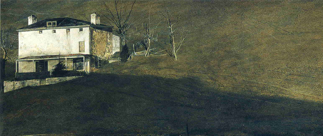
Zork and the paintings of Andrew Wyeth
Turns out I’m not the first member of Team Unwinnable to make a connection between paintings and game playing. Our own EIC Stu Horvath made the same link – with a text-based game, no less – but Zork’s text is highly descriptive and Wyeth’s paintings of the lonely white house with the open window are uncannily reminiscent of that most famous of text adventures.
———
Jill Scharr sees videogames everywhere she goes. Follow her travelogue on Twitter @JillScharr.

Sign up for the forthcoming weekly Unwinnable digest!

