Last Week’s Comics 4/4/2012
Aquaman #7
(DC – writer: Geoff Johns; art: Ivan Reis)
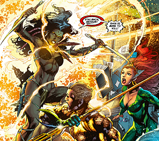
Beyond the first issue, I haven’t really enjoyed Aquaman. It’s been a mixture of tired plots and poor character development (especially that issue focused on Mera). But issue #7 feels like a step in the right direction. Geoff Johns is trying to add depth to a character whose only recent exposure was being a punching bag for writers of Family Guy, and in doing so he’s weaving a rich history for a character who, in the right hands, has the potential to be a great hero.
 Geoff Johns begins this book with his mystery, and it involves a new character named Kahina the Seer and Arthur’s old nemesis, Black Manta. For a guy with a silly-looking costume, Manta is written as a real badass, and I look forward to seeing the eventual showdown between him and Aquaman. The other half of the issue involves Arthur trying to find out more about the mysterious relic he recovered in the Marianas Trench, and while this is intriguing, it’s introduced in an odd way. As a reminder to readers that Aquaman is still protecting the ocean, Johns writes a quick 2-page scene of Arthur and Mera saving a boat from capsizing. I get the point, but it trips up the flow of the story and delays what is really the focus of the issue. The rest of the comic is fine, and I wholly enjoyed the conversation with Dr. Shin.
Johns and Ivan Reis have a great writer/artist relationship. They seem to understand the others’ needs, and Reis’ work is as great as ever. Loaded with detail, each page is beautifully crafted. Like a cleaner version of Mark Bagley, Reis gives a lot of specificity to his characters. The individual scales on Arthur’s costume make him an imposing figure, and for a guy who seems like he has a pretty silly power, Arthur looks strong and powerful on every page.
Joe Prado complements Reis’ drawings by keeping the lines tight around the bodies so that during the action sequences (and there are quite a few), the pages don’t look messy. And Rod Reis’ colors are awesome. Every page of the comic looks great. If nothing else, this book is an exercise in talented artists.
I’m sticking with this book because I have faith in Geoff Johns. I trust that something will come of this series, and this issue feels like the first cog in that machine. This makes me think back to Green Lantern when Johns introduced the light spectrum and the different-colored rings. It was teased a bit, and now it’s become a linchpin to the Green Lantern Universe. This story feels like it has the same weight to it. It isn’t enough to wash the bad taste of the previous issues out of my mouth, but it instills a bit of hope in me as a fan and a reviewer.
—–
Avengers vs. X-Men #1
 (Marvel – writer: Brian Michael Bendis; art: John Romita Jr.)
With a premise that seems culled from nowhere, Brian Michael Bendis turns two of the greatest superhero teams against each other in this first issue of Avengers vs. X-Men. I can’t say that I enjoyed the issue, but I’m intrigued by the story. The Phoenix force is back again, and this time it’s targeting Hope Summers – the first mutant born after The Scarlet Witch shrank the numbers of mutants to just under 200. Because Hope is the savior of the mutant race, Scott Summers wants to protect her, but since the Phoenix force seems intent on bonding with her, Captain America and the Avengers are planning on taking her into custody in order to keep her from becoming a human weapon. While this series is meant to occur over the course of this year, I have only one question: What’s the point?
I don’t mean this in a negative way, but a practical way. The end goal of the series seems pretty vague to me, so I had a hard time connecting with this issue. Bendis gives readers enough exposition and background to have a tenuous grasp of the material, but the pacing is a bit weak. In trying to establish Scott’s need to keep Hope strong enough to handle the Phoenix, Bendis also tries to give readers the other major conflict involving Wolverine, who split from Scott during the Schism storyline.
A lot is packed into this issue, but not all of it works. I had a hard time buying Scott’s actions when Cap shows up to take Hope away. Their conversation goes from civil to violent too quickly, and I don’t think Scott would act so irrationally. He has a reason to, but his actions don’t properly reflect his established persona. I like his tenacity when training Hope, and the dogged way in which he pushes her to control her power, but it isn’t properly connected with his anger at Cap’s presence on Utopia.
I’m a fan of John Romita’s art, but for such a big series, this feels like the wrong choice. Because Romita is more cartoonish than other big name artists – say Leinil Yu, Steve McNiven, or Stuart Immonen – I don’t feel the same weight to this series as I would in another artist’s hands. Romita’s art isn’t bad, but it’s not as grand as some of Marvel’s other “big guns,” the ones they bust out for their major stories. The characters don’t look as intimidating, and while I wanted to get into the Cap/Cyclops fight, I couldn’t help but look at their faces and how their emotions didn’t match the tone of their words.
Is this enough to pass on Avengers vs. X-Men? Not at all. I love a good superhero throwdown, and this one will have some epic matches. But I reiterate my thesis: what’s the point? Why devote so much time to this series? What’s the ultimate goal? This comic lacks the foundational background found in big series like Civil War and Secret Invasion, the kind that had major implications for the entire Marvel U like Avengers vs. X-Men does, but because it feels like the conflict came out of nowhere, I have a hard time seeing the purpose.
I’m still interested, but very guarded.
—–
The New Deadwardians #1
 (Vertigo – writer: Dan Abnett; art: I.N.J. Culbard)
Bannen’s Book of the Week: The New Deadwardians is about England’s upper classes voluntarily making themselves vampires to combat the lower classes, which have become zombies. The story follows Chief Inspector George Suttle of Murder Squad, a detective whose job is made harder due to the fact that everyone is already dead. How does he solve murder cases where his victims have been lifeless for years? While somewhat humorous in its presentation, The New Deadwardians is tinged with socio-political messages about the role of the upper class, the power of the government, and the drudgery of a working-class existence.
Nowhere in the comic does Dan Abnett identify his characters as vampires. I was able to get that information from a preview article at the end of the issue. While astute readers can guess that the characters are all vampires, I applaud Abnett for being bold in his choice to not explain it to the reader. Maybe eventually he will, but by leaving that aspect out of the main story, the clues become more noticeable and the plot isn’t dragged down by excessive exposition.
Instead, Abnett can focus on his lead – the phlegmatic George Suttle, a man who doesn’t lose his cool even when he comes upon his housekeeper being eaten by a zombie. Suttle’s lack of emotion makes him an intriguing character because it’s hard to tell if it’s his personality or sickness that makes him so cold. While the people around him try to gauge George’s mental state, we’re given insight as readers (Suttle narrates the comic). Through his thoughts we can see that George is a tortured man who misses all the details that made him human – things like breakfast, sleep, and the way life was before the outbreak.
The idea that everyone is dead in some way doesn’t add any levity to the comic. If anything, it makes the story more heart-wrenching. The upper class is soulless as displayed by George’s mother. When told of the housekeeper’s death, George’s mother reiterates the fact that she hasn’t had her breakfast and is quite beside herself with hunger. The death of her housekeeper isn’t as pressing as her need for food. And having the working class depicted as zombies is an explicitly symbolic move. The Edwardian age was a time of great excess for the wealthy. Everyone else was dealing with poverty and the toxicity of post-industrial England. Most of the workers probably felt like zombies in their jobs. If they’re not dead, the workers in The New Deadwardians are uneducated peasants, as displayed by George’s maid Louisa. She speaks like an ignorant dolt, and while I can’t tell if she’s meant to be a humorous character, she comes across as another sad figure in an overly dreary world. But she’s also the only character who emotes, and this may be a sign of her necessity to the plot. She serves a vital role as the last remains of a dying humanity.
Thanks to I.N.J. Culbard’s art, England looks as remorseless as the tone dictates. Using simple pencils (like those found in iZombie and Daredevil), Culbard draws a world that lacks excessive detail and could make the reader feel boxed in (just like the characters). The majority of his colors are muted so even the visuals look lifeless. It’s an aesthetic that adds depth to the story, and it’s one more reason The New Deadwardians is a book that you should be reading.
Layered in detail, The New Deadwardians easily has one of the most unique premises I’ve ever encountered. Dan Abnett’s writing is almost literary in its scope, and the pairing with I.N.J. Culbard is perfect. This book is well rounded in every way, and it’s got a lot to offer its readers. The New Deadwardians once again proves that smaller publishers, like Vertigo and Image, those who take chances with their work, will reap the rewards of such gambles.


