Last Week’s Comics 5/21/2014
Visit the MIT Press shop

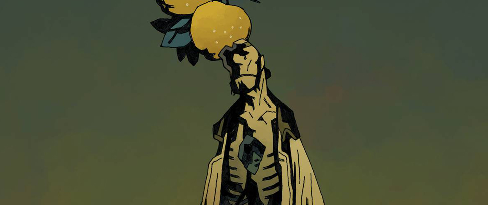
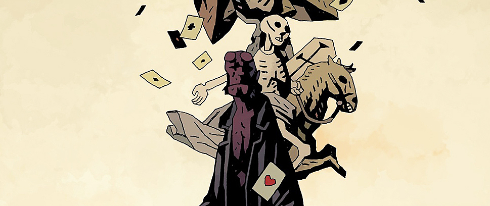
Hellboy in Hell #6
(Dark Horse – writer: Mike Mignola; art: Mike Mignola)
It’s been a few months since we last saw Hellboy and as always, it’s a pleasure (even if he is in the middle of Hell). Hellboy in Hell #6 feels more like the last issue and less like the first four. Mignola focuses on building Hellboy’s new home (unlike the tearing down he, John Arcudi & company are doing over in the last few issues of BPRD: Hell on Earth). This issue gives us some context as to what we’ve seen before and revisits an old enemy from Hellboy’s time in the mortal realm.
 Mignola is building a story but he’s also lingering – reveling in the weirdness of Hellboy’s current surroundings. Take Mr. Jenks and Mr. Dean, Hellboy’s two new friends. The issue begins with them telling Hellboy about the map and definitive history of Hell they’re working on. Their exposition provides readers with a rough idea of Hell’s geography. Pandemonium is at the center of the Lake of Fire. Beyond the lake is the labyrinthine city of Hell. Beyond the city are unclimbable mountains, an impassable forest and then the Abyss. However, when Hellboy presses his new friends for more information, they confess that they haven’t been able to find their way out of the city. They’re lost.
A strange visitor enters the scene and asks Hellboy and his friends if they want to play a game of cards. Jenks and Dean suddenly “remember” they have someplace to be. They change from looking like Victorian gentlemen to two skeletons in Victorian garb as they run away. It’s a surreal scene, but it completely works with the storytelling style Mignola’s adopted since the start of this series
The shadowy figure is an old foe of Big Red’s – the Vampire of Prague. The last time we saw him was in Hellboy: The Troll Witch and Others. In that story, drawn by P. Craig Russell, Hellboy beat the vampire in a game of cards, and the vampire wound up bursting into flames as the sun rose. Here, the vampire seeks revenge. The two begin to fight through the city, crashing through buildings and shadows. Mignola’s fight choreography calls back to Russell’s work as the two battle across rooftops in the stygian depths.
Hellboy in Hell #6 is more atmospheric than the narrative-driven BPRD: Hell on Earth. It’s a dreamlike book, and it is very easy to get lost in Mignola’s considerable shadows. It’s an experience that doesn’t come often enough, but I look forward to poring over these pages again and again until the next time. Be seeing you.
———
Star Wars #17
 (Dark Horse – writer: Brian Wood; art: Stéphane Créty)
There was a time in my life when I couldn’t get enough of the Star Wars galaxy. I bought every book series and fan magazine I could get my hands on, and I watched the trilogy once a month. Due to a combination of getting older, school, work obligations and diminishing returns in these series, I had to let go.
Fast-forward some years to near-simultaneous events. I came across a review of the first issue of Dark Horse’s new Star Wars title on this very website around the time I found some cheap copies of Timothy Zahn’s Heir to the Empire series. I was ready to re-enter the galaxy.
I loved rereading Heir to the Empire, maybe more than I did 20+ years ago. What dawned on 30-something Sal, as opposed to teenage me, were the simple reasons this series stands tall above all others: the main characters of the original trilogy are all present, and they act like the main characters that fans came to know and love. Dark Horse’s Star Wars seems to have an understanding of this.
The general plot is simple: what happened between A New Hope and The Empire Strikes Back? Story possibilities seemed endless, and I envisioned a new era of Star Wars with this particular title giving readers arcs that weave through all of the original movies.
So here we are, 17 issues in, and the title is winding down. Dark Horse announced a few months ago that they would cease publishing new Star Wars books by the end of 2014 since Disney bought the Star Wars brand. Our little story here is slated to end in August. While the tale hasn’t gotten stale, it is reaching a little too far. Princess Leia pretend-marrying (maybe) someone for safe haven for the Rebellion? Luke being grounded by Rogue Squadron? Yet none of these details are mentioned elsewhere in the canon? I think my original hope for short stories that jump around the trilogy, adhering to canon as much as possible, could have made the title stronger.
My major qualm is the art. Dark Horse has been rotating pencilers/colorists (possibly to keep a healthy pace) and the general look of the books is similar enough, but the characters look too cartoony. Proportion is inconsistent and faces are often askew. I’d prefer a more basic color palette, say like the art in The Star Wars title, or the 1970s look and feel of Boom! Studios’ Planet of the Apes. I do like Leia’s presentation as a bad-ass pilot and tactician, which could be explored further if the title continued.
I’m going to stick with Star Wars through the end. I don’t know what to make of Disney’s plans for the comics wing of the Star Wars brand (current word says everything will be canon) but I’m not ready to devote time, money and heart until I see in what directions things are going.
———
Astro City #12
 (Vertigo – writer: Kurt Busiek; art: Graham Nolan)
Seeing the familiar title font of Astro City with the fantastic cover art by Alex Ross instantly transports me back to the early-to-mid ’90s. I think of Marvels, Kingdom Come and so many other wonderful and progressive projects that Kurt Busiek and Alex Ross were involved with. I also recall the landmark run of Astro City starting in 1995 with the stories that would eventually be collected into trade paperbacks like Life in the Big City and Confession. This is just the tip of the iceberg as far as must-read Astro City runs from Busiek and interior artist Brent Anderson go. It’s great to see that Vertigo continues to publish this unique take on superheroes, where the city is essentially the main character. It’s been so long since I last visited, and much like how going to Miami in the hellish heat of July isn’t the wisest choice for a Northerner, maybe this wasn’t the right issue to revisit the city of superheroes.
It isn’t a bad issue by any means, but it doesn’t feel essential, either. This one-shot story concerns a villain who is struggling to reform. In some ways it recalls the great Astro City story arc from vol. 2, entitled “Tarnished Angel,” which was about a supervillain named Steeljack who was trying to reform. Unlike that run, this story, titled “The Deep Dark Woods,” has limited space to really develop Fred Glosman, a man who grew up poor and through crime managed to break into high society. Glosman bounces around among various costumed gangs like the Menagerie (featured on the cover) and the Sweet Adelines, a barbershop quartet that robs banks. Essentially, nice clothes and an addiction to the good life make him a villain, and it’s these things that eventually cost him his family and even his looks.
A recurring theme is Fred’s obsession with the Big Bad Wolf from Little Red Riding Hood. From the cover and the title of this issue I thought that maybe Fred would don his wolf’s mask from the Menagerie by the end of the issue and become more of a kingpin or dapper thief, but something else happens instead. While I wonder if Busiek is going somewhere with this, and I have faith that he will, this issue felt like a smaller piece of a larger story. That tends to be the case with Astro City anyway, since this is a series more about the city, the people and superpowered people within than it is about any singular point of view. Maybe it was also the capable-but-out-of-place artwork by guest artist Graham Nolan, since Brent Anderson has always handled the interior art for Astro City. Anderson’s art has always made even the most disparate of Astro City stories feel connected.
Despite not being blown away by this issue, I am curious to go back and look through the previous 11 issues of this run. I’m also curious to keep going, since Busiek hints in the letters column at some plot revelations in the next issue that I’ve been wondering about for almost the last 20 years. One-off issues are there for a reason, typically as a breather for those onboard for the long haul and as a potential jumping-on point for newbies or returning visitors. I think the epic nature of telling an ongoing narrative about a city rich with superheroic history has a lot of potential, and in the case of Astro City it’s always a surprise in each issue as to whose perspective that narrative will be told from.
———
Bee and PuppyCat #1
 (KaBOOM! – writer: Natasha Allegri, Garrett Jackson and Madeleine Flores; art: Natasha Allegri and Madeleine Flores)
If you liked the animated short Bee and PuppyCat, by former Adventure Time storyboard artist Natasha Allegri, then you’ll definitely want to check out its graphic novel spinoff Bee and PuppyCat #1. If you haven’t seen Bee and PuppyCat yet, what are you doing here? Go watch it right now on YouTube! It’s only 10 minutes long!
Bee and PuppyCat #1 continues the animated short’s story, though you don’t necessarily have to have seen the latter to understand the former. Basically, Bee is an “average” 20-something whose pet-slash-roommate, PuppyCat, set her up with a job at a magical interdimensional temp agency. But there’s nothing average about the adventures Bee and PuppyCat get up to; the comic is an explosion of pink, trippy weirdness that somehow manages to seem weirdly relatable. Or is that just me?
Bee is that wonderful kind of human who hardly blinks an eye at mysterious doglike cats (or is it catlike dogs?) and is just as happy sleeping in as she is seizing the day, but who is utterly horrified at the idea of birds seeing her in her embarrassing pajamas.
This issue contains two stories, one by Natasha Allegri herself and the second by Madeleine Flores. In Allegri’s story, the art style is very similar to the animated show, which itself bears strong resemblance to Adventure Time.
In the comic book, however, the art of Bee and Puppycat is flattened, with less detailed backgrounds, and the line work is also far looser, giving it a more casual appearance. The comic also depicts a much curvier Bee, which looked so great I was almost disappointed to see her relatively skinnier (but still very curvy) look in the TV show when I went back to look. The book’s oversized lettering, in expressive cursive and other fonts, also helps capture Bee’s unique unflappable voice.
Flores’ story has a somewhat different look, with linework that is both more solid and rougher-looking, and an overall chibi-like quality. Neither story really tells us anything more than the animated short already did, but they offer fun little peeks at the lives of my new favorite cartoon heroine.
Bottom line: Watch Bee and PuppyCat on YouTube ASAP. If you really love it, Bee and PuppyCat #1 will delight you as well, and help tide you over until the show’s official launch in July.
———
The United States of Murder Inc. #1
 (Icon – writer: Brian Michael Bendis; art: Michael Avon Oeming)
Valentine Gallo is the newest initiate into a shady mob family that not-so-secretly runs the United States government. But his first mission, to bring a mysterious briefcase to a U.S. senator in Washington, D.C., goes terribly awry, prompting Valentine’s mother to reveal a secret that upends Valentine’s world: she is actually a deep cover FBI agent who married into the Gallo family for the express purpose of having a son who could take down the mob once and for all.
That’s the plot for The United States of Murder Inc. #1 by veteran comic book writer Brian Michael Bendis and artist Michael Avon Oeming. The digital issue also comes with almost 50 pages of extras, mostly comprised of the comic’s original script and some sample art.
Maybe I haven’t watched enough mob movies, but I found Valentine’s speech patterns really interesting. He perfectly blends respect for his elders with youthful arrogance, and coats it all in a sullen cool that hides intense eagerness. I don’t have a read on him as a character yet, and for that reason alone I’m excited to see his reaction to the big reveal at the issue’s end.
The two other principal characters are Valentine’s mother and a mob agent named Jagger Rose, who appears on the way to D.C. claiming to be Valentine’s assigned bodyguard. Valentine’s mother set the issue’s tone by the third panel: in it, she and Valentine sport fancy clothes and aristocratic faces, yet her diction is casual, almost crass. It instantly sets the mood for a mob family that sees itself as distinguished, yet isn’t afraid to dirty its hands. Jagger Rose hit all the femme fatale notes, from her vivid red hair to her low-cut jumpsuit to that thing modern femme fatales do where they point out how their femme-fataliness is making the hero act like a goober. Her position within the mob family is still very unclear by the issue’s end, suggesting that she’ll have a big role to play as Valentine’s allegiances come under question.
The art in Murder Inc. is highly stylized, using solid black shadows and lines to define characters and environments. This gives the entire comic a film noirish feeling that echoes the story’s morally ambiguous nature. Solid cool colors like blue, purple and green-yellow fill the gaps in the black, while red is used to primarily to accentuate certain details: the blood of Valentine’s initiation ritual, some on-page onomatopoeia and, most often, Jagger Rose herself. In fact, the coloring most often privileges Jagger Rose over Valentine himself.
Overall, there’s a lot in Murder Inc. that feels familiar, but this first issue also contains a few subtle twists or unique moments that make it stand out.
———
You can follow Jill, Ian and Mike on Twitter @JillScharr, @IanGonzales and @EdwardsDeuce. Talk to them about last week’s comics, or this week’s, for that matter!