Last Week’s Comics 10/8/2014
Visit the MIT Press shop
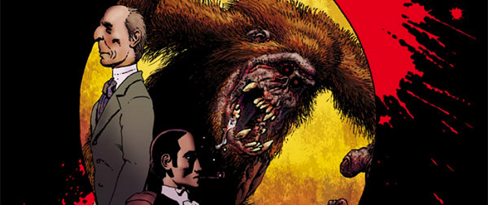
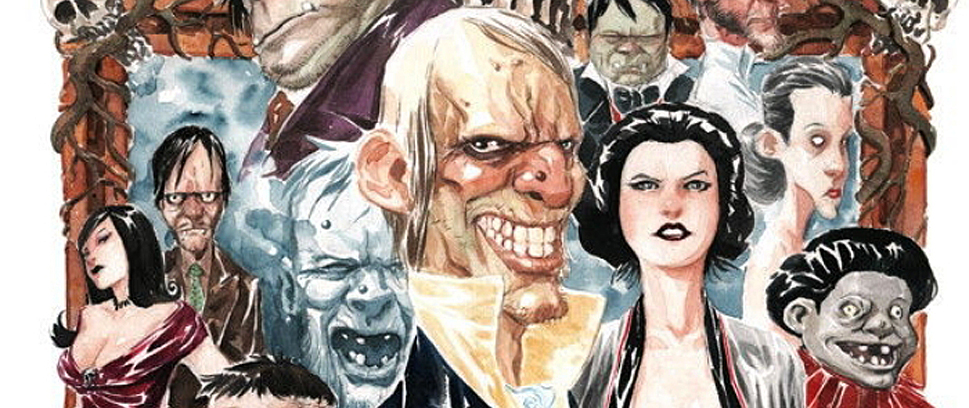
Creepy #18
(Dark Horse – writer: various; artist: various)
Uncle Creepy’s been chilling readers to the bone for half a century, and Creepy #18 celebrates his golden anniversary with some damn frightening tales. I remember snagging random issues of Creepy and Eerie at flea markets for a few scattered cents. The tales were dependably spooky, occasionally lurid and always entertaining. Creepy #18 harkens back to those classic issues and is the perfect comic for the fall season.
 In 2009, Dark Horse Comics resurrected Creepy in the form of an anthology comic. It’s been a beacon of horror comics since, and the latest issue showcases why this book has been around for 50 years. This issue features work from Fred Van Lente, Corinna Bechko, Peter Bagge, Alison Sampson, Dan Braun, Len Wein, Drew Moss, Simone Delladio, Art Baltazar, Luis Bermejo and more. It contains four new stories and one classic story – that’s a lot of comics in 35 pages.
Van Lente and Sampson kick off the golden anniversary with a story about Edgar Allan Poe’s death and legacy. It’s a clever story that weaves together imagery from several of Poe’s tales. Sampson’s storytelling evolves to a dreamlike pace as the twists and horrors are revealed. It’s a tale worthy of Poe himself, a haunting opening story that sets the tone for the rest of the issue.
What makes this issue work so well is the balance. Van Lente and Sampson’s “The Executor” explores a space full of worldly terrors, otherworldly terrors and a pinch of gallows humor. It’s exactly what a Creepy story should be.
The final story, “Over the River to Charlie” by Corinna Bechko and Drew Moss is a helluva ghost story. It focuses on two young girls who meet a man named Charlie. Charlie lives in a tree, until he takes up residence in the girls’ doll house. Bechko and Moss spin a rich and fulfilling ghost yarn in eight pages. It’s a helluva closer.
I’m not one to judge a book by its cover, but the anniversary cover by Dustin Nguyen brings the package together nicely. Whether it’s Peter Bagge’s hysterical riff on keeping up with the Joneses, Len Wein and Luis Bermejo’s classic tale of a barbarian and the mad wizard stalking him or Dan Brawn and Simone Delladio’s “The Man Who Walked Through Walls,” Creepy #18 delivers very different stories that all riff on the supernatural’s incursion into our world.
Full disclosure: Dark Horse Comics provided Unwinnable with an advance review copy of this issue. Creepy #18 hits store shelves today.
———
Gotham Academy #1
 (DC – writer: Becky Cloonan and Brenden Fletcher; artist: Karl Kerschl)
Gotham Academy is a deceptive comic – and I don’t meant that in a negative sense. Imagine if the comic were called Keystone City Academy or Metropolis Academy or Coast City Academy. As a reader, you would expect that the locale would have something to do with the story, and Gotham City plays a role in the comic. Writers Becky Cloonan and Brendan Fletcher pay lip service to the namesake, but they do so almost reluctantly because the comic cements itself as an individual.
Where Cloonan and Fletcher succeed is in developing their characters. Writing a comic called Gotham Academy would be too easy if it relied heavily on its location to tell the story. We have a few winks and nods to Gotham – Bruce Wayne makes an appearance, the Cobblepot family is referenced and the Bat-Signal is ever present in the sky. But the story is really about a student named Olive Silverlock, a solemn and reserved individual who harbors a dark resentment for Batman. Why? We’re not sure yet, but based on the way Silverlock acts when she sees the Bat-Signal, her history with the Dark Knight is not a pleasant one.
To offset Olive’s reticence, Cloonan and Fletcher introduce “Maps” Mizoguchi, a lively, goofy foil to Olive. Maps is the perpetual optimist, and her cheery attitude is infectious. A lot of Maps’ actions made me laugh out loud, as she’s so well developed that she steals all of her scenes in the comic. Maps and Olive have a history in that Olive used to date Maps’ older brother Kyle, so the two being paired together makes for a decent conflict that has yet to fully materialize, but one which opens a lot of storytelling opportunities.
The writing is crisp, and the comic keeps its ebullience from the first page to the last. The comedic beats are placed with impeccable timing, and the solid pacing makes reading the comic a joy, as each moment organically plays into the next. These writers definitely have skill, and if every issue is this lively, keeping engaged with the story will be a pleasure.
Karl Kerschl provides the art for the comic, and his designs – from characters to set pieces – are fantastic. The comic looks more like a Saturday morning cartoon than a comic, a visual I think Gotham Academy was aiming for. And the comic does feel like a cartoon at points, not that it’s a silly delivery – exactly the opposite – but in that it goes for animated stylings over photo realism. This helps sell the humor, and it gives the comic a uniqueness, which definitely sets it apart from Batman (even if it is supposed to take place in Gotham City).
Geyser and Dave McCaig deserve accolades as well for their colors. The tonality of the visuals is captured through Geyser and McCaig’s palette, which starts dark but morphs into vivid by the mid part of the issue. Geyser and McCaig get the story that Cloonan and Fletcher are trying to tell, and their visual designs bring the issue to life.
I loved Gotham Academy. Sure, the issue plays with some well-worn tropes, but it does so in a way that still keeps the story feeling original. With such well-developed characters, believing in the cast of Gotham Academy comes with ease. With DC’s turn towards seriousness with their major characters, it’s nice to see them having fun, because the issue is a blast to read.
I’m on board with Gotham Academy, and you should be, too. After all, Gotham has more to offer than just Batmen.
———
Thor #1
 (Marvel – writer: Jason Aaron; artist: Russell Dauterman)
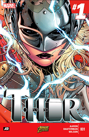
This is the sexiest Thor I’ve ever seen.
I’m not even talking about the so-called “Lady Thor,” the new wielder of the hammer Mjolnir, who makes her appearance at the end of this issue. I’m talking about Thor Odinson, who spends the entire issue shirtless and full-lipped and scruffy. (Seriously, try to find a previous depiction of Thor that has lips. It’s weirdly hard.) Artist Russell Dauterman is clearly drawing inspiration from actor Chris Hemsworth, and it is not only sexy, it’s clearly intended to be so. Three cheers for the female/queer gaze, everybody!
Its depiction of Thor is not the only way that Thor #1 works with female perspectives. The issue also depicts a power struggle between Odin, the former All-Father of Asgard who has just returned from a self-imposed exile, and Freyja, Odin’s wife who ruled as All-Mother during his absence and is in no hurry to give up her power.
Odin’s dialogue to Freyja is full of insinuations that her sex makes her unworthy to rule. Freyja doesn’t argue back, but she’s clearly having none of it.
Thor #1 picks up just after Marvel’s recent “Original Sin” crossover event, though all readers really need to know is recapped in the issue’s intro: After learning some unknown secret from Nick Fury, Thor dropped his hammer Mjolnir onto the Moon’s surface and can no longer lift it again. Not only is Thor apparently unworthy of the hammer, it seems the rest of Asgard is, too – even Odin himself can’t lift it.
A call for help soon rouses Thor from his ennui, and he rides down to Earth with a more cooperative weapon only to stumble into a trap set by old enemy Malekith the Accursed. Things look grim for our hero!
Back on the moon, a shadowy figure approaches Mjolnir and grasps its handle. The issue ends with a full-page spread of the new goddess of thunder, Mjolnir raised above her head.
Jason Aaron’s writing is well paced and character driven. First issues are always designed to bring in new readers, and Aaron manages to both introduce his characters while still carrying over their history from previous issues. He also manages to keep his “thees” and “thous” straight, a perennial problem in pseudo-medieval comics and a personal pet peeve of mine.
And Dauterman’s art is clean, technical and nuanced. Each character has a unique face, and many of the panel backgrounds and page layouts are quite detailed. Color artist Matthew Wilson also deserves a shout-out for blending bold colors with subtle shading, giving the Asgardians a larger-than-life brightness while also drawing out their foibles and dark sides.
In both Marvel’s Thor series and Asgard itself, men aren’t the main event any more. But this isn’t a case of losing anything; rather, the series seems poised to gain exciting new characters and perspectives. For me, Thor #1 is proof that we can have nice things.