Last Week’s Comics 10/17/2012
Visit the MIT Press shop

Point of Impact #1
(Image – writer; Jay Faerber; art: Koray Kuranel)
I went with Point of Impact for two reasons: First, the cover. I’m a sucker for ink-only comics, as they’re a great indicator of an artist’s abilities. Second, Image comics has been a hotbed of creative and original work. So, is Point of Impact another win for Image? Yes. I wouldn’t call it a big win, but when a comic can make its readers come back again, it has done its job.
 The story opens with a murder, and then follows the standard operating procedures of murder mysteries. It has all the necessary elements: a cuckold husband, a pair of rough-edged detectives and a break-in that has more serious implications than a man stealing a few pieces of jewelry. But the points where the comic shines are in its character interactions and simple, yet effective, art.
Jay Faerber’s story is so tightly constructed that I finished reading it in a few minutes. Several of the pages are nothing more than a fight, but the scene is well laid out. The other things I really enjoyed were the mysterious life of the deceased woman and the interactions of the two detectives assigned to the case. More is going on between these two and, for a story to succeed, it has to have engaging characters. Luckily, Point of Impact has those.
For the most part, Koray Kuranel’s black-and-white inks are well executed. The simplicity of the visuals aids the noir/mystery focus of the comic. While Kuranel’s dark-skinned characters look like a mess of shadowing and crosshatching, every other character is illustrated with a level of impressive detail. His style reminds me of Dan Jurgens. The art is simple, but clean. And the use of black and white really enhances the mood of the story.
Point of Impact appears to be nothing more than a murder mystery, but that doesn’t mean it’s bad. In fact, it’s a tightly-written story that grips you from beginning to end and delivers an engaging enough puzzle that I want to go back for more. Given that the series is only four issues, I expect the story to remain compact, but I hope the art gains a little clarity next issue.
———
Before Watchmen: Dr. Manhattan #2
 (DC – writer: J. Michael Straczynski; art: Adam Hughes)
Of all the Before Watchmen books, Dr. Manhattan is the most abstract. J. Michael Straczynski used the first issue as an existential experience for the main character; he explores the idea of alternate timelines and how each minute decision we make affects our world in ways we can’t imagine. The story, therefore, focuses on Jon Osterman and the world he would live in had he not entered the intrinsic field generator on that fateful day. The results are still extremely cryptic, and the comic is no closer to showing how it relates to Watchmen.
Considering that the comic is entitled Dr. Manhattan, the famous blue god is barely in it. Instead, we see Jon Osterman’s life beyond the accident that made him Dr. Manhattan. Much of the story is cut and dry. Jon would have grown up and gotten married. When the comic gets into the notion of Schrodinger’s cat, we see glimmers of the purpose, but I still don’t have an understanding of what JMS is getting at. After two issues, I don’t feel any closer to a resolution.
The bright spot of the comic is Adam Hughes’ art. His imagery is smooth and detailed. While his characters are thickly outlined, they don’t look blurry or uneven. His splash pages are crafted with impeccable clarity, and the final images hearken back to Dave Gibbons’ repetition of the smiley face in the original Watchmen.
The colorization is also well utilized. The softness of the finishes creates panels that glow, and even when the imagery is heavily shadowed, it has a layer of sharpness that elucidates Hughes’ abilities as an artist. I’m not completely into the story, but I am loving the art. In fact, the art alone makes the comic worth the buy. I look forward to the next two issues, if only to see what Adam Hughes will draw.
I’m glad the series is only four issues, because I think it would be difficult for JMS to carry it any longer. The comic still doesn’t read as if it has any connective tissue to its source material, but maybe it will make sense in the end.
If not, I can still enjoy looking at it.
———
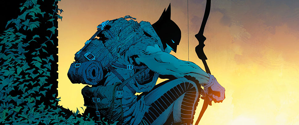
Batman #13
 (DC – writer: Scott Snyder; art: Greg Capullo)
Bannen’s Book of the Week: Scott Snyder has a proven track record of success, and the work he’s put out has been a joy to read due to its cleverness and engagement. So my excitement at seeing his version of the Joker was only dampened by the idea that I would feel let down and that the comic wouldn’t live up to my expectations.
Luckily, that was an unfounded belief.
Snyder’s Joker is every bit as dark as you would expect, but he is more than just a whirlwind of chaos. Much like Heath Ledger’s Joker in The Dark Knight, Snyder’s Joker has a game plan, and it is every bit as intricate and mysterious as you would imagine. But Snyder’s story is less about the Joker and more about how those around him are reacting. Since he barely appears in this issue, much of the information about him comes from other characters. Snyder takes time to show how each of Batman’s sidekicks reacts to hearing the news of the Joker’s return. While they’re depicted in action scenes, it is clear they’re uncomfortable with Joker’s resurgence in Gotham.
The opening moments of the book are laden with mood-heavy dialogue and set the tone for the story. At no point did I feel safe, and the buildup to the Joker’s appearance, while short, is strong enough to make his initial attack pretty terrifying. The final moments of the book and the predicament in which Batman finds himself stayed with me long after I read the comic. While I’m pretty sure Batman will escape, I have no idea how.
Greg Capullo is Scott Snyder’s steady work partner at this point, and the book succeeds because of Capullo’s art. He knows how to shift focus for effect, and while the majority of pages are packed with imagery, the panels never lose their clarity. There are some great scenes illustrated from different viewpoints, and Capullo shifts back and forth between tight and wide shots with such skill that the composition is near perfect.
Additionally, the Joker looks horrific. In the New 52, the Joker had his face cut off by the Dollmaker. Snyder uses this aspect to make Batman’s craziest nemesis seem even crazier. The climax is maddening (because we have to wait so long to see what happens next), and the comic left me wanting more.
I don’t know what to say beyond encouraging readers to see this story in action. Maybe you’re tired of hearing my Scott Snyder love, but the guy’s damn good – there is no denying that. Seeing how well he handles such a big-name character like the Joker, I think fans will now have a wish list of villains they want to see Snyder tackle next. Given the bar Snyder keeps setting and leaping over, I don’t see how he keeps topping himself.
But I’m not complaining.