The Space of Water
It’s easy to find movies that give no respect or regard to the spaces they take place in. They’re just hallways and rooms chained together by actors. As long as we see characters run out a door and open another in the next scene we can connect those spaces in our minds. But nothing particularly interesting happens with them they’re just the place the movie happens. They can be pretty or eye catching but ultimately they’re vapid.
Over the years Guillermo del Toro has continuously given us visual feasts and The Shape of Water has some really pretty rooms. But what sets The Shape of Water apart from stunners like Pan’s Labyrinth is the expert use of space and depth. It’s a film that gives such respect, time, and attention it’s the thing that’s stuck with me the most in the weeks since I’ve seen it.
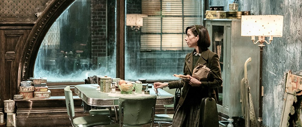
Del Toro instead gives us spaces that are visually connected and believable. Elisa’s apartment may be a bit outlandish but the space makes sense. It’s visually distinct and we know how its related to Giles’s apartment, the hallway, the stairs, and the theater. A person could sketch out a floor plan pretty easily.
What’s beautiful about the size and scope of Elisa’s building is that it easily builds a sense of familiarity. Spaces that are easy to keep and assemble in one’s mind are comfortable. As the first space we see and one that is painstakingly laid out in long takes it becomes the visual home for the film. We, like Elisa and Amphibian Man, feel the safest when we’re here.
This is in contrast to the research facility where Elisa works. We know there’s a security checkpoint, a loading dock, a lab, a locker room, a control room, and some access ways. But how do they all connect? We can connect some of the spaces but large portions of the layout are a mystery. Unlike Elisa’s apartment we’re not able to come up with a floor plan. We can connect some of the spaces together but not all of them. It’s impossible to know how far the control room is from the lab or the locker room.
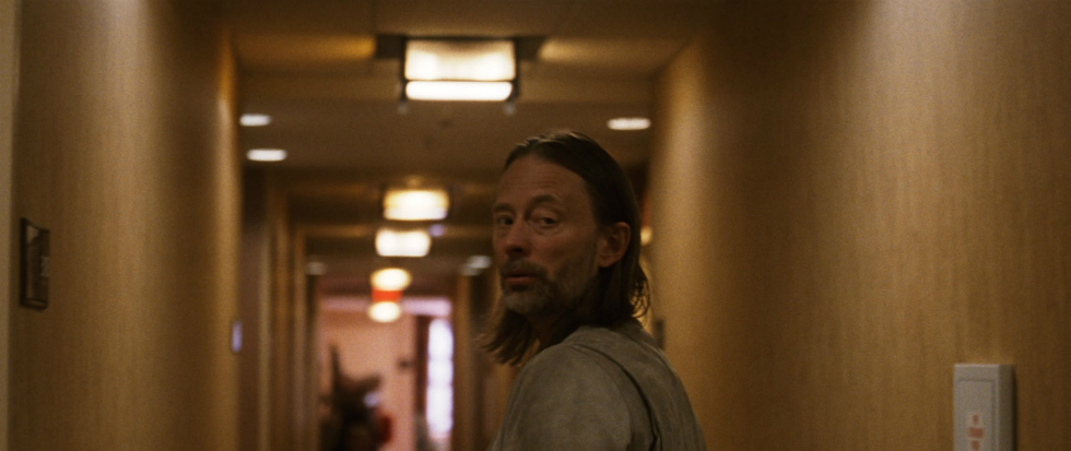
The effect of this is that the research facility is frightening. We can’t be at ease here because of that little voice in the back of our heads that says something isn’t totally right here. While the research facility isn’t the impossible series of winding halls that is the Overlook Hotel it’s still just uncanny enough to get to us. It’s a mass of drab concrete and harsh lighting compared to the warm wood tones of Elisa’s apartment.
The magic of this is that without knowing much about the story or characters we’re very quickly told a lot about the story. We learn not by being told but instead by seeing. This is compounded by the way that the movie is shot. Instead of characters running into and out of sets with the camera whirling around we’re given essentially flat spaces. On a practical level this is because they’re sets. But the effect is that the action feels contained, small, and tight.
Unlike other del Toro films, The Shape of Water is visually laid out in a way that helps us to read it and be affected by it. Spaces have layers and are established and slowly dug into. Once we’ve reached familiarity the space opens up a little more. Once we’ve seen Giles’s apartment we’re introduced to deeper facets of that apartment.
All together the spaces in The Shape of Water feel not just believable but contribute Michael-Stuhlbarg-levels-of-performance. They build a sense of timelessness, comfort, discomfort, and ultimately help teach the film to the viewer. While other movies are too busy with motion blur and set pieces The Shape of Water actually uses the set as pieces in a fabric that comes together wonderfully. While far from a perfect one, it’s certainly a good looking one.


