The Two-Sided Invitation of Cartoon Aesthetics
It’s not unheard of for a game with an inviting front to have a thorny center. But is it unusual for a game to be dismissed simply because it’s inviting? This is a question I had in mind while playing Hypersensitive Bob.
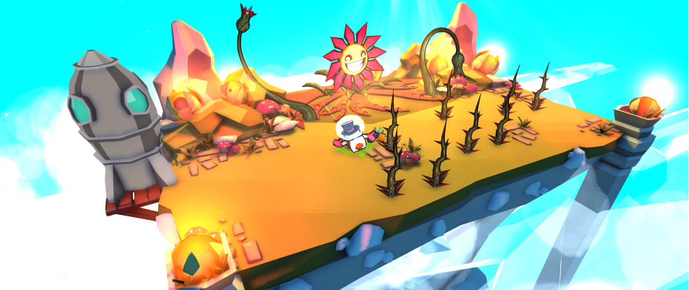
“Bob” is an admittedly ordinary name for a fellow who doesn’t fall within common character archetypes. His makeshift protective gear — fishbowl helmet, oven mitts, and a bucket for armor — is actually reminiscent of that Rugrats episode when Chuckie made a germ suit. In presenting him as a highly vulnerable allergy sufferer, the game explores a theme more often seen in life simulations like Big Pharma.
Taking the structural setup of roguelike meets outdoor dungeon crawler, players guide Bob on floating islands to wipe out enemies as a measure of self-preservation. Allergy sources include mushrooms, slugs, vicious turkeys and what I think is black pepper, all of which have their own attack patterns. Although mostly random in the unit selection, enemy spawn points often cater to the design of a particular island and happen in a sequence, so repeat plays will arm you with experience to prepare for follow-up waves.
Confusingly, little is done to elevate its originality, disregarding Bob’s back-story and almost any form of a welcoming preamble. But this isn’t why the game might be turned away. Although the controls feel clunky in the beginning (arrow keys fire pellets while WASD is for movement) and it’s frustrating to navigate the environment (enemies unreliably passing through crates, not going to the edge of a row), the arcade formula ensures the experience maintains a consistent pace and is not bolted down by these elements. The cartoony aesthetic that represents its greatest hurdle.
There’s a prevailing stigma against the inviting, cartoon-style image, perceived as translating to a “childish” experience. And for a game like ![]() Hypersensitive Bob, unconsciously inviting such disdain can feel like a death sentence. Cartoon motifs take different forms and don’t necessarily capture a similar visual DNA seen in children’s entertainment. Don’t Starve has a cartoon element to it, but it’s also coated in darkness where whimsy would normally be the accompanying ingredient.
Hypersensitive Bob, unconsciously inviting such disdain can feel like a death sentence. Cartoon motifs take different forms and don’t necessarily capture a similar visual DNA seen in children’s entertainment. Don’t Starve has a cartoon element to it, but it’s also coated in darkness where whimsy would normally be the accompanying ingredient.
The same can be said of Stick it To The Man, although its funky and warped presentation, with neon elements and a dream-life feel, is akin to Invader Zim. A more balanced example would be Stikbold!, which adopts a 3D blocky art style for its characters and environments, with charm stemming from its out-of-control game happenings. Meanwhile, Slime Rancher is adorable to a disproportionate degree while yet also being strikingly polished.
To equate Hypersensitive Bob as juvenile on the basis of its cartoony exterior would be premature. In actuality, the game’s risk-reward system — pooling vaccines towards Continues or exchanging them for upgrades — adds an RPG-like layer of depth that keeps the game moving. My favourite upgrades: boosting ammo to 12, and canceling out the first attack on every level. Additionally, once you reach 200 Points, the allure of Legendary Items needs to be weighed against not having a safety net for future encounters (the first Continue costs 100 Points and goes up from there).
The uphill battle facing Hypersensitive Bob is strictly due to its chosen art style. The brand of unordinary heroism on display here may not speak to a large crowd, but an approachable tone should not be confused with cuddly gameplay, for underneath its face of casual resistance is a game that knows how to match progression with sufficient challenge.


