Last Week’s Comics 9/5/2012
Justice League #12
(DC – writer: Geoff Johns; art: Jim Lee)
From the cover, readers know that Superman and Wonder Woman will eventually hook up. It’s a pairing that makes sense, seeing as how neither one of these godlike characters could really be with a mortal. Even the Greeks understood this. But given that the majority of the issue is the League tangling with the villain Graves, and that the seeds of Wonder Woman and Superman’s pairing haven’t really been planted in previous issues, the final pages of the comic feel unrealistic and more like an addendum to a pretty poor story arc.
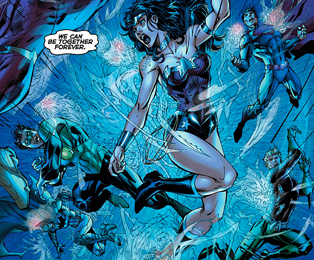 First off, Graves just isn’t an interesting villain. He can create projections of loved ones people have lost, but beyond that he’s kind of weak. It doesn’t take the team long to destroy Graves’ exterior body to reveal the shriveled person underneath. Johns tries to lay on sympathy for Graves, using Batman as a conduit to explain the author’s actions and how the league should feel bad for him, but I don’t buy it. I don’t feel bad for Graves because there was nothing more to him than a one-dimensional shell. But when he’s defeated, he suddenly develops a personality.
Also, given that Batman is supposed to be such a genius, his being fooled by Graves’ projections doesn’t hold water. I had a hard time believing that Bruce would be taken in by a ghostly Thomas or Martha Wayne. The only other mortal character, Steve Trevor, plays a vital role in saving the league members. I get that it’s meant to be symbolic of the league needing Trevor, but again this thread wasn’t introduced earlier. Instead, we got a screwy relationship between Steve and Diana.
Because Graves spends the majority of the issue shooting his projections at the heroes, Jim Lee packs the comic with ghostly tendrils flying all over the place. The problem is that they are visually distracting, and the imagery loses its clarity. Lee also goes to excess on character faces (save for Diana) so that lines of cross-hatching appear all over the place. These lines are also inked, making for sloppy character designs.
The comic comes to a close by teasing the future of the Justice League. Given what we’re shown, I’m excited for the next year of the New 52, and I hope that Johns can do better than this. As a finale, the comic gets the job done, but it’s nowhere near as good as it can or should be, especially given the talent. I can only have faith that Justice League improves.
———
Green Lantern Annual #1
 (DC – writer: Geoff Johns; art: Ethan Van Sciver)
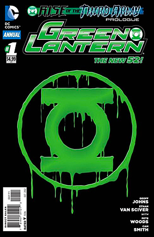
Whereas Geoff Johns hasn’t been at his best with Justice League, his Green Lantern series has been a consistently good read. Nothing really changed for Green Lantern after the New 52 started. The story picked up right where it left off before the reboot. So now, a year later, we get to see what the Third Army is, and how it will affect the Green Lanterns.
After the previous arc, Black Hand was returned to the Black Lantern Corps, severing his ties to the Indigo Tribe. This allowed him to once again have control of the dead. In the last issue, we found out that Hal Jordan would be the greatest Black Lantern ever, and in this issue, we see how that happens. The story is more violent than usual, but it works within the context of the comic.
Johns proves his ability to create history without changing canon. Readers get to see a different set of Guardians as well as the First Lantern, a character who remains visually obscured – for now. And speaking of the Guardians, Johns has found a way to take them from being little blue monks to sinister and dangerous beings. Given the major changes that are going to occur in the world of Green Lantern, I don’t see how Johns will ever be able to return the Guardians to their former status.
Artist Ethan Van Sciver is a welcome return in the annual, as his work is detailed and impressive. Van Sciver knows how to make the imagery gritty and dirty-looking (which is apropos for this issue). He’s also adept at drawing character faces that are fitting for the moment. His Guardians are chilling to look at, while his Black Hand looks awesome and powerful. Credit also needs to be given to Hi-Fi for beautiful and striking colors. The images never lose their clarity due to excellent pencil works, inks and fantastic coloring.
While I don’t wholly dig the Third Army character designs, I’m totally engaged by the story. Johns has teased this for a while now, and one of his last major Green Lantern crossovers (“Sinestro Corps War”) is one of the best epics I’ve ever read. “Rise of the Third Army” is localized solely in Green Lantern books rather than being a DC event, so I have very high hopes for this story. Given that we’re going to see the introduction of a new Lantern soon, I’d suggest getting on board with this series before you miss out.
If you skipped “Sinestro Corps War,” I urge you not to skip “Rise of the Third Army.”
———
Before Watchmen: Minutemen #3
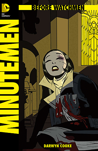 (DC – writer & artist: Darwyn Cooke)
Bannen’s Book of the Week: For two weeks in a row now, I’ve been bowled over by a Before Watchmen book. This time it’s Minutemen, which was good anyway, but this last issue was unbelievable. All credit goes to writer and artist Darwyn Cooke, who masterfully tells a character-driven story that is perfectly paced, beautifully drawn and damn near perfect in every sense.
One thing Cooke has been able to do very well is to intersplice two separate threads but have them overlap in the same page – sometimes panel to panel. He does this in issue #3 of Minutemen, but this time with more disturbing segues. In particular, Hollis Mason’s conversation with The Silhouette – which cuts back and forth between some violent imagery – is a perfect example of this. The contrasting pictures create a tone of unease, and shift the tale into a more urgent state.
There are other moments like this throughout the comic. Cooke is able to create palpable tension between his characters. He picks up where Alan Moore left off in Watchmen by having the Minutemen sitting around to decide Edward Blake’s fate after he tried to rape Silk Spectre. The results are intense. Similarly, a conversation between Sally Juspeczyk and Ursula Zandt is loaded with antagonism, and we’re starting to see the group breaking apart under its own weight.
As the artist, Cooke also has free rein on the visuals. The result is that he knows how and when to craft events into sequential moments, and when to shift the focus of the panel to minor details or juxtaposing images. There are too many visually stunning moments to name, but when flipping through the issue, I was struck by the pacing achieved by the panel design. Truly, Cooke is an artist.
At this point in the Before Watchmen cycle, you’ve made up your mind if you’re going to be reading these comics or not so there’s no use belaboring the point. Minutemen is excellent, end of story. It’s an exercise in writing and art, and a worthy sibling to its inspired work.

