Last Week’s Comics 4/18/12
The Secret Service #1
(Icon — writer: Mark Millar; art: Dave Gibbons)
For Mark Millar, The Secret Service is a subdued comic that concerns itself more with character than it does with spectacle. Much of the first issue is spent on developing the main characters, Gary and his uncle, Jack. While the comic moves at a slower pace than most other Millar creations, it has more dynamic characters and much slower burn that will lead to a greater payoff.
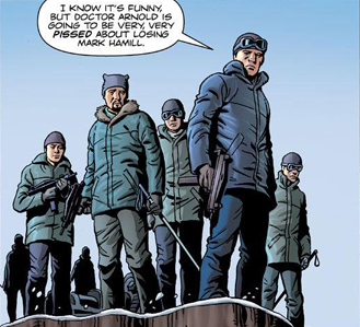 While the opening sequence of The Secret Service is like other Millar stories, its quick conclusion and transition to the true heart of the story — lovable loser Gary — make it a different read. It’s word-heavy and slow for a Millar book, but in a good way; readers have more time to get to know the characters. Millar paces the story well so that while the beginning and ending feel like two different stories, the characters’ personalities are cemented by the end of the book. After reading the last page, I had a pretty good idea of the kinds of people I would be reading about.
Maybe it’s because the comic is co-created with Dave Gibbons and Matthew Vaughn, but The Secret Service has a very deliberate stroke to its story telling. Gibbons is best known for his work with Alan Moore on Watchmen, a series that is all about being deliberate in its storytelling. Whereas Millar’s last few series (Nemesis and Super Crooks, particularly) focus on the villains, this is an attempt to focus on the hero. Gary, while being a loser, is a likable enough guy who has some flaws. He’s into drugs and speeding away from cops, but he cares about his mother and his family. One scene in particular, involving a little boy at a party, is disturbing to see and Gary’s reaction immediately puts the reader on his side.
One can see where Millar’s going with the story, especially with the introduction of Gary’s uncle. A confident and fearsome person, Jack is written with an aura of hushed violence about him, and while he doesn’t do much in this comic except look pissed off, I’m anxious to see how he’s revealed over the course of the series.
David Gibbons’ art is clean and precise. With Watchmen, he paced the actions so that sometimes, we were seeing a character’s movements over the course of nine panels per page. Here, he has to be more concise with his art. The pages are well crafted, and Gibbons’ hatched shadowing helps introduce both character and mood. One panel in particular shows Jack watching his nephew drinking, but Jack’s face is almost completely in shadow and he looks very menacing. Credit is also due to Angus McKie for his colors, which are subdued, yet proper for the book.
The Secret Service is a different kind of book for Mark Millar. It’s not all action and no soul. It has an engaging story, interesting characters and a phenomenal creative team. I enjoyed this book more than I thought I would, and I think Secret Service has a lot to offer.
———
Secret #1
(Image — writer: Jonathan Hickman; art: Ryan Bodenheim)
When I went to my comic shop on Wednesday, one of the workers had pulled a copy of Secret for me and put it in my box. He told me that he thought I would be interested in reading the comic, and said that after he read it, he felt sure I would love it.
 He was right.
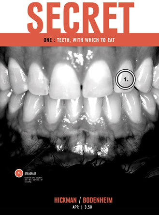
Secret is a thriller that deals with a group of men who sell security to major corporations by breaking into their systems to exploit their weaknesses. Then, they offer protection services for exorbitant amounts of money. But couple this with a mysterious assassination and a violent massacre, and you have enough intrigue in the comic to make it a captivating read from the opening scene (which is violent and awesome) to the final page (which is just as awesome).
The comic is also rife with strong and engaging characters. Grant Miller, the head of Steadfast Security Holdings, is a confident and dynamic character — as are his associates who do less than reputable things, but in the name of providing safety (or so they say). The comic has a ton of dialogue, but it’s necessary for the character development as well as the plot. But by the end of the issue, Miller is so fully fleshed out that readers already know the kind of man he is, and what lengths he’ll go to for a paycheck.
Ryan Bodenheim and Michael Garland are responsible for making this comic as good as it is. Bodenheim’s characters are similar in design to Gabriel Rodriguez’s drawing in Locke and Key — thick outlines, detailed illustrations and stylized character designs. There are moments where Bodenheim’s art takes over and tells the story without any of Hickman’s words. Michael Garland uses simple colors for this book — blacks, whites, reds, yellows and greens. No characters are truly colored. Color merely exists in this world, sometimes randomly thrown in (in one scene it merely tints the frames of pictures), sometimes used as mood setters — several pages are a mash-up of inked characters existing in flat colors. Think of Sin City, and you’ll get a picture of the kind of striking colorization used in this book.
For a first issue, Secret is very, very good. I loved every panel in this comic and while I guessed the ending of the issue a few pages prior, it didn’t diminish the strength of the story. Secret has everything needed to make a comic successful — strong characters, an intriguing story and fantastic art. Jonathan Hickman has one more winner to add to his growing list.
———
Bannen’s Book of the Week:
America’s Got Powers #1
(Image — writers: Jonathan Ross & Bryan Hitch; art: Bryan Hitch)
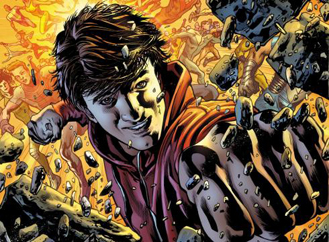
America’s Got Powers has a simple premise: seventeen years ago, a giant crystal landed in the middle of San Francisco, glowed for a few minutes, and then caused every woman in a 5-mile radius to give birth to a baby with superpowers. Now, people live in a world where those people, known as “Stoners,” compete gladiator-style for a shot at being a professional and therefore famous superhero — all except for the story’s main character, Tommy Watts, a boy born without any powers. At a whopping 35 pages of story, America’s Got Powers is a fantastic mixture of captivating characters and beautiful art.
Jonathan Ross puts a lot into this story. Several different seeds are planted, and while I love the amount of art and story we get for a $2.99 cover price, I have to say that this is a dense book. For a first issue, this asks a lot out of readers. This, however, doesn’t make the comic bad. In fact, it showcases just how much Ross and artist Bryan Hitch want to accomplish.
Tommy Watts is our connection to this world. A boy born without any powers, Tommy is a nice guy with a crappy job hocking merchandise for the show America’s Got Powers. His lack of powers makes him relatable, as does his attitude. While he’s obviously bummed out to not have powers, he compensates with his wit and charm. Like Peter Parker, Tommy’s kind of a loser, but he has heart. When he’s accidentally drawn into the arena, we get to see the true nature of the series, particularly in the last two pages.
There’s more to Tommy, though, than a stock hero. The comic opens with a character named Bobby Watts, and while there may be a connection, it’s not explored in this issue. Little threads like this are planted throughout and the second act of the book deals solely with the show coming to an end because, while Americans love the gladiatorial blood bath, the army has other plans for the Stoners once they lose. Here, the comic moves one step closer to a societal commentary — while we’re entertained by violence, the government is more entertained by how to harness it for military purposes. These moments are important to the series, but don’t overshadow Tommy. As the focal point, Tommy is definitely the person around whom the story is built.
Bryan Hitch’s art is the best part of this comic. His pencil work is fantastic as pages are packed with detail. The scenes in the arena offer the most in terms of showcasing Hitch’s skill, particular the battle scenes that involve not only a group of humans, but the group of robots they battle. But Hitch is at his best drawing characters up-close, conveying their emotions — the sadness in their eyes or the fear on their faces. Page upon page of this comic is layered with detail, so much so that it’s almost visually exhausting to look at. Credit has to be given to Andrew Currie and Paul Neary for their neat inking job. If not for their clean, fine lines, the pages would become a cluttered mess.
The same goes for Paul Mounts, who has to work extra hard to convey all the imagery as well as he does. Coloring is vibrant and intense, particularly the last half of the comic where we get to see the super-powered people compete against each other. The skill that went into crafting this comic is unbelievable, and it’s one of those times when explanations will not do the pages justice.
America’s Got Powers takes some time to read, and it gets a bit bogged down with everything tossed in there, but it’s still a fantastic book, and a series I’m looking forward to reading. Much like Saga, this book is layered and engrossing in its story telling, and visually absorbing in its art. To pass on this would be silly.
———
Brian Bannen doesn’t have powers, but he wishes he did, and that’s why he reads comics. See him rant about normalcy @Oaser.

