Last Week’s Comics 3/7/2012
Justice League #6
(DC – writer: Geoff Johns; art: Jim Lee)
As the rest of DC’s New 52 initial storylines come to an end, I hoped that Justice League would have a satisfactory conclusion for what has been a truly weak beginning. In this issue, however, Geoff Johns is a victim of his own game as he tries to pull off a conclusion that attempts to be everything an introductory arc is supposed to be. With a final story that proves to be anything but epic, Johns closes the first arc of Justice League with an intensely action-packed, but ultimately flawed issue that tries to be a grand finale, character introduction and mystery beginning all at once.
I had a hard time with the new Justice League, ever since Bruce Wayne took off his mask. Geoff Johns knows the character better, so why he wrote Bruce as a skulking action star rather than a dark detective is a mystery to me. Darkseid similarly acts in a less-than-Darkseid way. Everyone knows that he has awesomely powerful Omega beams. And he could easily defeat most heroes of the DCU. But here, before he can even really do anything, he’s blinded by Arthur and Diana.
 But that’s only one of a multitude of things that occurs in this comic. The first two thirds of it is the fight, and the last third is the resolution. Then, there’s an epilogue that sets up the bigger mystery about DC’s return to #1. All of this feels very cramped inside a 30-page comic (where several pages are taken up with full or splash action). One splash page had a total of 11 individual panels, and the story switches from the Capitol building to a writer’s office and then back again. The pacing is all over the place, so that the consistency is sorely lacking. At one point, we’re right in the middle of the fight, then we’re transported to Apokolips to watch Superman be tortured, and then we’re thrown right back into the fight again – with no transition. The movement is jarring, and it makes a normal reading experience more difficult than is to be expected.
The saving grace of the comic is the last five pages, where the mysterious Pandora talks about the DC rewrite with the Phantom Stranger. Their cryptic conversation feels like a much-needed breath after everything that occurs in the 23 pages before it. It’s mostly exposition, but it feels weightier than the entire comic.
That said, I love Jim Lee’s character designs. Lee has a way of drawing the characters so they look more athletic than beefy. Superman and Batman look sleek and muscular, but in a believable way. The same goes for Diana. Lee doesn’t exaggerate the more feminine parts of her body to a point where she’s nothing but boobs and butt. She looks rugged and gritty. His characterizations really sell the interactions in the book. Much of the composition, however, lacks the epic feel Johns is striving for.
Most of the battle with Darkseid takes place in small panels. He only fully appears on two splash pages and on two full pages. Otherwise, he’s almost a background figure. This makes emphasizing his size difficult, especially when so much is going on in the comic. Lee tries to fit all six members of the league in several different shots. What this does, however, is make for a less-detailed visual. I wanted to see more of the characters, and instead I felt like I saw all of the characters at once, but not in any discernible way.
Alex Sinclair, Tony Avina and Hi-Fi add great colors to the book, but with cluttered panels, the images don’t jump off the page they way they’re meant to. On some pages, there’s almost too much going on, so that Sinclair and Avina have to mute their work. The comic is fun to look at, but for the grand tone of this issue, and at no fault of their own, Sinclair and Avina fail to give the amount of detail expected on this scale.
While the next arc jumps forward to the present day, I have my reservations about Justice League. While the Pandora backstory laid the groundwork for some intriguing mysteries, Johns needs to do a better job of giving the story room to breathe. I would have preferred that he spent the first arc having the heroes come together to battle some other villain like Starro – one that poses a threat, but also one that could be defeated pretty easily. Having them battle Darkseid, however, proves problematic. First, he shouldn’t fall as quickly as he does in this issue. Second, if this is the first time these heroes are encountering him, he does a poor job of making himself the threat that he used to be. And third, they don’t really work as a team to defeat him. Yeah, they beat him up together, but in the end only one person is responsible for sending him back to Apokolips.
There were bound to be snafus, but I didn’t expect them to be so glaring. I only hope that Johns and Co. do a better job in the next arc.
———
Amazing Spider-Man #680
 (Marvel – writer: Dan Slott and Chris Yost; art: Giuseppe Camuncoli)
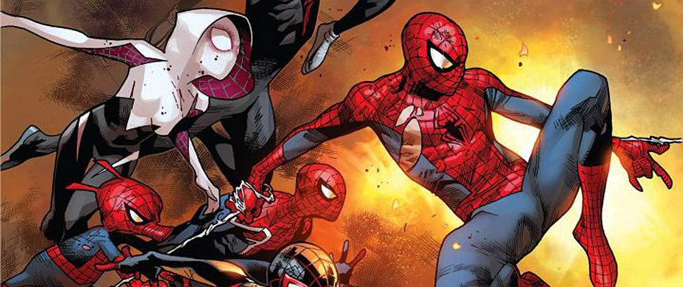
There’s a lot to like about Amazing Spider-Man #680. Part of it is the Johnny Storm/Spider-Man team-up, and part of it is the strange, fantastic setting in which the story takes place. Spider-Man has spent the past few months dealing with his own set of issues on Earth (like having the entire city of New York gain spider-powers), so it was a neat idea to take the Human Torch and Spider-Man into space for an odd, funny and extremely entertaining ride.
Dan Slott and Chris Yost dive right into the conflict. Two pages into this issue, Spidey is on his way to the FF tower to get Johnny Storm. The pair is going to take a rocket into space to save John Jameson. Once there, they find the station weirdly deserted, and after encountering a horde of Octobots, they catch up with John (who luckily was outside of the station when it was attacked). His crew, however, was not so lucky, and the final page reveals what happens to the members of the Apogee Space Station.
Slott and Yost do their best to make readers remember why a Torch/Spidey team-up is so much fun, Much of their banter is laced with sarcasm, and Johnny and Peter pull no punches. As soon as the story gets away from Horizon Labs, it takes on a more organic feel. While Slott and Yost toss in one more bit of conflict (between Jonah and Horizon), the rest of the story stays with Spidey and Torch. When Johnny is first introduced, he’s dancing in the FF loft while singing Rebecca Black’s “Friday.” Additionally, he’s trying to catch up on 700 hours of television he missed while trapped in the Negative Zone.
While I don’t like the pop-culture reference, I appreciate the attempt at humor (because it did make me laugh), especially because the panel is a direct reference to Risky Business. Slott and Yost must have had a lot of fun writing this comic, and it shows. Plus, they throw in one of Spidey’s oldest nemeses: Doctor Octopus. Personally, I love the redesigned Doc Ock, so I was excited to see him make a small cameo (which seems charged for the “Ends of the Earth” saga that’s set to begin in Amazing Spider-Man #682). This issue feels like a bridge to that story, but not in any structured sense. As a two-parter, this story has a lot to offer in its conclusion. Since much of this issue is exposition, the action in the next one should be superb.
Giuseppe Camuncoli is a welcome change from Humberto Ramos, and I had no qualms with the character design or illustration in this comic. Frank D’Armata does great work when Johnny turns his flame on, but for most of the issue, he uses dull colors. Nothing really stands out, visually, in this comic. That’s not a complaint, per se, but a noticeable difference from some previous Spidey comics.
His Doc Ock, however, is one scary-looking dude.
I enjoyed the wackiness of this issue, and I look forward to seeing the results – especially considering that for possibly the first time, Spidey will have to battle some Walking Dead-type villains.
———
The Cape #4
 (IDW – writer: Jason Ciaramella; art: Zach Howard)
Bannen’s Book of the Week: For such a short-lived series, The Cape has really defined itself as a strong story. This issue in particular added some depth to the characters – even the villainous Eric – and provided readers with a satisfactory ending and a definitive conclusion to this violent, antihero story.
Jason Ciaramella opens the book by going back to the day Eric returned to school after his accident. In fourth grade, I was badly burned by a microwaveable pasta meal. It scarred the left side of my face, and when I returned to school, I had to deal with kids staring at the scarred, watery burn on my face. For this reason, I related to the harassment Eric feels. Any kid who has had to deal with being singled out knows this type of feeling, and as a reader, I felt a connection to the villain of the story. This made the conclusion that much greater of an experience. Ciaramella goes for base emotions – anger, love, fear – and these translate into great storytelling.
What I appreciated most about the issue was its definitive end. Without spoiling the final page, there’s no way a Cape #5 should ever come out. Ciaramella gave us a good, finite arc with his characters. I particularly appreciated the bookends of the comic – scenes from Eric and Nick’s childhood that show how they once interacted as brothers are supposed to. This adds a weight of heartache to the story, especially seeing the dark turn Eric took. Their climactic battle is full of heavy dialogue that utilizes the brother relationship to really nail the moral dilemma Nick is faced with. His solution is clever and finely constructed.
Zach Howard does a fantastic job drawing this issue and his facial designs remind me of Gabriel Rodriguez’s art in Locke & Key. He captures the emotions of the characters perfectly, depicting the right amounts of anger, sadness, spite and arrogance. The violence in this comic is almost too much to bear, especially when Nick and Eric start fighting on the roof of the Prudential Building in Boston. Nelson Daniel does a wonderful job, helping Howard color in the ragged and tattered remains of Nick’s right cheek.
The most beautiful visual comes in the center of the comic, when Howard and Daniel draw a splash page that lets us into Eric’s warped inversion of events. We see demonic images like skulls and tentacles, as well as Eric’s warped perception of things – his relationship with his brother, his girlfriend, his mother and even his downfall. Much like J.H. William’s Batwoman, The Cape is more than a comic – it’s a piece of art.
I walked away from The Cape with an overwhelming sadness. While Eric was a psychopath, he was a relatable character. His fall is easily imagined, and the loss of his innocence is something everyone can visualize. I loved everything about this issue – the tone, the dialogue, the visuals. It’s an example of a great climax, and a book that every comic book fan should own.
———
Brian Bannen takes his supervillain name from his one weakness. Beware the scalding meat sauce of Dr. Rigatoni on Twitter @Oaser!


