Object Lessons #3: Megadungeon

This column is a reprint from Unwinnable Monthly #170. If you like what you see, grab the magazine for less than ten dollars, or subscribe and get all future magazines for half price.
———
What’s left when we’ve moved on.
———
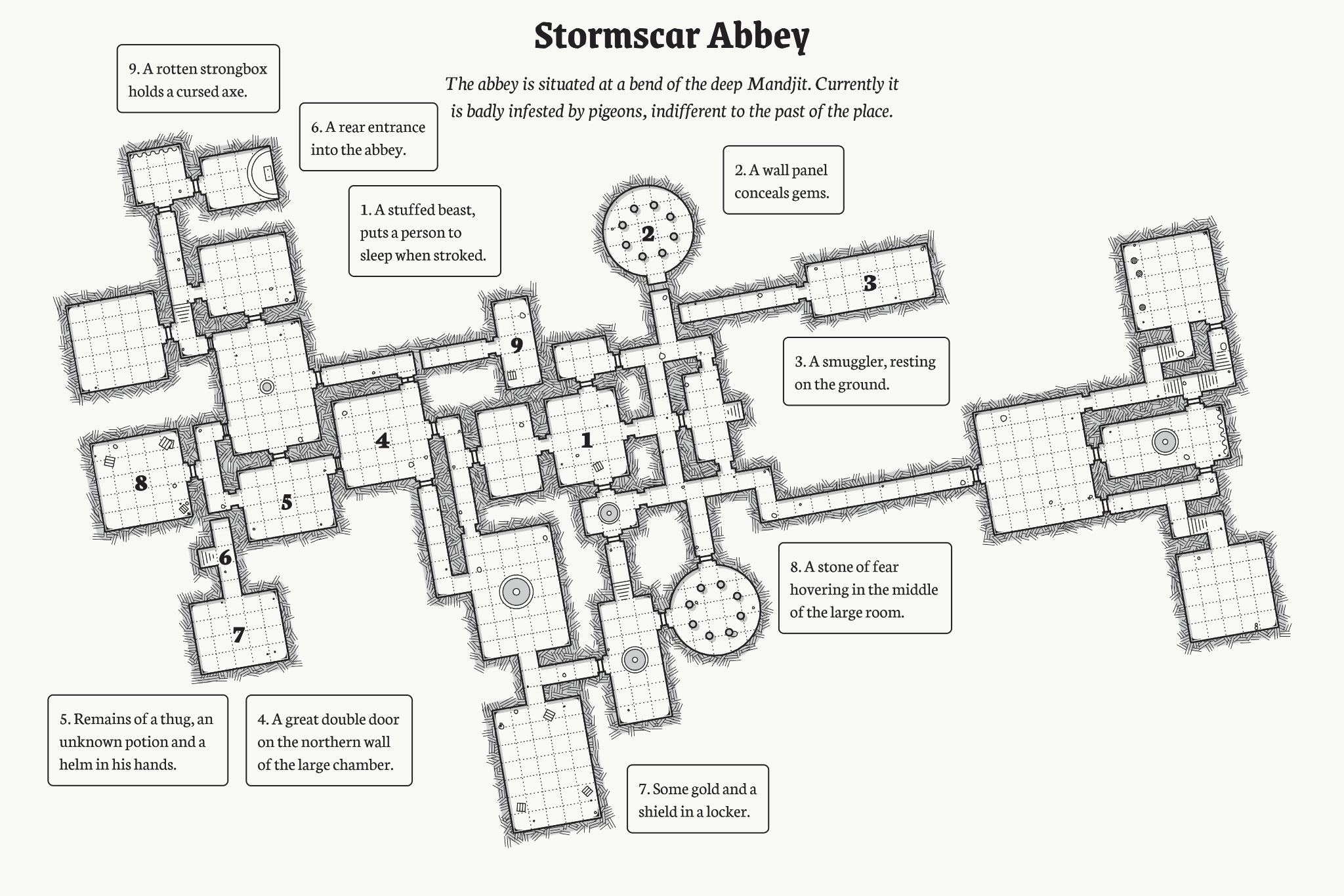
Halfway through this year I realized that I’d been playing a lot of RPGs; like, a lot. It was a good year for them, but on some level, I unconsciously made the decision to make up what I’d missed before. This might be the fault of how I started the year, which was with the Dungeon23 project that went viral in December 2022. The goal was to draw and describe one room of a megadungeon every day for a year. Every Reddit thread for it was punctuated by someone saying “only 5% of people will see this to the end!” I started almost out of spite. And you know what? I dropped it in March. It turns out that making a megadungeon when you don’t have a campaign to use it in isn’t fun.
What is a dungeon? This is the kind of question you think about when you draw your fiftieth square grid room that contains yet another statue and another random battle. A dungeon is first and foremost arranged space. That’s something I thought about when I played Trails in the Sky 3, which is a megadungeon itself. In having, perhaps, the laziest inciting incident you could (you’re trapped inside a cube; deal with it), only the space right in front of you matters.
The first area is a green maze with a nebula-like floor floating in a vast background of stars. There’s another dungeon from the first game that’s entirely gorgeous marble and easy to get lost in. This was on the PSP in 2006. Its outside environments are a little muddy sometimes, but the insides are their own little world. This series constitutes three out of the 17 RPGs I at least started this year. Its dungeons are long hallways, and I wouldn’t describe their design as good or even fun. However, their layouts communicate a special utilitarianism: there’s something at every dead end of their octopus-like structure.
At this point a normal person might be asking – did you say seventeen RPGs? How did I have enough time to play all of these? One, games form the foundation of my freelance job and two, they are a staple hobby as the world moves on from a pandemic that is very much still happening (lol!!! just kidding, it’s not funny.) In my Elizabeth Gilberting around countless digital realms, I began to develop Opinions about what makes a dungeon good. Genshin Impact, for instance, which I tried for a brief period again this year, has dungeons that are several isolated rooms usually connected by a couple floating platforms. You can run through them as many times as you want to get resources and items. I don’t like these dungeons. For one thing, it’s way too easy to fall off the edge of stuff.

For another, I think the best dungeons are the ones you encounter once and never again. Diablo IV, which I played about 10 hours of, similarly expects you to run through its caves and barely disguised hallways over and over to complete challenges. I will only ever get the shallowest enjoyment out of this style of game. I just don’t have the patience, or the desire, to walk through the same rooms over and over again.
This gets to something else I want to talk about: dungeon texture. In literary studies, texture is what we call the experience of the surface features of a work, like its sound and imagery, in contrast to its structure or argument. Games, obviously, have texturing, which itself can create texture: shadows and light, depth and space. To quote from this essay about games’ aesthetic flaws, “every game is also a representation in the same way that other artworks are: using Kendall Walton’s terms, they are sensory depictions, like paintings, sculpture and music, or narrations, like books, poetry and radio plays, or hybrids of the two, such as television, comics and films.” Like most of these categories, games have thematic texture and also visual texture that plays on multiple senses at once.
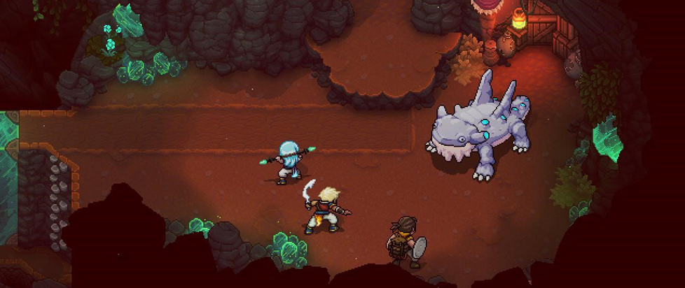
Sea of Stars is a great example of what I mean. It might be my favorite game of the year, and the reason for that is its environmental design, particularly the dungeons. They are not only made of beautiful pixel art but they are vertically oriented, with many puzzles that make you drop down through the level or take the stairs. Each dungeon feels like a perfectly constructed diorama. And each one is new. Despite that game’s stated influence from Chrono Trigger and other classic RPGs, it creates different themes for each area and expresses them through myriad special effects: the lighting and fog have been particularly lauded examples. From the cloudy green crystals in the second dungeon to the coral and undersea windows of a later one, they are all sparkling with texture.
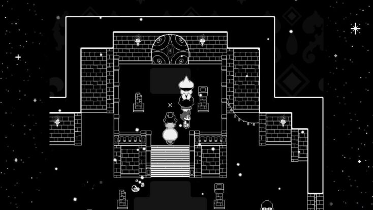
In contrast, there’s minimalist dungeon design like the pure grid of Dungeon Encounters or my graph paper scribbling. A slightly more detailed minimalist dungeon is in In Stars and Time, which is a time loop game where you explore a castle called the House of Change. Once you discover you can’t die, you go back through the same dungeon over and over, getting more information to defeat the king and restore time’s flow. It’s an extremely well-written game that deals with themes about immortality and eternal stasis, as well as sexuality and family loss. It also requires you to go back through the same rooms over and over again, a sacrifice I don’t find annoying because it serves the story the writing is trying to tell about how frustrating it is to strive through repetition.

A megadungeon only remains interesting when it’s both cohesive in its whole and distinctive in its parts. To return to that essay on aesthetic flaws, “whenever there are multiple forms of representation working together, there is the possibility of different aesthetic values about those kinds of representations clashing.” The smoothness of In Stars and Time greatly contributes to each loop feeling like an individual “floor” of something larger: every time something little changes, it feels sufficiently new. In contrast, each repetitive Diablo dungeon is alike in its structure and design, and since the differences mostly extend to visuals, I see that smoothness as a flaw.
The next step past this kind of repetitive design, or maybe a relative to it, is procedural generation; for instance, One Page Dungeon, which produces dungeon floor layouts and basic item descriptions. Using it feels like the place I eventually got to with my dungeon, when I ran out of inspiration: googling fantasy tropes or flipping through novels to imagine appropriate things to put in empty rooms. In other words, using it feels a little like cheating. With no shade to these kinds of tools – they do require human input, after all – I can’t not think of how people use AI to generate inspiration, a process that cuts off one’s ability to do so on their own.
An assumption I held at the beginning of the year was: a dungeon is a reflection of the person who dreamed it up. The motivation behind trying Dungeon23 for me was something like starting an apartment in the Sims mixed with reading my horoscope. I think I imagined the process of creating one room each day as meditative, something that would reveal a fact about my psyche or how my day was going in whatever I created. In practice it was totally different: my real life had no impact I could discern on what I was creating. I’m glad my graph paper drawings won’t be serving as a personality test, but I was also disappointed to find how impersonal what I made ended up turning out. And I ended up seeking that same level of investment in the dungeons I wandered through for the rest of the year: what signs can I see that a real person created this? How can I connect, however minutely, with the hand that drew this or wrote this word?
The results were mixed, but I still find dungeons as enigmatic as I did at the start of the year. I still see them as boundary keepers between free exploration and the world of Traps and Puzzles, condensed rooms expressing a theme through sound and light rather than anything explicitly said. And I hope to play more things in the new year that experiment with what makes a dungeon, and that still have the fingerprints of their designers left in the paint.
———
Emily Price is a freelance writer and PhD candidate in literature based in Brooklyn, NY.


