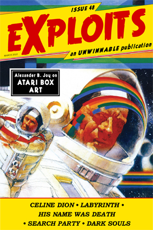
The Absurd Pleasures of Atari 2600 Box Art
 This is a reprint of the feature essay from Issue #48 of Exploits, our collaborative cultural diary in magazine form. If you like what you see, buy it now for $2, or subscribe to never miss an issue (note: Exploits is always free for subscribers of Unwinnable Monthly).
———
Unrepresentative box art once formed a key pillar of classic gaming. There was no feeling quite like plugging in a game cartridge and discovering that what you saw onscreen bore no relation to what the box and label depicted. The Atari 2600 era boasts this experience’s most jarring iteration, where the evocative hand-drawn art of Atari’s first-party titles promised worlds and wonders that the system’s rudimentary (or “abstract”) graphics seldom delivered.
At the time, the incongruity was a deliberate strategy. In Tim Lapetino’s 2016 book The Art of Atari, former Atari art director Steve Hendricks reveals that “On the 2600 packaging they told us to ‘do something that could spark the imagination of young buyers,’ and we tried to give them some flesh and blood and energy. We tried to take the imagination of the designers and keep it conceptual – loose, representational, capturing a lot of the aspects of the game in one illustration.” Of course, this approach was also born of necessity. “The games were so simple you had to create as much of the context with reality as you could,” Hendricks notes. “We had to implant the visual image in the gamer’s mind.” Thanks to Atari’s staff artists, players could convince themselves they controlled a tank or starship or adventurer instead of a featureless block.
With the console long out of production, the cover images for Atari 2600 games now enjoy an aesthetic afterlife. By one method of appreciation, they’re inventive, expressive interpretations of simple games, celebrating inspiration and imagination alike. But by my preferred approach, Atari 2600 box art, like the sensationalized B-movie posters of yesteryear, provides a conduit for unexpected hilarity. The gulf between the actual games and their implied content creates comparisons so outlandish they beg for ironic enjoyment.
 Pick any first-party Atari 2600 game, and you’ll see what I mean. Flag Capture conjures dramatic naval battles between warring pirate factions when the game itself doesn’t even feature boats. Super Breakout resembles 2001: A Space Odyssey more than a solitaire Pong variant. Competitive snake game Surround becomes a sci-fi battle sim. The egregiously misnamed Slot Racers insists those flaccid, phallic vehicles you pilot are in fact the sleek roadsters of a neon-drenched future. Space War suggests you’ll rain terror on interstellar outposts instead of scoot triangles across gray screens. My favorite is Video Checkers – by coincidence, a Steve Hendricks piece – which turns an underwhelming childhood pastime into a medieval epic where nobody can stop making smug faces.
Nowadays, we might be tempted to call Atari’s approach false advertising. I’d urge resisting that temptation. For in the age of digital distribution, where ad copy tends to correspond to in-game artifacts, Atari 2600 box art recalls a joy lost to us: the creative partnership between player and program that allowed games to expand far beyond what they were and unlock all they might be.


