Architecture and Authority
 This column is a reprint from Unwinnable Monthly #139. If you like what you see, grab the magazine for less than ten dollars, or subscribe and get all future magazines for half price.
———
Architecture and games.
———
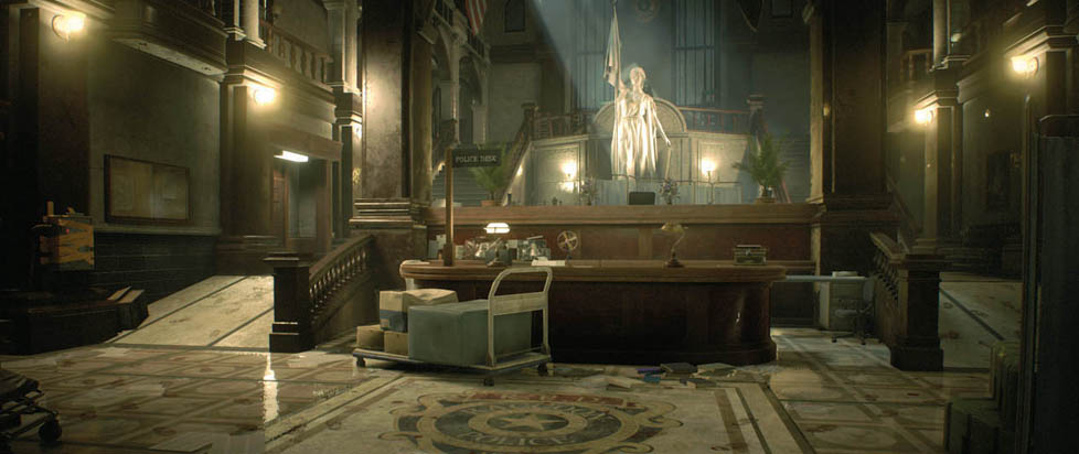
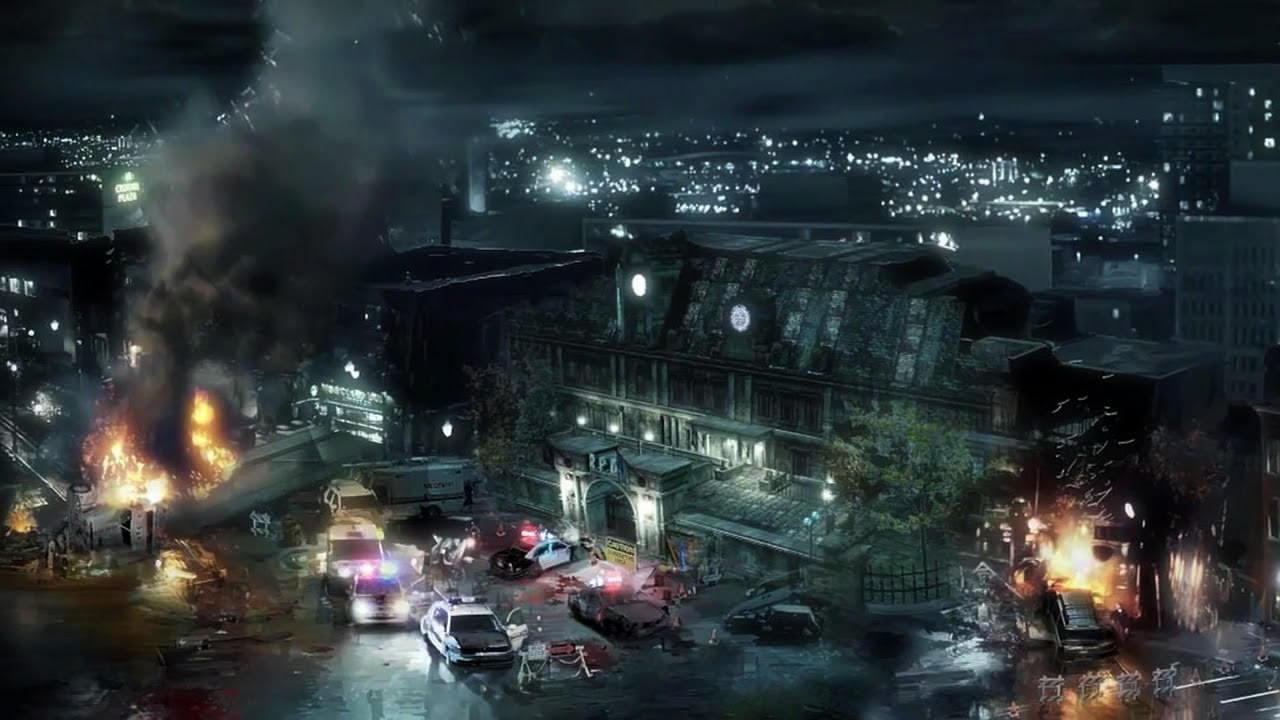
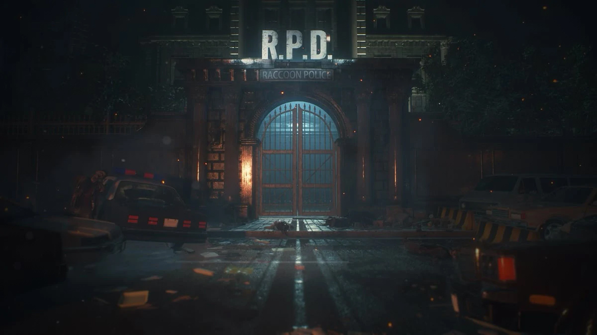
Take some time to play Resident Evil 2 and you’ll quickly become acquainted with the Raccoon Police Station. The situation is basically inevitable on account of the fact that you’ll be wandering around the place for a good part of the game. The building is definitely beautiful, but it’s worth mentioning for what I think is a much more important reason: the structure communicates a strong sense of authority. What you’re seeing on display is the power of the state in the form of the police.
Architecture has been used to communicate authority for thousands of years. This would be why people started building monumental structures in the first place. These were mostly palaces in the past, but they can be anything from libraries to banks in the present. Things haven’t changed much over the millennia. Similar to palaces, libraries and banks communicate a certain amount of authority. When it comes to these particular buildings, we’re talking about authority in terms of knowledge and wealth, but let’s focus on politics because the power of the state is, of course, the long arm of the law. In other words, let’s focus our attention on police stations.

The best way to understand how architecture communicates authority is to look at how buildings are designed. This involves manipulating form, space and order. You’re probably thinking right about now that you’re about to get a bunch of theoretical bunk, but let me assure you that I’m talking in terms of practical reality. Form is all about shapes like the circle, square and triangle. Space is mostly a matter of size and scale. Order has to do with principles of design like symmetry, rhythm and repetition. What about the Raccoon Police Station, though? You can understand how the Raccoon Police Station communicates authority by looking at several different features of the building. You can make sense of this by considering how the structure manipulates form, space and order.
Shapes are used to communicate meaning. There are more than just three of these, but the shapes that you’ll most often come across in architecture would have to be the circle, square and triangle. While the circle is all about equality, the triangle has more to do with hierarchy. The square communicates a particularly strong sense of strength. Take a look at the Raccoon Police Station and you’ll be hard pressed to find any circles. I counted a couple of them on the outside and a few on the inside, but they’re definitely few and far between. Squares and triangles on the other hand are all over the place. The walls are a series of squares and the roof is basically just a bunch of triangles. The windows are squares with triangles for lintels. You could say the same thing about the doors. The main entry into the building consists of double doors under a portico with a pointed pediment. You can see all of this on the outside, but the inside of the structure has a lot of squares and triangles, too. The walls often feature square pilasters. The coffered ceilings and parquet floors provide even better examples of this. I remember seeing a lot of checkerboard patterns. The result is that you get the impression that you’re being oppressed.
Size and scale say a lot about the importance of things. When you write down a word in uppercase, you’re attributing more meaning to it than if you were to write down the same word in lowercase. Bigger is always better. This principle doesn’t change much when it comes to architecture. The importance of a structure appears to increase with size and scale. The actual importance remains the same, but we’re not talking about actual importance. We’re talking about how things are perceived. Similar to writing a word in uppercase, you’re attributing more meaning to a building by making it really big. You can see how this works by looking at the Raccoon Police Station. The structure towers over pretty much everything else in the surrounding district. The building looks big on the outside, but if you step inside the structure, the Raccoon Police Station looks quite a bit bigger. Walk into the main hall and you’ll soon see what I mean. This part of the Raccoon Police Station is basically an open space beneath a vaulted ceiling with mezzanines on the second and third floors. The room can even accommodate a massive statue on the wall opposite to the main entry. The size and scale of this room create a sense of importance that gets imparted to the police.
Principles of design create consistency. When it comes to architecture, the most commonly used principles of design are symmetry, rhythm and repetition. The result is order. They give you some idea of what to expect in the absence of experience. You might not be able to find your way around a building without them. The creation of this consistency comes at a cost, though. The fact of the matter is that symmetry, rhythm and repetition don’t appear very often in the world around us. They’re products of people. Nature doesn’t like them. The order that they create through consistency communicates power. This probably sounds like theoretical bunk, so let’s take a look at the Raccoon Police Station. The main hall for example is an open space with rows of columns beneath a series of arches. Parallel sets of staircases give access to the second floor. You don’t have to look very hard to see the use of symmetry in the columns and arches. The same goes for the stairs. You can see rhythm and repetition on the inside, but you can see how these principles of design have been used on the outside, too. The best example would have to be the windows. These are completely identical. They also happen to have been placed at equal intervals in the walls. I think that you’re supposed to feel small.

You can see how architecture communicates authority by looking at the Raccoon Police Station. The question that you’re probably asking yourself at this particular point in time is what you should be taking away from all of this. The answer is that you should always be critical of the built environment. You need to understand what a building is trying to communicate so that you don’t end up getting duped.
When it comes to architecture, the fact of the matter is that people have been communicating authority by manipulating form, space and order for multiple millennia. The point has always been to make themselves look more powerful than everybody else. The focus was on particular people in the past, but you’re a lot more likely to see this being practiced by institutions like the police in the present. The only way to know for sure what game they’re playing is to read the rulebook. When you look at a police station for example, you have to know that you’re looking at a building that is laying claim to political authority. The same goes for libraries and banks, but these are more about claiming authority in terms of knowledge and wealth. You’re doing yourself a disservice by accepting this authority at face value because the institution might not actually deserve your support. You need to be able to smell a scam. Don’t get duped into thinking that you’re always dealing with an institution that deserves to hold authority.
———
Justin Reeve is an archaeologist specializing in architecture, urbanism and spatial theory, but he can frequently be found writing about videogames, too. You can follow him on Twitter @JustinAndyReeve.


