Bizarre Banality
 This column is a reprint from Unwinnable Monthly #134. If you like what you see, grab the magazine for less than ten dollars, or subscribe and get all future magazines for half price.
———
Architecture and games.
———
Take a walk around the residence in Gone Home and let me know if you see anything strange. I don’t mean in terms of the contents, though. The house has all sorts of secrets in the form of hidden objects that reveal interesting things about the inhabitants. I mean in terms of the architecture.
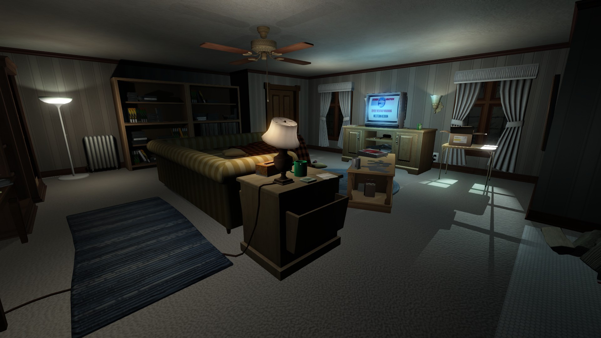
The residence in Gone Home looks perfectly normal at first glance. I would even go so far as to say that it seems a little bit banal. Poke around the place and you’ll discover all sorts of dated decorations like wainscoting and wallpaper. You’ll see tons of tasteless tile and shaggy carpet. You’ll find quite a few fixtures that look like they’re from a different decade. In other words, the residence in Gone Home is no different from the hundreds of houses that you’ve probably been in before. Right? Well, not so much. Take in the details and I’m sure that you’ll come to this conclusion. The residence in Gone Home is by no means banal. The building is actually bizarre.
You can break down the bizarre banality of the place into a couple of different categories. The first would have to be the building plan. The second is definitely the interior design. When you aren’t really looking, these appear perfectly normal, but if you stop to think about the details, they seem pretty strange.

How about we start by discussing the building plan? This makes very little sense no matter how you slice up the stories.
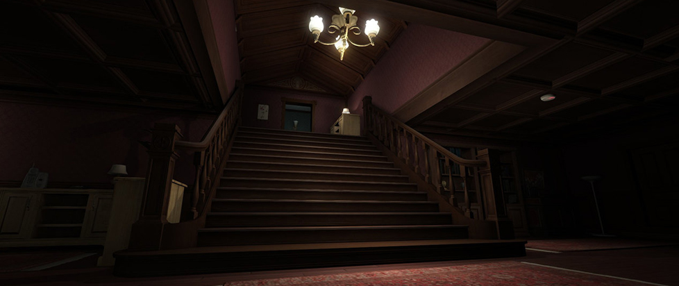
The residence in Gone Home has a second story without a first floor. You might be wondering what I mean by this. The structure has a first floor, but the second story isn’t actually on top of it. The majority of houses are basically just really big boxes because everything above the first floor has to be supported by something. You can’t have a hovering house. When it comes to the residence in Gone Home, the second story seems to be floating somewhere behind the first floor, though. You reach this part of the structure by going up a staircase in the foyer, but if you take a second to situate yourself in space when you get there, you’ll notice that you aren’t actually where you’re supposed to be. The fact of the matter is that you’re above and behind what amounts to the back wall of the building.
Walk up the staircase to the second story of the structure and you’ll find a bunch of bedrooms. In terms of the architecture, the most interesting aspect of these would have to be the ceilings. The main bedroom has a skylight. The guest bedrooms have walls that angle inward above the point at which they meet the rafters. Why are these features interesting? They suggest that nothing could be above them. You can’t have a skylight which isn’t built into a roof. You also can’t have a story above what amounts to an attic. The residence in Gone Home on the other hand has a third floor that you access by going up a ladder behind the main bedroom. This part of the building seems even more strange when you stop to think about the turrets. These would have to be supported by something on the second story.
I could say more about the building plan, but you can probably see where I’m going with this by now, so let’s just talk a little bit about the interior design. This hardly holds together any better.

The doors and windows of the building are completely out of proportion with almost everything else in the structure. They’re huge. When you place these in relation to the walls, you can definitely appreciate this phenomenon, but if you compare the doors and windows to some of the contents, you’ll see the degree to which they’re distorted. In my personal opinion, the desks and chairs provide the best examples. These are totally out of whack in terms of size and scale. Take a look at them and you’ll soon see what I mean. The problem of proportion seems even more strange when you stop to think about the light switches and electrical outlets. These are absolutely massive. They take up a lot more than their fair share of wall space. When it comes to the contents, they seem to be about the same size as most of the books and magazines.
The structure has a lot of strange features. The doors for example are double hinged, so they open in both directions. I really can’t think of too many houses that have this particular feature. You can occasionally find these opening onto a deck or patio, but I’ve never heard of doors with double hinges being used in every single room of a house. The heating and ventilation system is pretty strange, too. Spend a while exploring the structure and you’ll soon find yourself in the basement. Take a look at the water boiler. You can find steam radiators in most of the rooms, but the residence in Gone Home seems to be heated by forced air. The ceiling of the basement is covered with ducts. You can see vents on every floor. The heating system is complicated even further by the fireplaces. Where exactly are the chimneys?
They seem banal at first glance, but the building plan and interior design of the residence in Gone Home are actually bizarre. What exactly is the deal with this? The answer is more simple than it seems.

The structure doesn’t exist in the real world. The banality makes it seem like a real place, but this bizarre building is just a game world. This has an important implication. Since it has no physical existence, the building isn’t actually bound by the laws of physics. This means that you can have a second story without a first floor. This means that you can have doors and windows that are completely out of proportion with everything around them, too. You don’t tend to notice these quirks because the experience of being in the game world is the only thing which really matters. You might call them concessions. What does it matter if the building is structurally sound? Who wants to get stuck behind a door that only opens in one direction? The most important thing is that you’re able to move around the place in a way that doesn’t detract from the experience of being there in the first place. The details have to contribute to this, but they don’t actually need to make any sense.
———
Justin Reeve is an archaeologist specializing in architecture, urbanism and spatial theory, but he can frequently be found writing about videogames, too. You can follow him on Twitter @JustinAndyReeve.


