The Siege and the Sandfox
 This column is a reprint from Unwinnable Monthly #99. If you like what you see, grab the magazine for less than ten dollars, or subscribe and get all future magazines for half price.
———
This series of articles is made possible through the generous sponsorship of Epic’s Unreal Engine. While Epic puts us in touch with our subjects, they have no input or approval in the final story.
———
In terms of stealth games, I consider Mark of the Ninja a high water mark in recent years (full disclosure: I’m friends with designer Nels Anderson and writer Chris Dahlen). 2D stealth isn’t exactly a booming genre, so you can imagine my delight when I discovered The Siege and the Sandfox.
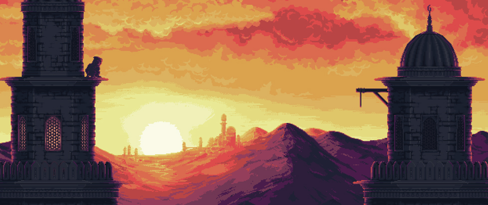
A “stealthvania” that combines 2D platforming with stealth mechanics, presented in a lovely 16-bit art style harkening back to the Super NES-era but enhanced with modern effects. You largely traverse an underground area of prisons, tombs and caves, sneaking about, avoiding traps, befriending allies and attempting to discover the secret of a sinister threat to the besieged kingdom above.
Under development by Cardboard Sword, a collection of experienced developers from a variety of AAA backgrounds seeking to be free of traditional corporate structure, The Siege and the Sandfox will hopefully see release in 2018, with a publishing and funding partnership with Chucklefish.
Cardboard Sword’s CEO Olly Bennett took time out to chat with us about the challenges of developing a 2D stealth game, the allure of the 16-bit era and more.

First off, can you speak to your inspirations? Siegefox, being a Metroidvania-style game, obviously draws from the open, side-scrolling foundation of the namesakes, but I also detect a lot of influence from games like Mark of the Ninja and even the Prince of Persia.
Yes, so in addition to the genre’s namesakes, we’ve taken huge inspiration from the 2D stealth of Mark of the Ninja. 2D stealth is not easy, but MotN proves that it is possible, and to great effect. We’re also very inspired by several of the earlier Prince of Persia games; a slower more considered and deliberate relationship with the environment. There are other more subtler inspirations too: the atmosphere of the original Thief games; the bobbing characters and animations of Metal Slug; the clever use of color and shape from the art in Batman on the NES; stylistic references from Monkey Island, and more.
The visuals of the game hearken back to the Super Nintendo era, but also stand apart. What made you embrace that particular period? And what are some of the key ways you distinguish your visuals from the period?
The SNES and that era of pixel art holds many warm memories for our team. The games from back then, and even the physical systems themselves, had a wonderful joyous feel to them. Maybe that’s nostalgia speaking, but unlike trying to recreate the art of something like the early 3D titles, we’re taking our lead from the best examples of when pixel gaming was at its peak.
The art in The Siege and the Sandfox has been intentionally designed to make you remember that era of gaming, but with modern effects and a few technical liberties. We’ve stuck to the color palette restrictions, mostly, breaking it here and there where we’ve thought the situation benefits. Most noticeably, of course, is our use of modern lighting and technical effects from Unreal. We think they really enrich the pixel art and complement each other well.

Can you speak to the enduring appeal the aesthetics of old games have on the industry, particularly for independent developers?
The games industry is still pretty young, and has changed a great deal in a short amount of time. 3D is visually stunning and has almost unlimited potential, but we’ve been dominated by 3D games for the last 10 years or so. There’s a large market of games players, and games makers that I think are nostalgic for the timeless charm pixel art can have. It’s almost like a comforting respite from the constant stream of shiny textures and photo-realistic guns. Now that indie is flourishing in the wake of the current console generation, I think it’s natural that we’d see developers respond by creating games in the styles they used to love.
Stealth and the systems that go into making a great stealth game, are, to my mind, a modern gaming convention (perhaps exemplified by Mark of the Ninja). How did you approach the meshing of old school looks with modern design practices?
Modern stealth games (and a few classic ones) realize that the best way to gain depth is to be systems driven and that instant-fail gameplay won’t allow players to be exposed to most of these systems. Players are given the opportunity to recover from their mistakes, which often leads to the most memorable moments of any stealth game.
While we may look like an old school game, we recognize the power of these modern conventions and look to apply them where it makes sense. In the same way, we’re aware of how a 2D perspective changes the balance of information given to the player about their surroundings. Give them too much and there’s no tension, too little and the game can appear random.
2D games often show the other side of doors and walls, and enemy locations and intents are readable regardless of distance. This is completely different to a first person game, where a player’s vision is naturally limited by the perspective.
MotN succeeded because the developers recognized that they would need to replicate these limitations in 2D. This is why they have a visibility occlusion system. Rooms are not revealed until the player can see into them, which is information they need to earn by exploring the space. We’ve taken a great deal of inspiration from the MotN systems and implemented what we feel is the best fit for our game.

Stealth and how it works in a game has a way of almost becoming a character in and of itself. What’s the philosophy behind stealth in Siegefox?
The Sandfox is calm and collected; we’ve built our stealth around that. Our philosophy is that the stealth mechanics and the Sandfox are one and the same in this sense. The occlusion system (obscuring areas the Sandfox can’t see) and audio cues encourage players to take their time, rather than rushing in.
These systems also make high ground much more desirable, which dovetails neatly with our parkour controls. That isn’t to say you can’t approach things in a more direct manner should you desire – the Sandfox is an assassin after all, but the game is designed to encourage a cautious considered approach.
I’ve been impressed not just by the parkour elements of the game, but by how they seem to feel. The Sandfox seems to have a real weight and velocity in his movement. How did you go about designing that?
Parkour is all about using the environment, navigating the ups and downs, and finding routes through it. The Sandfox knows what they’re doing, so instead of being light and springy with lots of air control, we wanted the moves to feel practiced and measured. Games like Prince of Persia and Flashback do this really well, but being rotoscoped, they sacrificed control to achieve this. Most modern games solve this problem with inverse kinematics (IK), but we couldn’t do this as we use 2D sprites. We solved this problem by brute forcing the solution: we hand animated everything; all animations; the blends between animation states; the loops; and so on.

Moving past the retro aesthetic, there’s a lush beauty on display in the environments. Can you talk a bit about how you developed your world? Do you have particular real world or fictional inspirations?
Architecturally, we wanted to have three distinct styles and periods, to show that the kingdom above has been built on history and that the location is very old. There are hints of artistic inspirations taken from the Sands of Time trilogy and Forgotten Sands for our prison area, and Skyrim and Oblivion for the mausoleum, but mostly the artists just made what they thought looked good and fitting with what they pictured in their heads.
Immediately under the palace is a relatively recent and active prison, but with a community of ‘lifers’ in an inescapable older section further below. Because of all this ancient architecture, and the network of caves between them, some factions of prisoners have delved deeper, away from the guarded areas. So the player will venture into areas that are older than others, with ruins, crumbling brickwork, growing moss, water dripping through cracks in eroding rocks, areas rarely visited, with dust motes lingering in stale air. We’ve used several layers on each tilemap to express these details, which is what enables us to bring our environments to life.
Why did you choose Unreal Engine 4? Are there any unexpected benefits or challenges to using the engine?
We didn’t choose Unreal for The Siege and the Sandfox; we chose Unreal for Cardboard Sword. As a company we aim to keep making games until we’re old and gray. Epic provides a fantastically powerful tool that will continue to develop. As we make more and more games, our experience in the engine and relationship with Epic will continue to grow too, enabling us to get more and more out of their tools. Achieving 2D in Unreal has not been anywhere near as difficult as people assume, and in all the other areas where the engine shines – such as lighting and blueprints – it provides us with simple, powerful, effective features that are easy to apply to our game project and create stunning results.
Has the Dev Grant allowed you to do anything you otherwise would not have been able to?
The dev grant came at the perfect time, when we were still looking for a funding partner. It provided us with a safety net, to allow us to keep developing the game while finding the perfect company to work with.


