
Skin Deep
Each week, Jeremy Signor contemplates the heart and soul of tabletop gaming. This is The Board Soul.
We don’t like to admit that we like how something looks. Visual aesthetics are often discounted as being a shallow metric for measuring a game’s worth, but the truth is that the form a game takes is an important part of how we engage with the games we play. It’s what connects the mechanics and the theme, but we also connect with game visuals on an intrinsic level. That’s the secret of Azul, an abstract game that tasks you with placing gorgeous plastic tiles in different patterns to score the most points and win the game. I can honestly say that Azul would not be nearly as compelling if it wasn’t as beautiful as it is, and you know what? There’s nothing wrong with that.
Michael Kiesling was inspired to create Azul from the Portuguese tile art form known as azulejo, which used polished stones to create works of mosaic art. And what you get with Azul is a reasonable facsimile of that concept. You’re given a series of tiles to place in an arrangement on your personal player board in order to score points, but what you’re immediately drawn to is the tiles themselves. They’re as square as a piece of Starburst candy, yet each one has a nice heft to them. The surface of each is shiny, and they’re divided between monochromatic tiles and those that have a little design on them. Each tile’s pattern is its own work of art in its way, and taken together, the tiles steal the show in Azul, an undeniably beautiful board game component.
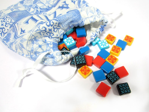
It’s not like the gameplay itself is lackluster, either. Azul is a game about making simple choices leading to you building an ever-growing scoring mechanism out of next to nothing. You’re also planning a few moves ahead, as the texture of the game state changes in small but profound ways between turns. Different locations offer different tiles until someone takes some as they dump the rest in the center of the table as another location players can grab from. It’s a game all about the small things adding up, much like the tile mosaics that Azul takes its inspiration from.
Those tiles, though. You keep coming back to the tiles because of how beautiful and tactile they are, but also because Azul puts them front and center at all times. You’re constantly looking at them as you make your choices from the offer in the center of the table, you’re handling them as you pick out the ones you want, and you’re placing them on your personal player board, framed with a striking blue pattern much like the tiles themselves. The visual design of Azul is what ties the entire game together, and you keep wanting to come back to it just to get the chance to play with those damn tiles again.
If we’re going to evaluate the entirety of a game, then we first need to admit to ourselves that the more seemingly “superficial” elements of a game are still inextricably tied to the core of what a game is. Azul illustrates this perfectly. Separate the mechanics from the aesthetics and it’s is just not the same game. If the colorful, glossy tiles were replaced by cardboard chits, Azul wouldn’t shine nearly as bright as it does. Azul is a game about celebrating the beauty of azulejo, after all, and there’s no better way to do that than by putting you in the driver’s seat of some tiles and set you to work creating your own point mosaics. And if you happen to create some art along the way, even better.


