Refining Persona
 This column is a reprint from Unwinnable Monthly #97. If you like what you see, grab the magazine for less than ten dollars, or subscribe and get all future magazines for half price.
———
A monthly glimpse into whatever gaming bugaboo Rob’s got on his mind.
———
Videogame sequels. Ugh. Far too often, they end up being derivative rehashes of earlier games in the same series that disappoint despite having a successful (presumably, because why bother making another one if not?) start. Sequels don’t always suck, of course, but many do have a tendency to come up short. Here’s the thing: if you want some excellent examples of games that do sequels right – by building off of and learning from what came before – look no further than the latter half of the Persona series.
The first two games were good, don’t get me wrong, but it was Persona 3 that really put the franchise in the spotlight. The poppy visual design, the style (both fashion and otherwise), the balance between typical RPG turn-based battles and “Social Links” – and of course that freaking amazing soundtrack – were hard to ignore. It was a great game but little did we know at the time how much better it could get.
Persona 4. My favorite JRPG of all time. God that game is fantastic. This is where the cleverness of the series’ design improvements started to appear – because duh, it’s a sequel, right? Persona 4 took the stylish combination of relationship building and fantastical RPG combat, then refined the crap out of it. The interfaces were even more slickly designed, the various text boxes and other displays added even more to the cohesive visual design, the music was even better, etc. And, my god, those cropped character portraits that pop up when you hit enemies with whatever they’re weak against (and of course the all-out-attack) look amazing. Even better than what we got in Persona 3.
Better yet, Persona 4 made a number of mechanical improvements I didn’t know the previous game needed. Quick travel was a thing, which made the day-to-day tasks significantly more bearable since all the arbitrary and time-consuming running was skippable. Symbols appeared next to spells to make it easier to tell at a glance what was what. Party members no longer got tired in dungeons – instead you were just limited by how well you could manage SP and, eventually, you could even replenish it (for a fee). The combat menu used a much more straightforward and easier to navigate vertical list of words instead of a rotating circle of occasionally obtuse icons. Dungeons were better, too, with more thematic areas representing different characters as opposed to one big tower that didn’t mix the environments up all that much. It was the best Persona had to offer (until P4 Golden, anyway). But then Persona 5 happened.
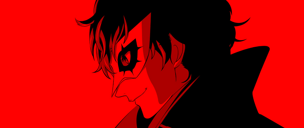
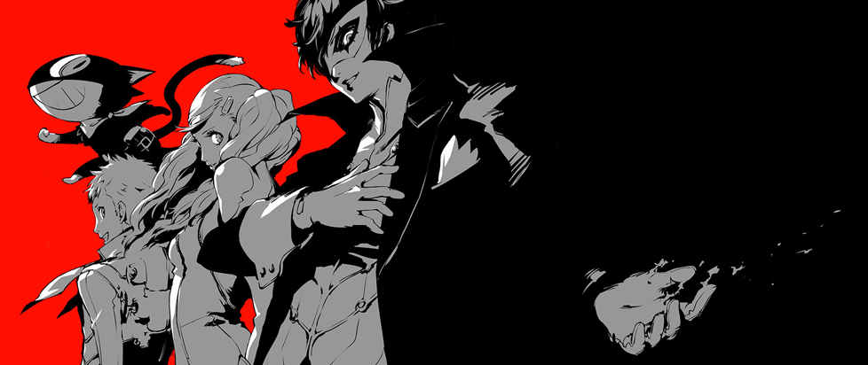
As I’ve said, Persona 4 is my favorite JRPG ever. This will never change. However, from a purely objective standpoint I can’t deny that Persona 5 is the better designed game. It improves on so many different bits and pieces I’m not entirely sure where to begin so I’ll just start with the visuals. Holy shit. If Persona 4 made Persona 3’s visual design look dated, Persona 5 makes Persona 4 look like the first game we got stateside on the original Playstation. My god, this game looks slick. The level of graphical refinement to everything from the text boxes to the status screen is jaw-dropping. This also extends to the fashion, which is way too slick to be realistic but still incredible. The Phantom Thief outfits in particular are a sight to behold.
The music is also fantastic, of course, though I still prefer what’s in Persona 4 Golden. I can admit that, on a technical level, the newer game’s soundtrack is even more impressive. The seemingly jazz-inspired (I think?) tunes are all great on their own, but the way that they grow and change ever so slightly as the story progresses is brilliant. I can only hope that more games try something similar in the future.

And then we come to the mechanics, which stand so far above what came before there might as well be a two-generation gap in the hardware. Wait a second . . . Kidding aside, as much as I adore Persona 4, I have to admit it’s difficult to come back to after playing Persona 5. The combat menu does away with directional navigation entirely and instead has each option (attack, skill, guard, etc.) mapped to a specific button on the controller. This alone is a revelation, as it makes combat flow so much better. Skill selection has also gotten an upgrade thanks to similar symbols that accompanied the skill names from Persona 4, but now the symbols are also color-coded (i.e. bufu/ice skills have a blue icon, agi/fire have red, etc). Then there’s more subtle interface changes like how you can swap personas from the Skill menu instead of having a devoted Persona menu, or the inclusion of damage types like nuclear and bullet that haven’t been in the series for several years.
The non-combat changes are just as big a deal. Now non-party Social Links serve a purpose besides simply providing experience boosts to Persona fusions. It’s great from a gameplay standpoint because it grants some useful perks like being able to swap party members while in combat or let you perform actions in the evening after spending the day dungeon crawling, and it’s great from a thematic standpoint because it feeds in to the idea that you’re part of a team of misfits fighting against society on the down low. Fast travel is even easier as now you can jump to specific locations instead of more general landmarks, plus when people want to do stuff you get texts that you can respond to in order to immediately meet up with them rather than try to find them in the city. Hell, you can save anywhere when you’re wandering around the city – no more searching for glowing butterflies.
The sequels that fall flat tend to make no changes, super small changes or really weird changes. What Persona 3, 4 and 5 do right is make changes that matter. The big ones, like the visual design, work because they lend each game a very distinct feel – you can look at a screen shot for any one of the three and immediately know which one it is. The small changes, like the combat menus and skill icons, are simple on the surface but make a significant impact to what you could consider “quality of life.” And the weird decisions, well, they’re weird in the right ways. Mostly. I’m pretty sure they should’ve put much more thought behind Lala Escargot.
———
Rob Rich has loved videogames since the 80s and has the good fortune to be able to write about them. Catch his rants on Twitter at @RobsteinOne
