Last Week’s Comics 8/27/14
Visit the MIT Press shop
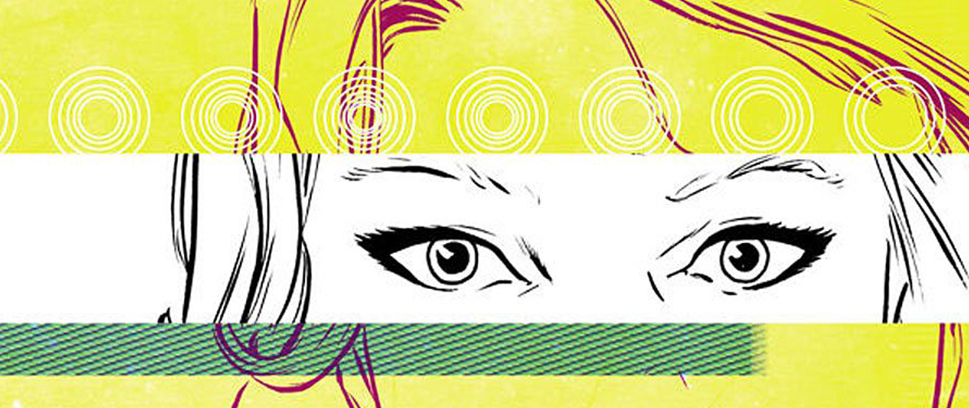
Pop # 1
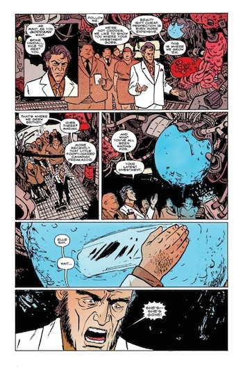
Dark Horse Comics – Writer: Curt Pires Art: Jason Coplan
You should really snag Pop #1. Curt Pires and Jason Copland’s book starts off by vivisecting the music business via its two main characters, Elle and Coop; Elle is a pop star and Coop owns a record shop. They are opposite sides of the same rotten industry when they literally collide. What follows is a damn funny sci-fi satire that only comics can pull off. We’re just one issue into a four issue miniseries and I already dig it!
First up is Elle, a beautiful blonde pop star. She looks like she could be the next American Idol or a winner on The Voice. There’s nothing terribly defining about her, save for her red eyes. Where’d those come from? Well, she was also grown in a test tube by a cabal of greedy record company executives. And she’s on the run.
That’s when Elle meets Coop. Coop feels like he’s wasted his life with a store full of musty old records and comics. He lives alone and really likes to smoke pot. He’s about to hang himself when Elle runs smack dab into him on the street. She asks for help and then promptly passes out.
The story moves from there, introducing characters like Spike Vandall, a Hollywood record executive cliché that’s runs the genetic engineering lab, two assassins that look like Joey Ramone and Pat Benatar, and Dustin Beaver – a cruel, juvenile “Canadian” singer grown in the same lab as Elle. Pires, Copland and company build a compelling world with these characters that has a lot of story potential.
I really dig Copland’s storytelling in this issue. He bobs and weaves between the dank record industry genetics lab, a dream sequence for Elle and Coop’s drab, realistic apartment with fluid efficiency. The pacing is also top-notch. Combine his line work with Pete Toms’ colors and Dylan Todd’s designs and you get a comic that’s up there with music books like Hip Hop Family Tree and Phonogram.
With its promising cast and a high concept plot in the first issue, Pop #1 has me thinking about music celebrities and, more importantly, just how far the record industry is willing to go to get their grubby mits on your $1.29 a song. Pick it up.
Full disclosure: Dark Horse Comics provided Unwinnable with an advanced review PDF of Pop #1. It hits store shelves today.
– Ian Gonzales
Little Nemo: Return to Slumberland #1
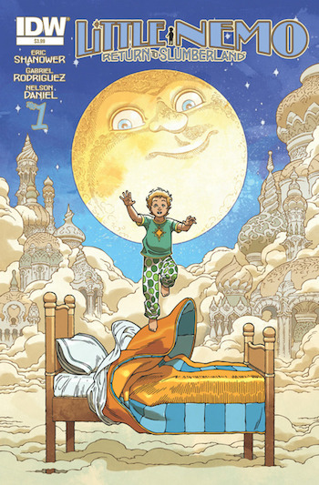 IDW – Writer: Eric Shanower Art: Gabriel Rodriguez Colors: Nelson Daniel
Anybody who has ever been a fan of the comics medium, whether it be books or newspaper strips, should check out the work of Windsor McCay. In the late 19th to early 20th century McCay was working wonders in the field, many of which are still unmatched today. His greatest accomplishment began in 1905. It’s the story of a little boy named Nemo, who is summoned from his bed by a minion of King Morpheus, the ruler of the magical dreamland kingdom of Slumberland.
Every week for over a decade, in either The New York Herald or The New York American (McCay had long stints at both papers, though the strip was relatively short lived at the American), Nemo would have a fantastic little dream adventure. These adventures would end with him waking up. Now after all these years it’s finally time for Nemo to return to Slumberland.
Little Nemo: Return to Slumberland #1 gets the ball rolling quickly. There is no backstory given. Instead we open on the court of King Morpheus in a panicked state. The Princess of Slumberland wants a new playmate and the King’s court is scrambling through lists and calling out names of potential candidates. We get the impression that much time has passed since the original series because it is mentioned that the Princess has not been satisfied with any of her playmates since Nemo.
When a boy named James Nemo Summerton is called out, the Princess chooses him immediately. King Morpheus sends out a minion to retrieve him, and getting the boy who would prefer to be called “Jimmy” to Slumberland is what the rest of the issue is about.
Jimmy is initially resistant to the idea of going to Slumberland, which presents the opportunity for many of the basic elements of the setting to be revealed. He’s also not too keen on playing with a girl, probably because of cooties or some other boyish reason. He doesn’t like being called Nemo either, since it’s a middle name that his dad apparently got from a cartoon.
Shanower does a great job introducing (and giving dimension to) the realistically stubborn Jimmy and multiple other inhabitants of Slumberland with little dialogue, allowing Rodriguez and Daniel the opportunity to show off their visual chops.
The artwork and colors in this book are beautiful. Since we’re not fully absorbed into the world yet I feel like this issue only provided a hint of what’s to come.
There’s a wonderful sequence where Jimmy and the candy kid servant of Morpheus named Bon-Bon go through a wintry, rollercoaster-like ride on Jimmy’s bed. There’s also a harrowing scene where Jimmy rescues Bon-Bon from a Triple-Tongued Binthromium, not to mention another scene involving some cloud monsters called Kyoom-Yoo-Lompers.
The expressive artwork does an excellent job of intercutting the surreal beauty of the dream landscapes with the panic of Jimmy and Bon-Bon being chased by strange creatures. Then the chase is suddenly cut off by a panel of Jimmy falling out of his bed at home, the perfect analog for the nature of dreams themselves.
So far, Return to Slumberland is a lovely homage to the work of Windsor McCay. If McCay was alive today he would more than likely endorse – and be proud – of what Shanower, Rodriguez and co. are trying to accomplish. I for one am enjoying the opportunity to experience new Nemo adventures month by month, much like people did over a century ago week by week.
I know this series is already successful in its mission due to its ability to tickle that same part of my brain that the original series managed to, and that McCay acolytes like Moebius also succeed in doing. It’s the ability to trick the brain into experiencing a waking dream, and in the case of this comic it’s a nice one.
– Michael Edwards
The Fade Out #1
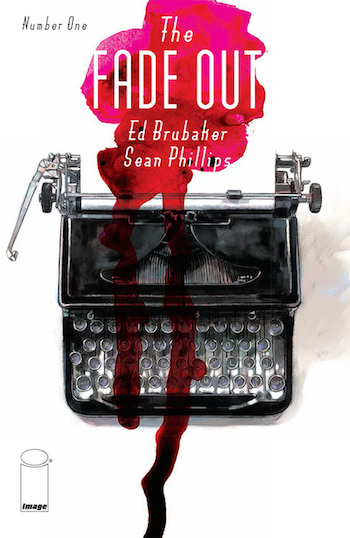 Image Comics – Writer: Ed Brubaker; Art: Sean Philips
Ed Brubaker’s Winter Soldier story arc in Captain America vol. 5 – pretty much his whole run on vol. 5 with Bucky Barnes as Cap – is one of my favorite Marvel comics of all time. So I was excited to see The Fade Out #1, by Brubaker and artist Sean Philips, debut last week.
The Fade Out takes place in Hollywood in the post-war 1940s, following a screenwriter named Charlie Parish as he smokes cigarettes, reflects on life in Hollywood, and discovers the murdered body of Valeria Sommers, the leading lady of a film Parish was helping to write.
If you’ve seen just about any film noir you already have an idea of Charlie’s character – or at least how he presents himself to the audience. Via textboxes that evoke the narration often found in the genre, Charlie represents himself as a morose intellectual with a certain exterior toughness that doesn’t quite mask his interior sensitivity.
Charlie’s perspective also colors our perception of other characters, particularly Valeria and “publicity girl” Dotty Quinn. But when Charlie wistfully describes the dead Valeria as “the kind [of girl] you were supposed to protect,” what readers get isn’t so much an accurate assessment of Valeria’s character as it is Brubaker evoking a hard-boiled atmosphere, filtered through Charlie’s biased and possibly untrustworthy perspective.
The comic’s namesake, a fade out, has multiple layers as well. First, it’s a reference to the film technique; second, the words themselves suggest an increasing darkness, or a light being snuffed out, which parallels the murder that forms the comic’s narrative arc. Like noir aesthetics, “fade out” is also a contrast between light and dark, both as a characteristic visual technique and in Philips’ art.
Philips’ panels often start with simple black lines to frame characters and sets, leaving room for the moody colors to bring volume to the scene. But in many panels, faces, bodies, or whole chunks of scenery are colored entirely black, creating stark shadows that contrast sharply with any color present. These shadows separate readers from the characters, shrouding their full expressions and emotions.
The Fade Out #1 does a thorough job setting up the murder, the mystery and the players involved, but by the end of it I still feel like nothing is certain. After all, noir does love its twists – and so does Brubaker.
– Jill Scharr