Last Week’s Comics 04/02/14
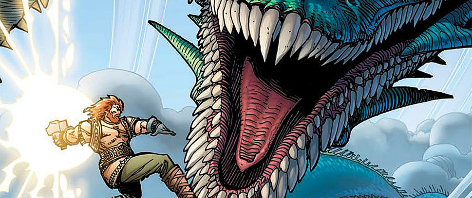
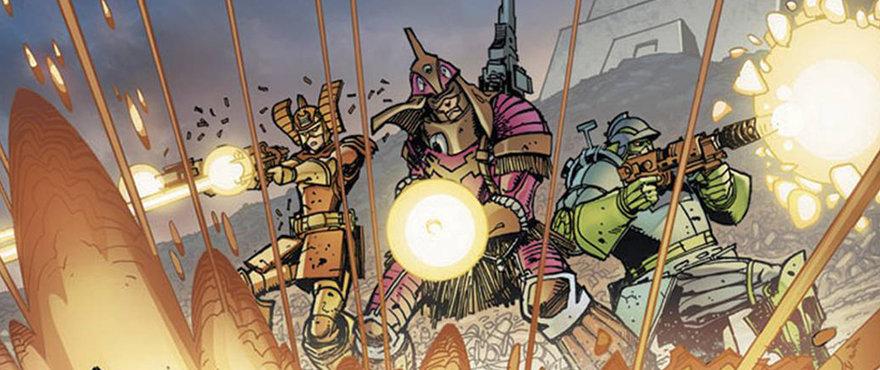
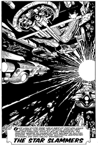 Star Slammers Remastered #1
(IDW – writer: Walt Simonson; art: Walt Simonson)
Star Slammers Remastered #1 opens with the following:
“Once upon a time, there was a race of men who could out-shoot, out-fight, and out-kill anybody. They were paid fabulous sums to act as mercenaries. The practice became so lucrative, they decided to go into business. They became the most successful businessmen in history, and they called themselves… The Star Slammers!”
It’s a raw and bombastic mission statement that describes this comic perfectly. Star Slammers is a big book and it’s a treat to see it back in print after all these years.
Walt Simonson is a living legend in comics. His work on Thor, Manhunter, X-Factor, Batman, Metal Men, Orion, Fantastic Four and so many more is some of the most dynamic and influential in the medium. His art constantly evolves, yet Simonson has maintained a consistent style throughout his career. Whether reading his Alien adaptation or last year’s The Judas Coin, it’s clear they both come from Walt Simonson’s pencil. Star Slammers is an early work of Simonson’s whose origins go back to his school days. Star Slammers Remastered is an older work with a fresh, more experienced set of eyes on it and the book looks better than ever.
The Remastered series reprints the 1980s Marvel Graphic Novel and the 1990s Bravura/Dark Horse series. The first issue consists of the graphic novel’s first 20 pages. The art here is dynamic and detailed – like the child of Jack Kirby, Moebius and countless dystopic 2000AD comics.
Star Slammers Remastered #1 is the beginning of a larger work that may confuse the reader out of context. It’s not so much a problem with the work as it is that it’s not being reprinted in its original format. It reminds me of those Amazing Spider-Man reprints that were in the New York Post a few years back. They were floppies inserted into a newspaper that reprinted half a comic from Stan Lee and Steve Ditko’s original Spidey era. They’re good stories, but the story flow was off. Much the same thing happens here towards the end of the issue. It’s not the first issue of the story, it’s the first act of the story.
The book is recolored based on Walt and Louise Simonson’s colors on the original graphic novel. The colors transition from dull earth tones to much brighter primary and secondary colors once the three Star Slammers show up. The color shift enhances Simonson’s art by adding another layer of complexity to a book that, on its face, is a book about badasses blowing shit up in space. As the story continues, we learn a bit more about the Slammers’ motivations, their coming battle with the Orions and Ethon, the youngest Slammer’s, background.
The rest of the OGN will be reprinted in issues #2 and #3, while the rest of the series will reprint the Bravura/Dark Horse mini series. Even though it’s only part of the first graphic novel, Star Slammers Remastered #1 is still a compelling read. I’m looking forward to seeing the entire saga unfold again and I envy anyone reading these comics for the first time.
– Ian Gonzales
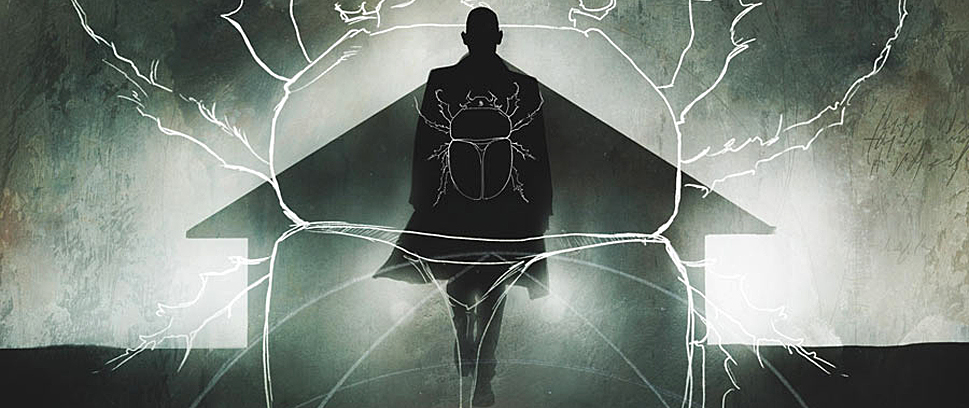
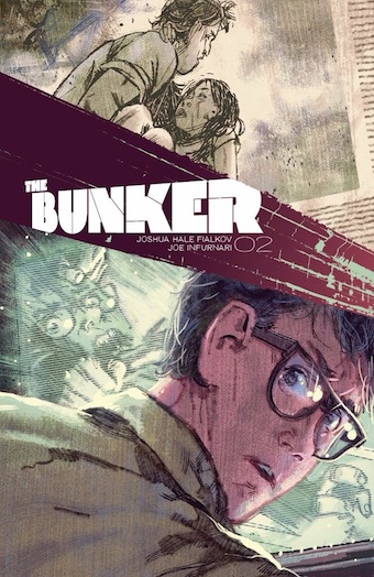 The Bunker #2
(Oni Press – writer: Joshua Hale Fialkov ; art: Joe Infurnari)
I picked this up based on a recommendation from the comic store I frequent. The Bunker, written by Echoes scribe Joshua Hale Fialkov, tells the story of five friends who uncover a bunker where their time capsule was once buried. Inside the bunker, they find all of their names, as well as letters written to themselves, letters which spell out a disturbing, apocalyptic future that they all, in some way, caused.
Unless they can change the past.
Fialkov’s concept touches upon big themes like fate and destiny, the ability to learn from mistakes and the foresight to accept what you can’t change. The first issue clocked in at a whopping forty-something pages, so the second issue reads much quicker. Fialkov’s heavy exposition and characterization in the first issue pave the way for a much smoother read the second time.
This issue focuses much more on the mystery of the future. According to Grady’s future self, his younger self must follow through with saving a bunch of people from a terrorist attack. This, of course, raises the ethical question of knowing what horrors will befall people, and yet being powerless to stop them from occurring because, according to Grady, they must occur.
Fialkov’s dialogue is much cleaner this time around as well. Issue one was a bit of a swear-fest with curses tossed into almost every dialogue bubble. The conversation this time is much sharper, much more believable. The weightiness of the situation Fialkov has created is definitely having its affect on the characters, and their reactions are genuine and relatable. What sells the characters, in fact, is how relatable they are.
Where the issue stumbles, though, is in its visuals. While I like the sketchy, chalky look of Joe Infurnari’s art, the design makes for some opaque visuals, especially in the action sequences. The style is definitely unique and not something I’ve ever really encountered before and it helps sell the darker tones of the comic. That being said, occasionally the imagery loses its clarity and while you can decipher what’s occurring on the page, it takes a second or two for the image to center.
If you’re a fan of a show like Lost, you’ll like The Bunker. (Lost is even referenced in The Bunker). Fialkov crafts a cool mystery that will only be addressed over time, and the characters are engaging enough that the The Bunker doesn’t just rely solely on its concept. What’s more intriguing is how Fialkov will address the destiny of the characters, particularly when they’re required to do or not do something that will result in tragedy or death.
Either way, I’m on board with The Bunker.
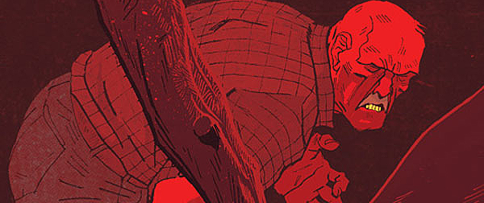
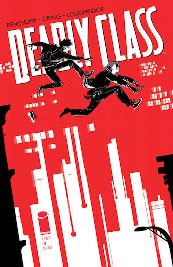 Deadly Class #3
(Image – writer: Rick Remender; art: Wes Craig)
After being given an assignment to go out and kill someone in last month’s Deadly Class, Rick Remender’s protagonists find themselves faced with the dilemma of taking a life in order to pass their course or confronting the one thing that’s keeping them from getting their “homework” done: humanity.
And much of issue #3 is about the moral struggle of having humanity and the will to take a life. Using mostly dialogue, Remender tells the backstory of Marcus’ friend Willie and how a life of violence he experienced early on in his childhood begets more bloodshed much later in life. Their conversation is moving and believable, a true showcase of Remender’s abilities as a writer and the way he captures authentic voice through his characters.
Furthermore, the characterization Remender gives both Willie and Marcus makes them very believable protagonists. They spend the majority of the issue avoiding what they’re supposed to do and when they finally have the opportunity they struggle to complete their assignment. But Remender goes a bit further, drawing back the curtain on Marcus’ life just a little more and the small showing we’re given takes us a much deeper and darker place in his mind – one that unlocks a hidden violence within.
Deadly Class is a loaded comic, but Wes Craig brilliantly brings its story to life. Many of the shots are cinema-like – continuous, methodical and perfectly paced for maximum emotional effect. The buildup to the climax is particularly impressive as it lays a solid foundation for Marcus’ actions, yet it’s one that gives us the ability to sympathize with him regardless of the end results.
Lee Loughridge also deserves a ton of credit as the solid color structure adds layers of tone to every scene, particularly when Marcus goes to find the bum who stole his shoes. Here, Loughridge, Craig and Remender all work in conjunction to craft a tense and brilliant piece of comic poetry.
There’s a reason Deadly Class sells out before it even gets in stores: it’s a damn good comic. I thought the novelty of the character was lost in the previous issue, but by separating Marcus from his schooling and paring down the comic to focus on a few characters, Rick Remender avoids overloading the issue.
The true star of Deadly Class is Marcus, and as long as we can keep some connection to him we can at least justify his actions even if we don’t agree with them. Remender’s building the world around him slowly, but by what we’ve seen already Marcus does not act without reason.
And this makes him all the more dangerous.
 The Superior Spider-Man #30
(Marvel – writer: Dan Slott; script: Christos Gage; art: Giuseppe Camuncoli)
Bannen’s Book of the Week:
The reason why Superior Spider-Man #30 is my pick of the week really has to do with one thing: the return of the real Peter Parker.
Dan Slott has allowed Otto Octavius to walk around in Peter’s body for long enough, and now all of his ego, scheming and villainy have resulted in Otto’s biggest disaster since taking control of his nemesis’ body. Slott brings in all of this threads – Jameson’s intense hatred for the Superior Spider-Man, the Green Goblin’s army taking control of Manhattan and Peter’s consciousness floating around in his mindscape – and ties them all together in one issue that brings the real amazing Spider-Man back to our world.
Despite the emotional impact of Peter’s return, the comic’s writing is not at its best. This may be due to Dan Slott crafting the plot and Christos Gage writing the script but the issue strays a bit into melodrama, particularly the conversation between Otto and Peter. Otto has never been short on ego – his sudden realization that his arrogance has been a compensation for his failure to be the best Spider-Man doesn’t jibe with the confident figure we’ve previously seen displayed. Otto’s delivery is a bit too saccharine, making the hokiness of the climax almost ruins an otherwise powerful moment.
But damn it’s good to see Peter Parker back in his old blue and red costume.
Christos Gage really hits all the emotional beats with aplomb and his build-up to the finale is superb. Panel constructions are unique and the sharpness with which he illustrates the action sequences is really admirable. The comic is a busy one, and many panels are layered with detail; still, despite the compactness of the imagery nothing looks cluttered or uneven.
Additionally, Antonio Fabela provides the colors for the issue and the muted scheme is really noticeable in the final page where the arist makes Spidey’s old costume look vibrant and flashy. Throw in John Dell and Terry Pallot’s inks and the shading used for effect brings the urgency of the story and the dejection of the tone to life.
I’m so glad Peter Parker – the real Peter Parker – is back. Otto provided readers with a new look at Spider-Man as a much darker hero (a hero like Batman, for example). But Spider-Man is not as dour nor is he as dark. He’s something more, something that people can only hope to strive for. And Otto’s lesson – that he can in no way ever be as good as Peter Parker – is what Dan Slott’s true goal was in taking Peter away from readers for so long.
We don’t appreciate what we have until it’s gone, and I am so glad to have the original Amazing Spider-Man back. I can’t wait to see the true hero back in action.
– Brian Bannen
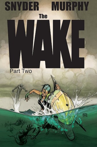 The Wake #7
(Vertigo – writer: Scott Snyder; art: Sean Gordon Murphy)
The first five issues of the ten-part series The Wake read like a disaster drama: in the present day, a scientist with unusual expertise is suddenly the only thing standing between Earth and total destruction. But Doctor Lee Archer failed – or at least seemed to, because The Wake #7 takes place in a future where most of the earth is underwater and humans live in constant danger of the savage sea-dwelling creatures known as mers (guess what they are). Our new hero is Leeward, a scavenger who believes there’s a secret signal emanating from somewhere over the ocean that can help the humans beat the mers once and for all.
Issue #7 begins with a flashback to Leeward’s childhood, where we learn that her parents’ pursuit of the same radio signal put them at odds with the new government and eventually got them killed. The scene gives context to Leeward’s own obsession with the signal and explores the vulnerable side beneath her tough, blunt exterior. Last issue Leeward was beating people with severed mer heads. This issue she’s wearing a fuzzy dolphin hat.
This issue also gave us a further look at The Governess, the pink-haired ruler of what was once the U.S., but it’s her right-hand-man Marlowe who really gets to stretch his villainous chops: he arrests Leeward’s parents in the flashback, arrests Leeward in the present, chains her to an oar in his prison boat, and then literally makes her walk the plank.
If that weren’t adventure-ish enough, the issue ends with Leeward and her pet dolphin being swallowed by a giant mer – which turns out to be a hideout for a group of pirates. By the final page it was clear how far The Wake has come from its much subtler earlier issues.
Leeward’s story has quite a different feel than Lee Archer’s – instead of a slowly unfolding discovery we’re plunked right in the center of a new world, complete with conniving rulers, domesticated whales, techno-pirates and patchwork futurepunk clothes. The transition from mystery thriller to adventure might have been jarring, were it not for writer Scott Snyder’s tight control over his characters and world, and Sean Murphy’s distinctive art style that provides a visual continuity between the two parts.
When summarized like this, The Wake sounds like a typical comic book, but its detailed art and nuanced characters set it apart. With three issues left, I’ll be sad to see this series end.
– Jill Scharr


