Last Week’s Comics 10/16/2013
Coffin Hill #1
(Vertigo – writer: Caitlin Kittredge; art: Inaki Miranda)
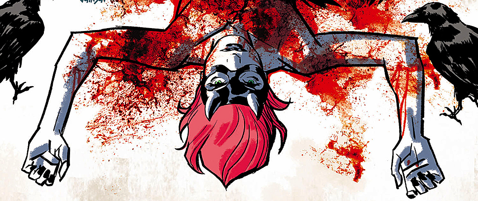
Coffin Hill is the story of a police officer who cracks a big case, then gets shot and comes out of the hospital as a changed person. The reason for her change is unclear, but it may have something to do with her witch-like past and the time she and a friend woke up in the woods covered in blood.
If you’re not interested yet, there’s something wrong with you.
 Caitlin Kittredge hints at larger issues. After her lead, Eve Coffin, is shot, we get a few glimpses of Eve’s past. Clearly, we’re not being given everything. Kittredge has a plan to dole out Eve’s dark past and how it relates to her current predicament.
As a lead, Eve is interesting, if a bit of a cliché. The spoiled daughter of socialites, Eve rebels from her parents’ clean-cut ways through worshipping unholy demons (I think). How she ever became a police officer is still a mystery. But Kittredge develops Eve enough to see that her meek persona at the beginning of the issue is miles away from the woman who exits the hospital at the end.
This change is also due to Inaki Miranda, who finds a way to convey all of Eve’s emotions – from her initial humility, to her hidden wickedness, to her hardened and cold demeanor – with the stroke of a pencil. The comic relies heavily on its tone, and Miranda conveys this with ease. Eva De La Cruz’s colors also aid the visuals. Using a variety of subdued hues, De La Cruz brings the feeling of the comic to life, especially in the more horror-centric and supernatural moments.
I like what I see so far in Coffin Hill. It’s a comic with a lot of promise and a solid opening. Eve Coffin’s story seems multilayered and intriguing, and I for one will be jumping on this series to see how it plays out.
I recommend you do as well. I don’t think you’ll be disappointed.
———
Batman #24
 (DC – writer: Scott Snyder; art: Greg Capullo)
When Scott Snyder is on, he is on fire.
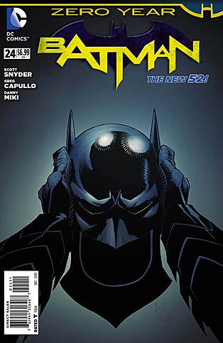
This issue of Snyder’s “Zero Year” brings the arc with the Red Hood to a close – and with cinematic quality. Snyder’s been building to Bruce’s first appearance as Batman, and he doesn’t disappoint when the Batman finally appears. Snyder gives Bruce some clever, movie-style dialogue that helps cement the character as the embodiment of justice that criminals have come to fear.
Plus, Snyder’s dialogue-heavy approach works well to pace the comic. Normally, excessive dialogue slows down the story. In this case, however, I was riveted by what Bruce had to say, particularly towards the end of the issue when he confronts the Red Hood. Snyder shows that Bruce is not only extremely confident but also extremely intelligent. His in-fight movements highlight his abilities as a tactician and the resourcefulness that’s allowed him to survive as long as he has.
Clearly, Snyder meant for this to be the moment that solidifies his decision to become Batman, and he presents the climax of the issue – a fight between Batman and Red Hood in A.C.E. chemicals – perfectly, mixing action and story together in a cohesive and powerful sequence.
Greg Capullo is definitely Robin to Snyder’s Batman. With a nod to Detective Comics #27, Capullo kicks off the story with sharpness, definition and page after page of detailed art. Images convey action smoothly, and the flow of the story is easy to follow because of Capullo’s structure and design.
The final pages are drawn by Rafael Albuquerque, Snyder’s longtime partner on American Vampire. His art is good, if a bit out of place for the world of Batman – especially after Capullo’s fantastic work.
Batman #24 is the 60-minute mark of Batman Begins. It’s the fruition of all the character, conflict and story development. Everything comes together perfectly to deliver the definitive moments of Bruce’s life as Batman. What’s even more exciting is seeing that Snyder isn’t done with “Zero Year,” as the final pages show that he has much more planned.
If the second arc of this run is anything like the first, we’ll have a lot to look forward to.
———
Superman/Wonder Woman #1
 (DC – writer: Charles Soule; art: Tony S. Daniel)
Bannen’s Book of the Week: Before I begin this review, I really need to gush about Tony Daniel. I love his art. I love the crispness of his character designs, the sleekness he gives to every player in the comic and the way he draws action. Daniel really outdoes himself with Superman/Wonder Woman, and the book is better for having him on board.
As for the story? I dig it. Lois, as a love interest for Clark, always served as a reminder of the “burden” of his powers. Whenever Lois really needed Clark, he was unavailable because of his devotion to mankind and the obligation he felt in using his abilities to save people. I mean, he’s Superman, for God’s sake – so what if he misses dinner because he was saving the planet from an extraterrestrial army?
Having Diana as a love interest solves this problem immediately. The conflict of the comic comes in the fact that Clark has to go help some sailors in a storm, and he asks Diana to come along. The match is perfect, and it opens the door for so many story opportunities. Because Diana, like Clark, has had to make sacrifices, she, too, understands why they can’t live a “normal” life together.
And to this effect, Charles Soule provides some great context for the characters. While we get action with these two superheroes, Soule also provides a basis for their relationship, and he makes their union believable. Around Diana, Clark lacks all the goofiness and awkwardness he portrays to throw people off on his true identity. And Diana, around Clark, can be confident in her lineage, finally having someone who respects and admires it.
So while the comic is initially about Clark and Diana saving sailors, Soule throws us for a loop with the reintroduction of a well-known villain whose appearance was incredibly surprising (but in the best of ways). We also get to see Clark and Diana in action, both together and separately, and Soule ends the comic with a strong cliffhanger – one that will definitely bring readers back for more.
And if I haven’t already praised Tony Daniel enough, I need to reiterate how strong the visuals are. Close-ups of the characters are impeccably detailed, and every image has a polished sheen to it. Daniel definitely knows how to make the heroes look like heroes, and colorist Tomeu Morey complies with a strong chromatic scheme that brings the panels to life. If anything, Diana gets the best shots, as she tends to look more imposing than Clark, particularly in the battle sequences.
Soule splits the story nicely, playing up the heroic aspect of his characters, their desire to be with each other and the fear the average man feels when confronted by someone with godlike powers.
I’ve seen enough to know I want to see more.
While fans initially balked at the Superman/Wonder Woman romance, I think they’ll be pleasantly surprised to see how it plays out. Plus, we know how ferocious Clark gets when his lady’s in danger, and the final image of the comic shows us that she has quite a fight ahead of her. We know she can handle her own, but still, I want to see what happens when her boyfriend gets back, because the bad guy is one on whom Clark does not need to hold back.
There will be retribution, and hopefully you’ll be one of the readers who gets to see it.


