Last Week’s Comics 7/10/2013
Green Lantern #22
(DC – writer: Robert Venditti; art: Billy Tan)
If you, like me, were worried that the quality of writing in Green Lantern would dip when Geoff Johns left, don’t worry. If anything, it’s better than it’s been for a long time, and Robert Venditti is definitely making his name on the title.
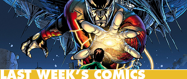
 With Hal Jordan now in control of the entire Green Lantern Corps, the story has a lot of different places it can go. This issue is about Hal battling Larfleeze and his orange constructs, but a few intriguing mysteries are thrown in. These are doors to larger conflicts, and there’s a spark in Venditti’s writing that makes the comic a seamless read.
Because the rest of the Green Lantern crew are in their own books, Venditti doesn’t have to worry about giving face time to John Stewart, Kyle Rayner or Guy Gardner. This is strictly Hal’s book, and it shows. You can see that Venditti has found a way to tap into the spirit of Hal that Johns so soundly created, yet to also be original in his approach.
And artist Billy Tan is an excellent choice for this book. Like Doug Mahnke, Tan draws with stunning clarity, sharp definition and impressive detail. A Green Lantern book needs a certain level of lucidity in its composition – mostly around aliens and constructs – and Tan achieves this. The rest of the art team (Rob Hunter and Jon Sibal on inks; Alex Sinclair and Tony Avina on colors) all work in tandem to create a superb-looking book.
Part of my love for the title may be in how it didn’t suffer when Johns left, so I may be looking at the comic through a different lens. But credit should be given where it is due. Robert Venditti and Billy Tan have stepped nicely into the big shoes left before them, and so far, they’re filling them with ease.
———
The Superior Foes of Spider-man #1
 (Marvel – writer: Nick Spencer; art: Steve Lieber)
Villains are losers. Let’s get that out of the way. What other group of people besides villains is consistently beaten down by super-powered heroes, continuously trying and failing to do anything of worth? Yet sometimes the losers have some good things to say, and this is the premise behind The Superior Foes of Spider-Man. We get to see the world through the eyes of a few of Spider-Man’s rogues, and we learn that, like us, they have pets to care for, bills to pay and lives to lead. Even if they do so in silly-looking costumes.
This issue is centered on Boomerang, one of Spider-Man’s less-effective foes. We learn that Boomerang had a promising career as a baseball player, but he got caught up in the sex, drugs and rock and roll of a celebrity lifestyle. We also learn that he loves his pet bird.
The comic doesn’t provide much resolution for Boomerang. If anything, it acts as a setup for the future of the series. But there’s enough quirkiness to make this comic a fun and lighthearted read. Most times we see villains in a comic book, they’re plotting some mega scheme that eventually ends in their own (often painful) defeat. So it’s fun to see the ins and outs of their daily lives and how some of them have aspirations of being big-time criminals – if only they could pull off a crime for once.
Nick Spencer does a fantastic job in writing the issue, as he mixes good narrative with good humor. The bad guys are funny – sometimes intentionally, sometimes not – but they’re written with as much seriousness as a hero or heroine, and this makes the comic a worthy read. Spencer wants you to understand these characters, even if you’re not supposed to like them (but you kinda do).
Steve Lieber’s art also helps sell the humor. He has a knack for drawing faces and body poses to convey a range of emotions. When reading the book, it’s hard to not laugh out loud at the absurdity of some of the situations, particularly those involving uncouth hand gestures. I’m reminded of David Aja when I look at Lieber’s work, except Lieber employs much thinner inking. Either way, he has an eye for humor and he complements Spencer well.
The Superior Foes of Spider-Man is the kind of book that reminds you how absurd the world of superheroes is. But it’s also the kind of book that humanizes the bad guys, but not in a way that completely absolves them of any blame. It makes you feel bad for them, even if only for a few minutes. But seriously, if a guy’s going to run around dressed as a giant boomerang, he should expect some jeers.
———
Satellite Sam #1
 (Image – writer: Matt Fraction; art: Howard Chaykin)
Bannen’s Book of the Week: Satellite Sam is a book about a murder. But the murder is buried in the high-intensity, chaotic world of a 1950s space program. So while we’re trying to understand what’s occurring offscreen, we’re also trying to understand what’s occurring onscreen. Yet despite the herky-jerky nature of the storytelling, Matt Fraction and artist Howard Chaykin deliver a great first issue that easily draws you back for a second helping.
The comic focuses on what happens behind the scenes of the show, “Satellite Sam,” but it also focuses on the behind-the-scenes lives of its characters. We follow Mikey White, a program director whose father happens to be the star of the show. When his father doesn’t come to work on time, Mikey has to fill in for him. What Mikey realizes later is that his father had a very dark secret – one with potential to have caused his death.
The comic is a bit jumpy, as Fraction sometimes shows the same action from different viewpoints. This is a bit odd at first, and it tends to slow down the narrative. But once you’re in the world of the story, these hypershifts are not really cumbersome. If anything, they provide some fun insight into what occurs offscreen and why a character has reacted a certain way.
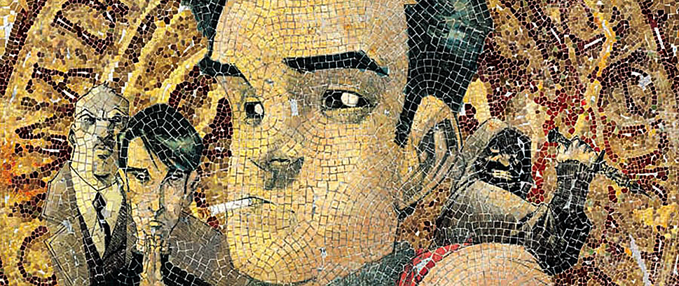
And much like Fraction’s writing, Howard Chaykin’s art can be a bit jumpy. Some of his illustrations are sharp and lush, but other times his work is overshadowed and his character faces a bit out of whack because the comic is illustrated in black and white. Yet this design has a certain nostalgic feel to it. The set pieces and clothing are well done and help communicate the period of the comic.
The only time the issue slows down is at the end, and this is where the comic shows its layers. The final shot of Mikey, splayed out by his father’s bed, is heartwrenching and powerful, and it’s a great indicator of the type of emotion Fraction’s really trying to convey. I’d offer more about the issue, but I don’t want to give away too much. I really just encourage you to read it.


