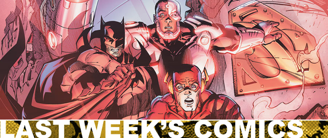
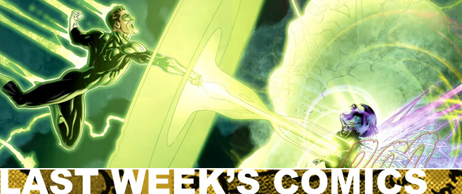
Last Week’s Comics 6/5/2013
Visit the MIT Press shop
X-Men #1
(Marvel – writer: Brian Wood; art: Olivier Coipel)
Know what X-Men #1 is? A textbook example of how to draw in new readers. This is one of the best-constructed stories I’ve ever read, not because it’s particularly amazing (though it is damn good), or visually perfect (though it is damn close), but because it strips away a lot of excess to deliver a comic that invites you in, regardless of your past history or knowledge of continuity.
In essence, this is a book written for comic fans.
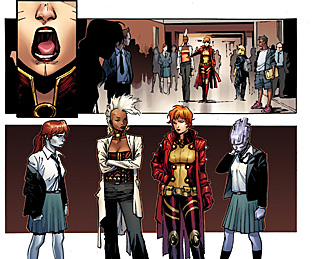 Writer Brian Wood eschews years of continuity by stripping the story down to a base level. Jubilee is returning to Xavier’s School (now known as The Jean Grey School for Higher Learning), but this time she has a baby in tow. On her way, she calls X-friends for help, and suddenly an evil is unleashed upon the world.
Simple, really.
Wood uses the best-known X-women so readers with even a tenuous understanding of the X-Men will feel right at home, and he constructs the story in a very linear fashion. The ease with which the comic flows makes reading it a joy, and before you know it, you’re at the end and wanting more.
The only time the issue loses its smoothness is in a sequence involving a train. The intent is to lay the seeds for some deeper mysteries surrounding Jubilee’s adopted baby, but the action it involves feels really unnecessary. Even Oliver Coipel doesn’t give much time to it, ending the sequence in a few uneven and opaque panels.
But everything else Coipel does is impressive. His character faces are fantastic for the way they emote, and like David Marquez, Coipel eschews excessive inks (with fellow inker Mark Morales) for a series of clean and sharp visuals, particularly in close-ups. I was often struck by just how powerful Coipel makes these women look, and he leaves no doubt that they can handle themselves without the likes of Wolverine or Colossus running in to save the day.
X-Men #1 is a great book. It’s tightly structured and engaging, both in the story and art, and it offers itself openly to new and old readers alike. Plus, it puts the female arm of the X-Men front and center, showing that the ladies don’t need men to help them.
The girls definitely have everything under control.
———
The Wake #1
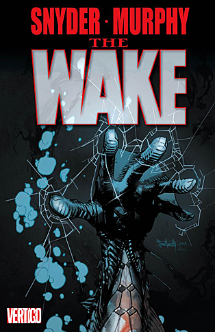 (Vertigo – writer: Scott Snyder; art: Sean Murphy)
When I read that Scott Snyder, one of my favorite writers, and Sean Murphy, one of my favorite artists, were going to team up on a book, I was immediately excited. Snyder has been a mainstay for Vertigo for a few years now, ever since he started the incredible American Vampire, and Sean Murphy is fresh off his highly praised series, Punk Rock Jesus. Could they put out a product that would be a perfect mesh of Snyder’s writing abilities and Murphy’s stylized and engaging art?
Yes. Undoubtedly, unequivocally yes.
The Wake has a lot of things going for it in its debut. The comic relies heavily on establishing the mystery of an alien life form found at the bottom of the ocean, but it takes its time getting there. This only builds the tension over the course of the issue, though, and the methodical nature of the climax gives the comic a weight of confidence and a strong enough introduction to get readers excited.
Our heroine, a disgraced NOAA agent named Lee Archer, is brought into the fold due to her knowledge of sea animals and some mysterious tragedy located in her past. What she discovers in a deepwater drilling station is terrifying and a great hook for the future of the series. Archer is damaged goods, and her naiveté makes her a perfect lead. Readers can easily connect with her so that, going forward, her discoveries will be all the more compelling.
The comic is equal parts The Abyss and The Thing, giving a sense of desolation to its characters at the bottom of the ocean. Snyder frontloads the exposition, giving the readers the requisite information at the onset, before moving forward with his tale. We’re no closer to understanding what the series is about by the end of it, but we’re definitely invested.
This is also due to Murphy’s rough-hewn art. When the story moves below the surface, Murphy’s ability to convey mood is overtly present and the creature reveal at the end of the issue is chilling. A few times he gets a little crazy with the ink lines so that character’s lips seem stretched at the corners, but this is a minor distraction, as everything else in the comic is sharp.
The Wake is full of intricate details and interconnections, as illustrated by the cryptic introduction and epilogue of the story. There’s enough going on here to keep readers invested, and I wholly recommend this series. I don’t think you’ll be disappointed.
Even in its first issue, The Wake looks like a surefire hit for Snyder and Murphy. Like Jaws, it may keep some people out of the water this summer, especially if what we see here is waiting below the surface.
———
Earth 2 Annual #1
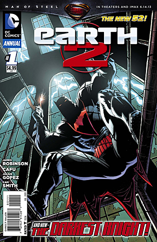 (DC – writer: James Robinson; art: Cafu & Julius Gopez)
Bannen’s Book of the Week: While the cover of this issue hints at the reveal of the new Batman of Earth 2, the comic is really about Al Pratt, better known as the Atom. James Robinson spends the first part of the issue showing us how Al came to get his powers and the ramifications of this, but then he unleashes some of his best action sequences of the series. The comic is a darker turn for Robinson, but the results are easily his best work to date.
We start by learning about Al Pratt’s past and his connection to the military. Robinson works backwards, from Pratt’s inheriting of his powers to the moment when he used them, then to present day as he hunts down a known war criminal. What works best about this story is the way Robinson explores post-traumatic stress disorder in soldiers, and how Pratt’s own experiences help him to come to terms with his role as the Atom. Robinson humanizes Pratt while at the same time empowering him, particularly when he displays his powers.
The comic really breaks down into three acts, the second of which shifts from story to action. We get to see Al throw down with a giant robot in Phnom Penh, a concept that Robinson is able to make both realistic and awesome. The pacing of the issue is also well done, and the comic transitions nicely between its act breaks. The only hiccup is a panel involving Hawkgirl, which feels out of place with the rest of the tale. It’s a minor distraction from the finale, though, and when we see who Robinson introduces in the epilogue, longtime DC and Jack Kirby fans should be very excited for the future of Earth 2.
We’re also introduced to the new Batman of Earth 2, and while we don’t get more than a taste, it’s enough to whet my appetite for more. His moments are every bit as energetic as the Atom’s, except they’re tinged with Batman’s ferocity and intimidation. The mystery of his appearance is, obviously, not explored here, but Robinson definitely made me want to know more. I hope we’ll see the new Batman appearing in Robinson’s ever-expanding world.
In every section of the comic, Cafu and Julius Gopez draw some impressive imagery, particularly in the fight scenes. They’re also able to slow the story down when it demands attention. They convey the tenseness of Al’s meetings with his therapist with aplomb, and the settings are perfectly drawn, giving life to the images on the page. This is true for the action as well as the darker and more serious moments of the comic. Each facet of the story is visually captivating.
I don’t want to say that I was surprised by how good Earth 2 Annual #1 is, but I was definitely not expecting it to be so serious. Robinson’s kept the story pretty light so far, even with the “Tower of Fate” arc, but here he deals with more serious characters and the shift in tone is noticeable and better.
The future of this series looks bright, especially when seen through this lens. James Robinson should be praised for his work on Earth 2. It is definitely a book worthy of your time.