Last Week’s Comics 8/29/2012
Amazing Spider-Man #692
(Marvel – writer: Dan Slott; art: Humberto Ramos)
Sidekicks are a pervasive and important part of comics. Batman has Robin. Superman has Superboy. Aquaman has Aqualad. The sidekick plays a vital role in helping the hero but, where most heroes eventually gained sidekicks, Spider-Man has always been a lone wolf. Not because he’s aloof like Wolverine, but because the character was so intriguing on his own that a sidekick was unnecessary.
Until now.
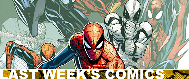
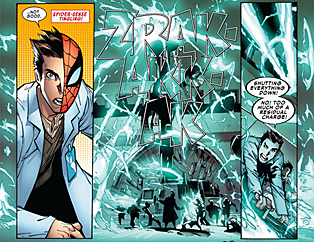 Dan Slott introduces Alpha, whose real name is Andy Maguire (Get it? Andrew Garfield and Toby Maguire – the two movie Spider-Men). He’s a super-underachiever who gains super powers while visiting Horizon Labs. Through a freak accident, Andy gains an eclectic array of abilities, from super speed to super strength, and Spider-Man is charged with training him because, as it turns out, Andy is kind of a jerk.
What struck me most about this issue was how predictable it was. Andy gets his powers because some schlub isn’t looking at the controls when he presses the button that makes all the machines go crazy. After he gains his powers, he turns into an arrogant dope. I thought, “Slott’s got something hidden up his sleeve.” I kept waiting for the curveball. But the story is everything you’d expect it to be, which was a bit disappointing for an author who’s shown an ability to be inventive and clever in his writing.
Humberto Ramos’s art, however, is pretty darn good in this issue. It’s still cartoonish, but he draws some impressively detailed panels and has an ability to convey action and movement, then slow down the story. There are a few hiccups, like people’s faces missing details or Andy’s girlfriend suddenly having glasses, but these don’t really detract from the overall work.
The comic also has two additional stories, one penned by Dean Haspiel and the other by Joshua Hale Fialkov. Both are heavy-handed in their messages, but Fialkov’s is a ton of fun to read. I didn’t really care for Nuno Plati’s art (Spider-Man looks like a grey alien most of the time), but the story has some touching moments and some really great dialogue. Based on that story, I would recommend Fialkov as a worthy replacement for Slott (whenever he chooses to end his run).
At $5.99, the comic is pretty expensive, but the writers clearly have a lot of love for the character and I like the idea of a sidekick. It’s something new that doesn’t require canonical alterations (like Gwen Stacy having Norman Osborne’s twin babies). I’m intrigued to see how it plays out. I just wish it was more than expected.
———
Before Watchmen: Dr. Manhattan #1
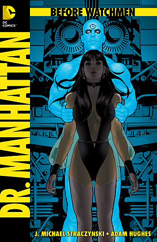 (DC – writer: J. Michael Straczynski; art: Adam Hughes)
My favorite part of Watchmen is the issue devoted solely to Dr. Manhattan. I think it is some of Alan Moore’s best writing, as readers see that Jon Osterman, while a literal god, does have feelings about the circumstances he experiences and how much power he has to alter them.
Dr. Manhattan is also confident and, while never thankful for the accident that birthed him, he doesn’t seem to question why it occurred. This is the premise of J. Michael Straczynski’s story, as Dr. Manhattan spends the issue in an existential state, asking, “Why am I what I am?” The story bounces around quite a bit, moving from moment to moment with Jon’s narration as the focal point. Nothing new is really added to the character and, while I see JMS trying to pen an erudite tale, I think the constant shifts in focus makes it difficult for readers to follow the thread.
In Watchmen, for example, Jon is able to explain his entire origin in one issue, shifting between defining character moments, but the story never loses the thread because the entire issue occurs while Jon is on Mars. Here, however, the moments are a lot of rehashed scenes from Watchmen, but the newer events – save for Jon visiting his dying father – don’t feel like character-defining moments. And the final two pages feel like an attempt to make a canonical change on the original work, and I just can’t abide by that. I’m curious to see JMS’ point, but only because I have no idea what he’s trying to do.
The visuals, however, are great. I really dug Adam Hughes style, panel focus and inking. My only complaint is that the visuals look reserved. Yes, Dr. Manhattan walks around nude, and yes, you see his penis a lot in the original Watchmen, but Hughes goes to lengths to avoid showing all of Dr. Manhattan. Many of the shots of Dr. Manhattan are at angles that make it so that most of his body is out of frame or is hidden by something else. It’s so noticeably prudish that it disengaged me from the story.
I sound very negative about Dr. Manhattan, but it’s not a terrible comic. It has some strong merits, including JMS’ ability to capture Dr. Manhattan’s narrative voice and the great visualizations by Adam Hughes. I just wish that JMS made his endgame clearer so that readers could see the point of the comic, rather than trying to restructure the origin of one of the most unique characters in comics history.
———
America’s Got Powers #3
 (Image – writer: Jonathan Ross; art: Bryan Hitch)
Bannen’s Book of the Week: In the latest issue of America’s Got Powers, Jonathan Ross and Bryan Hitch reveal the real nature of the superhero boom, and it is truly horrific.
The opening pages of the comic hearken back to concentration and internment camps, as well as eugenics and god-like scientific control. Suddenly, the nature of the superhero loses all of its appeal, and it makes the gladiatorial aspect of the comic even more grotesque. There were hints of this in earlier issues, mostly through Professor Colin Syell, the only person involved with superhumans who seems to have a heart.
Ross and Hitch also continue the story of Zero, AKA Tommy Watts, the boy with no powers who suddenly manifested them. We learn what Tommy’s true power is in this issue, and I was honestly surprised when I got to the final page. It is an intriguing revelation that creates more questions than it answers. Readers will have to come back to learn more.
Bryan Hitch’s art is not as clean as in other issues, but he conveys the chaos very well and keeps the story moving smoothly. At no point do the visuals lose their clarity, even during the action-heavy scenes in the arena. Hitch also plays with point of view, focus and panel design, drawing pages that are loaded with panels but which are seamlessly interconnected. One splash page had ten panels of varying sizes, yet I had no trouble working my way from image to image. Most of the comic is structured like this and it makes for pages that are layered in detail.
As readers learn more, they’re starting to see who the real enemies are. Tommy’s problems are only beginning, but the introduction of a new group of heroes makes way for a great cliffhanger and a reason to come back next month. And for such a full comic, the issue is only $2.99 – more than worth its price. Add this to your list of must-reads if you haven’t already.
