Last Week’s Comics 8/1/2012
Before Watchmen: Comedian #2
(DC – writer: Brian Azzarello; art: J.G. Jones)
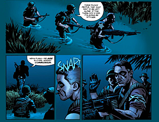
Edward Blake’s time in Vietnam was pivotal to Watchmen. It was here that readers got to see how he was disfigured, how much humanity he lacked and how damn right he was about the future. So when I read issue #2 of Comedian, I expected some depth that would lead up to this (as the cover shows that the story takes place in Vietnam). What this issue reinforces, however, is that Edward Blake is a bad dude. And beyond the lack of character development, the issue has serious flaws in pacing and structure, and at times is difficult to follow due to broken dialogue and half-finished sentences.
 It appears that writer Brian Azzarello tried to break up the dialogue so that each panel wasn’t so word-heavy. The moments when he chose to do this, though, make following the discussion arduous. The initial conversation between Blake and Robert Kennedy is so choppy that words appear out of nowhere – words that seem out of place with the discussion. Even on a second read, I was scratching my head as to why Azzarello chose to split up the statements the way he did. There’s very little connection between a scene change and the narration that accompanies it. More often, it’s like the conversation wasn’t over, but Azzarello needed a transition between pages and panels, so he split up the words. The result is an uneven pacing that makes the story skip around like a scratched record.
Beyond the poor pacing and dialogue, the art of the book continues to be a weakness. J.G. Jones goes to extremes with his inks, overly shading his imagery. Faces are continuously muddled, and while Azzarello uses historical figures, Jones’ visual translation of them is ineffective. His Robert Kennedy barely looks like Robert Kennedy, save for a vague likeness. Additionally, the constant shift in character focus makes the book visually arduous. A lot of shots look truncated due to their perspective, and a few times, Jones breaks the panel walls completely and pushes images into each other. The flow of the panels, at times, is difficult to follow.
Comedian is not a must-read for Before Watchmen fans. It’s a story that has added little depth to what readers already know about Edward Blake. Plus, the final panel of the previous issue isn’t referenced here at all. Considering the amount of time Azzarello spent on the buildup in the last issue, the immediate shift in the time period pushes the rhythm of the story out of sync, and by the end of the issue, this series reads as more episodic than continuous. The talent on this book seems like the kind of talent that could tell a good story about the Comedian. Unfortunately, Azzarello and Jones have yet to find their footing, and Before Watchmen: Comedian suffers for it.
———
Debris #1
 (Image – writer: Kurtis J. Wiebe; art: Riley Rossmo)
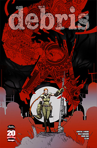
I know Kurtis Wiebe best for his hauntingly eerie Green Wake. Wiebe eschews the supernatural (somewhat) in his new limited series, Debris. Set in a post-apocalyptic world, Debris has a mixture of familiar apocalyptic and futuristic elements, and its lead, a strong-willed woman named Maya, reads like Katniss Everdeen in The Hunger Games. Given these connections, Debris still makes itself an individualized, interesting and – at times – opaque read.
Kurtis Wiebe wastes no time showing readers the strength of his heroine and lead, Maya. She is introduced to readers through her actions, and within five pages, we know she is a person who handles herself well under intense pressure. Her quest is a bit forced, as it’s evident that Wiebe wanted to get her away from everything she knows in order for her to grow as a person. But the purpose of her journey is nothing new – it’s something we’ve seen before in other “journey”-type stories.
Additionally, Debris has a sweeping and particular mythos, with highly specialized terminology, but Wiebe avoids addressing any of this yet. Much of the language (for example, Maya calling raptor-like robots “Avios”), is explained through the imagery. However, there are few times where characters use familiar words in unfamiliar contexts, and Wiebe doesn’t come back to these. It’s not hard to infer the meanings of these terms, but given the originality Wiebe is playing with, a better understanding of the language would have made the purpose of Maya’s role clearer.
Riley Rossmo gives the book some great visuals, and while he uses recognizable apocalyptic imagery, his style and focus make the book a fun read. Characters lose their detail at distances, but Rossmo is well suited to depict the heavy action of the comic. Panels are focused and images are clear. Part of this is due to the thin inks but also to the ways in which Rossmo moves the reader’s eyes across the pages. The story is stronger because of it.
Debris is a good opening for a new series. It has an interesting mystery, a strong lead and a clear purpose. It has a few flaws , but it’s still another example of the great work that Image has been commissioning lately.
———
Green Lantern #11
 (DC – writer: Geoff Johns; art: Doug Mahnke)
Bannen’s Book of the Week: Geoff Johns really shines sometimes, and it’s usually when his stories are character-driven. Whereas Justice League feels compacted with its focus on so many heroes, Green Lantern has been a better book to read because the story only revolves around two people. Given the recent circumstances, and Johns’ ability to pen a growing mystery, Green Lantern stands out for its clear focus and engrossing story, and for Johns’ ability to elucidate the personality traits that makes his characters such individualized players.
The best moment of the previous issue was the end, when Black Hand threw himself off a cliff in order to die. Comic fans who read Blackest Night will know why. William Hand returns to his former self in this issue, and Johns amps up the creep factor to accommodate him. Hands’ moments can be disturbing and a bit too comic-bookish, but they’re not out of character with how Johns has established him.
Johns also adds more mystery to the upcoming “Third Army” arc. He’s been teasing this idea for some time now, and readers are finally given their first glimpse of the new Lanterns the Guardians are trying to create. Where the Oans used to seem peaceful, if a bit aloof, Johns has now made them into calculating and malicious leaders.
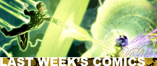
Furthermore, Doug Mahnke’s art gets better as the issue progresses. The first few pages are shadow-heavy and detail-lacking, almost as if someone else drew them, but as the comic progresses, the art becomes clearer. Mahnke has an ability to slow the pace of the story by giving readers grand images, as well as images of slanted heroic poses meant to highlight the absurdity of situations. This is a more subdued Mahnke (as the issue has a lack of any constructs), but it allows for characters to come through in the illustrations. There is a moment of weakness where the letters don’t match the characters speaking them, but Mahnke shouldn’t be held accountable for this. The panel in which it occurs is actually the least detailed one, so the book doesn’t suffer too much. But it is noticeable.
There are times when Geoff Johns really knocks it out of the park, and this is one of them. Green Lantern has been a consistently good read, and Johns knows how to build to an ending that is interesting and climactic. And given the ending of this issue, August 15th can’t get here fast enough so I can see the outcome.


