Last Week’s Comics 7/25/2012
Before Watchmen: Silk Spectre #2
(DC – writers: Darwyn Cooke and Amanda Conner; art: Amanda Conner)
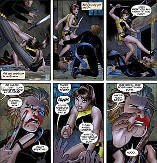
Of all the Before Watchmen authors, Darwyn Cooke has written the best series so far. Minutemen is a comic that captures the golden age imagery while still dealing with the harshness of being a superhero (as seen in Watchmen). Minutemen #2 was a better comic than #1, and similarly the first issue of Silk Spectre was good, but the second issue is much better. There are still some flaws in the comic, but those have less to do with craft than content, and Silk Spectre #2 is a great issue crafted by two very talented people.
 So what works? Darwyn Cooke and Amanda Conner’s narration. In this issue, Cooke and Conner’s pacing and narration are most like the original pacing and narration found in Watchmen. Much of the narrative voice comes from Sally herself as she writes a letter to Hollis Mason, and the action is perfectly aligned with the storytelling taking place in each panel. Sally is spunky and self-assured, a far cry from the embittered woman we meet in Watchmen. Cooke and Conner also capture the spirit of the sixties, the move towards counterculture, and the independence people tried to attain through social revolution.
What doesn’t work? A consumerist conspiracy that is taking shape as the main conflict of the series. It’s a bit too Bond-esque, and given the heavy thematics of Minutemen, this feels like a plot-driven idea rather than a deep societal exploration. Once this was introduced, I was taken out of the comic. The developing tension is still present at the end of the issue and the climax is well constructed, but the driving force of the story feels hollow given the depth of its inspiration.
Simply put, Amanda Conner does a fantastic job on the art. Her style is like that found in Archie comics, minus the overall wholesomeness, yet there are very dark moments in this book. Conner also has a lot of panels to draw, but each is as crisp as the last. Paul Mounts’ colors add a smooth finish to the imagery while still capturing the garishness of ’60s stylings. The final pages in particular are a great mixture of asymmetrical designs and trippy colorization.
As with Minutemen, Silk Spectre is a better story in its second issue. Granted, the first issue is a lot like dipping one’s toes into the water to test its heat, so this time I was more immersed in the story than before. But I like the effort we’re seeing, both in the story and the art. I respect people who are balking on Before Watchmen because of personal convictions. I do think, however, they’re missing out.
———
Justice League #11 (DC – writer: Geoff Johns; art: Jim Lee)
Every issue of Justice League I buy, I tell myself “This will be when things start getting good.” Unfortunately, the series has yet to take off and as it closes in on its 12th issue, I don’t see this happening unless Johns scales back his story so that it focuses more on the characters of the Justice League, and less on its potential scope.
I’ll be honest: the best part of the comic is the Shazam origin story at the end. Gary Frank’s art is fantastic (as usual) and Geoff Johns has managed, in a very short amount of time, to reintroduce Billy Batson so that when he finally becomes Shazam, it will be a very cathartic end to a truly interesting tale.
The real issue I see with Justice League is that it isn’t focused on the story it wants to tell. There’s a major diversion involving a throwdown between Wonder Woman and the League, and while I like the emphasis on Diana in this issue, I feel like Johns is rushing to get to the final page for its emotional impact. The book is littered with great character moments, but much like the first arc of the series, the villain (who is supposed to be a real baddie) isn’t utilized in a way that makes him seem truly threatening. Given the finale of the previous issue, the characters should have learned their lesson, but the end of this issue tells us otherwise.
Additionally, Jim Lee’s art is a bit erratic and unfocused. At times, it’s clean and detailed (particularly his splash pages), but in the tighter panels and closeups, it takes on the same tone as a Rob Liefeld image with excessive crosshatching and ink lines. Jim Lee is a much better artist than Rob Liefeld. Colors tend to be the best part of the issue, particularly in the eerie Valley of Souls where the imagery is necessary to convey tone.
It’s evident that Geoff Johns wants to build the Justice League as a team, but he’s also trying to give them a reason to band together. Using the villain Graves to do this doesn’t properly allow for the camaraderie to develop. Much like his Darkseid arc, Johns builds up the villain as a major threat, but doesn’t properly allow for him to truly affect the team on an emotional level. It’s still a mystery to me why these people are even working together. I’m happy to see the Justice League together again, but from a man who penned such great and character-driven stories as The Sinestro Corps War and Infinite Crisis, Johns looks lost as to what goal he’s trying to accomplish.
———
Saga #5
 (Image – writer: Brian K. Vaughan; art: Fiona Staples)
Bannen’s Book of the Week: Brian K. Vaughan’s Saga is one of the hottest books hitting shelves every month. Issue five is another great entry into the series and another example of Vaughan’s ability to pen a tight, engaging story, and Fiona Staples’ ability to translate this fantasy epic into a stunning visual narrative.
What struck me most about this issue was its pacing. From the main story (involving the protagonists Fiona and Marko) to the mercenary named The Will, to the robot leader named IV, Saga never loses its thread. Even given the amount of scene changes, the comic transitions smoothly from one moment to the next. For an interstellar science fiction story, this is impressive. I find that the more time spent with the characters, the more they surprise. In this issue and the previous one, The Will in particular is given some moments that move him beyond a cold-faced mercenary and make him a more interesting character. Right now, Vaughan has three separate story lines swirling around each other, but it’s evident they’re on the verge of intersecting. What this means for the future of the series is still up in the air, but with plot threads this deep, readers have a lot to look forward to.
Visually, this book is still spectacular. Fiona Staples’ character designs have never looked better, especially in the action-heavy scenes. The imagery never loses its clarity, and the mixture of background colors that match the emotion add the necessary element needed to make the imagery come alive. Even though some characters have televisions for faces and spider abdomens for bodies, the visuals feel real. I completely buy into this world that Vaughan has created, and it’s partially because of the work by Fiona Staples. She gives life to these characters in a way that helps sell the story, even with all its fantastical elements.
What gets me most about Saga is that I care deeply about the characters. I worry that Marko and Alana won’t survive the trip. I worry that Hazel will be taken away from them. I worry that, in the end, Brian K. Vaughan will leave us heartbroken because he’s managed to create such wonderful characters whom I feel a strong connection to, and whom I want to succeed. This is the mark of a great writer (and a great creative team). I understand we’re only five issues in, but Saga has yet to disappoint.


