The Aesthetic Failure of Okami
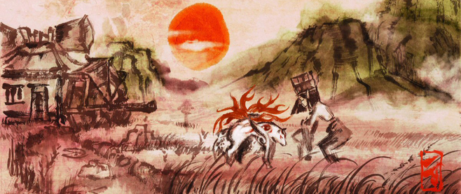
It’s often the case that any discussion regarding Okami inevitably ends up revolving around comparisons to The Legend of Zelda. How does Capcom’s adventure title stack up to Nintendo’s highly-venerated franchise? Does it fall short? This is a problem. For one thing, the most interesting thing about the last decade of Zelda has been witnessing the series slowly but gradually buckle under its own weight with each successive installment. It hasn’t exactly been flying high. Secondly, the conversation glosses over the one reason anyone cares about Okami in the first place: its sumi-e art direction.
Set Zelda aside and the more compelling question has always been in asking how well Okami lives up to the philosophy behind its own inspired, brush-like aesthetics. Thinking about that, though, brings up another, more unfortunate query: How did it misfire so badly?
[pullquote]The only ink the painter is allowed to apply to paper is that which is needed to capture a subject’s essence.[/pullquote]
Developed centuries ago, sumi-e (literally, “ink painting”) is a painting style that’s been used to wonderful effect by artists like China’s Xia Gui and Japan’s Sesshu Toyo. As Arthur Wesley Dow wrote in Composition, a sumi-e artist must “put upon the paper the fewest possible lines and tones…Every brush-touch must be full-charged with meaning, and useless detail eliminated.” In other words, the only ink the painter is allowed to apply to paper is that which is needed to capture a subject’s essence.
In some respects, Okami certainly lives up to this inspiration. Its visual dynamism was unprecedented for its time, and has since rarely been eclipsed even by the power of current technology. Flowers sprout in Amaterasu’s wake as she runs through fields. Ink strokes swirl through the air to signify flowing winds. By allowing players to cover the screen in a canvas and enact change in the landscape through their painting, the title also vividly re-imagined what it meant for a brushstroke to be “full of meaning.” A simple line could create bridges over impossible gaps, while elegant circles could bring barren trees to blossom.
For a universe brought to life by a style that throws out unnecessary details, however, the actual world of Okami is overrun with them. Producer Atsushi Inaba said his goal was to have players interact with and feel the power of nature, but this is often overshadowed by a number of excesses. Even the tiniest of accomplishments result in the player being showered with gifts: furniture, money, wooden bears, beads, praise, paintings and other trinkets that are rarely, if ever, actually used (much less treasured). In a title hoping to reflect the powerful essence of nature, shouldn’t bringing a barren world back to life be enough reward? The game even nods towards their pointlessness by later suggesting you should just sell everything. On top of this, Okami never stops talking; it’s constantly instructing, directing and giving away solutions to its puzzles.
When Henry Bowie wrote On the Laws of Japanese Painting, he commented on the burden that sumi-e artists shouldered when they picked up an ink brush. “Should [the student’s] subject be a tree, he is urged when painting it to feel the strength which shoots through the branches and sustains the limbs.” It is a supremely confident style, so much so that an entire painting must be completed at once and without pause. No corrections tolerated. If they’re needed, the piece is considered a failure.
 Okami’s confidence doesn’t seem to extend past its audio/visual experience. At one point in its sequel Okamiden, an elderly man tasks me with scouring the area to find a collection of journals. My first thought is that these must be important, but instead he concludes, “If you can find all our journals, well, I just won’t know what to say.” The painter is throwing ink on the canvas via plenty of side quests, but there’s no sense of purpose. What do these journals mean?
On another occasion, I’m told to restore a tree sapling planted on the roof of a house. As I make my way there, I’m told another two times to remember what to do! When I bring out the canvas to paint, the game pauses again to say, “So you just trace the outline, right?” These are only two instances, but both titles are filled with examples in which players are inundated with text and camera movements that are not only superfluous, but also solve the very puzzles you’re supposed to.
The reason sumi-e uses as few strokes as possible is because, according to Dow, “the painter expected the beholder to create with him.” The viewer is employed as an active participant in the creative process, applying the filler while the artist boldly provides the necessary structure. With Okami, though, there is either a lack of confidence in itself or in the player. One has to wonder what exactly the viewer is meant to bring to the experience here; he or she is simply following orders.
Still, the point isn’t necessarily that Okami failed because it didn’t strictly adhere to sumi-e principles. Unfortunately, though, it always seems to err on the side of excess when choosing a more minimalist approach would’ve done two things. It would’ve not only brought the game more in line with its fantastic art direction, but also would’ve made for a tighter, more rewarding experience. As it is, Okami is a title sorely in need of an editor, and so when it asks if all we have to do is “trace the outline,” we already know the answer. If only it were that easy.
———
Follow Jordan on Twitter @JordanMammo.


