Last Week’s Comics 4/25/2012
Amazing Spider-Man #684
(Marvel – writer: Dan Slott; art: Humberto Ramos)
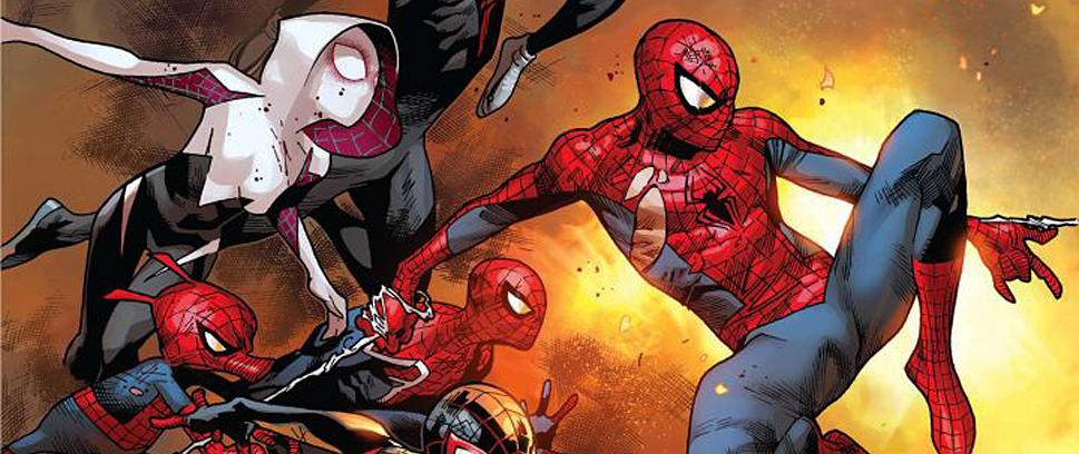
I’ve been lukewarm with Dan Slott’s Amazing Spider-Man as of late, but this latest issue really sold me. While I still roll my eyes at some of the dialogue and nonsensical moments, I have to credit Slott for writing what is one of the most unique Spider-Man stories in recent history, and creating what I think is one of the best teamups in a Spider-Man comic.
While Slott resolves Spider-Man’s most recent dilemma at the beginning of the issue, he carefully crafts a story that showcases Doc Ock’s ability to manipulate those around him. Ock is smart and calculating, and while his plans appear to be altruistic, there is no doubt in my mind that he has a sinister motive. Maybe it’s because of his past history with Spidey, but it’s more due to the chess-like movements Otto makes in this issue. His last play on the final page is a genius move, and it makes way for some pretty awesome story lines. We’ll see how it plays out, but Slott has definitely given himself a field of narrative goodies.
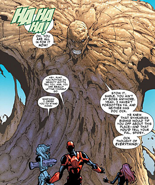 Slott also has a pretty clever and unexpected teaming in this issue. After escaping from the clutches of Doctor Octopus, Spider-Man joins forces with Silver Sable and Black Widow. The grouping works well as both women show that they are capable and powerful allies and it looks like they will be with Spidey for the long haul. Slott gives both women plenty of face time and clever dialogue so they maintain their sense of humor along with their awesomeness. I loved the grouping so much that I’m surprised no one thought of it before.
Initially, I was disappointed to see that Humberto Ramos was illustrating this comic. Stefano Caselli did a fantastic job on the last one, and as far as I’m concerned, he should illustrate every Spider-Man comic. But Ramos’ work is less cartoonish in this issue, and these are probably some of the best illustrations he’s done. The images are clean and sharp, unlike Ramos’ usual touch, and his drawings of Spidey battling Sandman are awesome.
Edgar Delgado and Victor Olazaba do great work with the colors and inks, respectively. Making the Sandman look visually clean cannot be easy, but Delgado and Olazaba pull it off. Plus, the scenes that require dark tones – usually scenes involving the remaining members of the sinister six – are perfectly colored and inked. One panel in particular shows a monstrous-looking Ock who stands above a shadowed Flint Marko and Aleksei Systsevich. Both men look menacing, given the half of their face that is barely illuminated in the orange warning lights of Ock’s den.
“Spider-Man: Ends of the Earth” is turning out to be a great series. I was skeptical at first, but the more pieces Slott throws into the mix, the more engaging the comic becomes. And I have to confess that I’m worried for Doc Ock. While I don’t want him to win, I fear he may be meeting his end at the climax of this arc. After everything Slott has done to him, I now see him as Spider-Man’s greatest villain – and that’s not a door I want to see closed.
———
Justice League #8
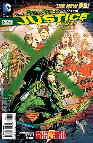 (DC – writer: Geoff Johns; art: Carlos D’Anda, Ivan Reis and Joe Prado)
Every time I read an issue of Justice League, I tell myself that it’s the one that will finally make the series good. Unfortunately, this is another poor entry in a series that is falling far below my expectations as both a fan of the Justice League and a fan of Geoff Johns.
I first read Green Arrow back when Kevin Smith started his series, and I followed on with Judd Winick. Then, Oliver Queen was cocky, but respected. Here, he chases the league around like a lost puppy. He spends the entire issue trying to show them he’s worthy of being part of the team, but at no point does he exude any of his usual persona. He’s good, but he’s only shown trying too hard. He doesn’t prove that he should be part of the league. If anything, he shows why Superman should just burn him up with his heat vision. He’s annoying and puerile, lacking any of the intensity that made Oliver such an interesting character.
The issue also has a new artist, but Carlos D’Anda’s art is a jarring transition from the angular, tight lines found in Jim Lee’s work. The characters look cartoonish and bubbly, much like an Ed McGuinness drawing. The second half of the issue has Ivan Reis’ clean, highly detailed art, so D’Anda’s work feels out of place. D’Anda’s characters are misshapen and blocky whereas Reis’ art is superbly sharp. The splash page of the Justice League fighting Martian Manhunter should be made into a poster. It’s a gorgeous piece of art.
The best part of the issue is the Shazam reboot, written by Johns and illustrated by the awesome Gary Frank. I love the new Billy Batson – he’s such a punk. Johns is clearly trying to make him different than Superman, and so far he’s succeeding. Billy is a much more engaging character than Clark, who is a goody-goody God in blue spandex. Billy is anything but likable, and that’s what makes his transition to Shazam so interesting. I don’t want to see him lose the attitude, but I’m curious how Johns will make the transition.
This issue of Justice League is better than the previous ones, but its pacing still lacks focus. The fight with Martian Manhunter, while beautifully illustrated, comes out of nowhere and much of the fight sequences are pieced together in medias res. Only in the beginning is the reader given some grounding, but even then it’s through Colonel Trevor, and not any members of the Justice League.
I’m still not ready to give up on this series because I love Geoff Johns so much, but the comic is another misstep. Johns has not advanced the story far enough to the point where I feel like I’m reading a Justice League book. I’m waiting for it to get good, but I’m running out of patience.
———
The Punisher #10
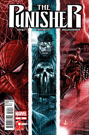 (Marvel – writer: Greg Rucka; art: Marco Checchetto)
Bannen’s Book of the Week: Greg Rucka continues The Omega Effect crossover this week by taking full writing duties in his own title. The issue still has the same Spidey humor (I laughed out loud at a few parts), and a great mixture of action and character. This series is probably the best crossover in comics right now, and this is a great setup for the exciting finale next week in Daredevil #11.
The second installment slows the series down and focuses more on developing the relationship between the characters. It still builds to a great cliffhanger, but the lead-in is well constructed. Many of the panels are quick cuts meant to advance the story along and the comic has no full splash pages, but a lot of dialogue. For such a full comic, however, it reads quickly. Rucka packs a lot into this issue and while it’s mostly setup, it builds the tension perfectly.
The story is still full of action, but beyond that, it’s got a lot of sadness and emotion, particularly for the vengeful Rachel Alves, a woman whom Rucka introduced in the beginning of his series when she survived a massive shootout on the day of her wedding. There’s a great moment between Matt and Rachel where he has to talk her away from killing someone, and I genuinely didn’t know what the outcome would be. Rucka paces the scene so well that I had no clue what would happen when I turned the page. Feeling anxious while reading a comic is not a normal experience, so I praise Rucka for his strong storytelling.
Mark Checchetto does a fantastic job with the illustrations (and he has to do a lot of them). Panels are highly detailed, characters are angular but solid, and character faces achieve the desired emotions. Checchetto also does his own inks, and the man knows how to shade a page. The inks add just the right amount of shadows and shading to create the mood of each scene. Matt Hollingsworth is the colorist and he does fine work in bringing the images to life. While the colors are not vibrant, their muted appearance helps to keep the overall tone of the comic intact. And when you’re dealing with someone as ruthless as The Punisher, you don’t want to make the comic too lighthearted.
For the second part of this trilogy, Punisher #10 does a fantastic job of setting up the climax. All the pieces are in place – now it’s time to see how they turn out.
