The Lost Magic of Disney’s Animation
The Lion King and Aladdin trailers look ugly as hell. Without any twinge of longing or nostalgia I can confidently say that between a certain set of years Disney was riding a wave of hits with brilliant songs, beautiful animation, wonderful cinematography and their fair share of cultural appropriation. They’re good movies, perhaps a relic of their time but good-looking movies. These new ones look like raw butt.
I didn’t realize it when I was a young, simple child with simple tastes, but these 90s have a brilliant sense of lighting, scene construction and color. I never realized how good they looked until I noticed how bad the remakes look. Instead of the bright, vibrant, evocative (and partially stolen and racialized) worlds that we were treated to in the 90s, we’re mired in the grimdark worlds of inferior design.
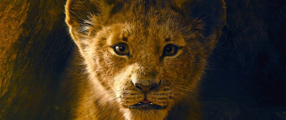
One of the sad things about having your youth being sold back to you is that we’re, hopefully, a little more discerning than when were children. We notice that the Lion King trailer looks muddy and dark. That the animals that were larger than life and visually intelligible are now basked in shadow and hard to tell apart. We notice that the lush landscapes are flattened. I know on an intellectual level that lighting really works this way, that plants aren’t so otherworldly green, but this is Disney for heavens sake. Where did the magic go?
Animation lets you do some pretty special stuff. Things don’t have to look like they do in real life. Some of the time its better that they don’t. That someone looked at these movies and said “How great would this be with photorealistic CGI?” is a head-scratcher. They don’t look great. They look bad.

Even the camera placement and scene construction suffers. Looking at the Aladdin trailer, its confusing to imagine how anyone took such an iconic scene as Aladdin finding the lamp and filled with it with visual noise. When Aladdin reaches forward to take the lamp the original isolates Aladdin and the lamp. There’s just him, and the lamp, bathed in light. In the new version Aladdin and the lamp are lost in a glittering room of treasure. It’s hard to see the edges of Aladdin and the lamp’s plinth. The whole thing is muddy and unclear. Simply put, it’s just worse than the animation.
I always advocate for people to look to the specific, special powers of a form or medium. Animation lets creators do things that real cameras and real lighting never could. Part of its special power is the ways it can exaggerate, or create vibrance. Part of that special power is what made the originals so charming. When you change the medium, you’ll always lose something. Film will never have the same feedback as live theater. Animation struggles to capture the “weight” of live action. But when evaluating a remake like these or Beauty and the Beast before them its important to note that in the translation to live action something has gone horribly wrong.
This isn’t really a problem of “live action” either. Peter Jackson, Baz Luhrmann, the Wachowskis, Ava DuVernay have all made CGI heavy movies that are beautiful and visually comprehensive. None of them make the very basic three-point lightning mistakes that these two movies look like they’re about to. And I get it, in real life the sun does not work this way. But this isn’t real life, these are Disney movies, there should be magic and wonder and awe and I should be able to see it.
