Last Week’s Comics 7/3/2013
Lazarus #1
(Image – writer: Greg Rucka; art: Michael Lark)
Lazarus tells the story of a woman named Forever and the dystopian future in which she lives. Chosen as her family’s symbol (or Lazarus), Forever is trained, given scientific advantages and taught how to be immune to every physical assault possible. Despite this, however, she’s starting to develop a conscience – and therein lies the overriding theme of the book.
 As it opens, Lazarus gives us everything we need to know in the first five pages. We see Forever survive several gun shots, and then we see her enact her vengeance. It’s gory, exciting and a great harbinger of the future of the series. Through Rucka’s dialogue, we learn more about Forever (nicknamed Eve) and how her emotions are getting in the way of her training.
Eve, as a lead character, is our connection to this cruel world, and while we see her do some pretty heartless things, it’s clear that she’s the most sincere character. Rucka lays the groundwork for some greater mysteries – like the attack on Eve and her brother’s attempts to monitor her therapy sessions – and the world is fleshed out enough to be palatable, if not very relatable.
Michael Lark takes the art duties and he does a fine job, communicating the grittiness of the world. While his imagery is sharp, it’s not very clean, but I say this as a compliment. The unpolished look of his art conveys the tone of the comic; desolation and hopelessness abound in Lazarus, and Rucka has Michael Lark to transmit this through his visuals.
When you read a new #1 issue, you always take a chance on getting a comic that fails to keep you engaged. Lazarus is not that book. It’s intriguing, smart and for a first issue, well rounded. I’ll be back for more next month, and I highly recommend you join me.
———
Batman/Superman #1
 (DC – writer: Greg Pak; art: Jae Lee and Ben Oliver)
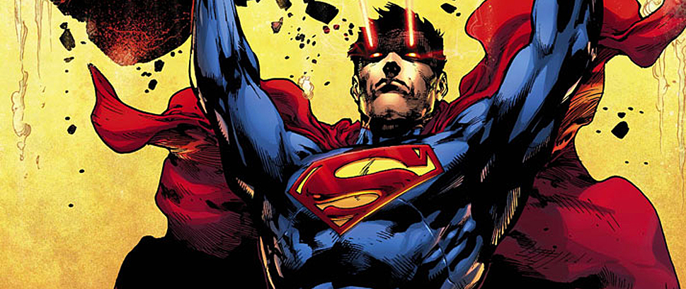
I loved Jeph Loeb’s Superman/Batman. I stopped collecting the series after he stopped writing it because the stories, to me, weren’t as good (and I know people still complain about his writing but you have to admit, it was awesome to see Batman punch Darkseid in his big concrete head). So now that the two have teamed up again, in Batman/Superman this time, I was very excited, especially considering this is Greg Pak’s first DC book and Jae Lee is on the art.
But the book is a bit odd, and slightly off. It has some neat moments and great character thoughts, but the story jerks around too much to be clear, and by the end, the issue feels more like a truncated action story than a powerful introduction.
Batman/Superman is really about Bruce and Clark first meeting. We see this happen as a righteous Clark confronts an apathetic Bruce in Gotham. Clark’s purpose is to ask Bruce about Wayne Enterprise employees found murdered in Metropolis, and then the story is off.
Pak captures Clark’s altruism and Bruce’s darkness perfectly, and each character’s inner thoughts play off this idea. Bruce is awed by Clark but calculated in his approach. Clark, on the other hand, is annoyed by Bruce’s calm. He’s direct in his confrontation because he’s Superman and can’t be hurt.
But when the comic shifts back to Smallville, it gets weird. Suddenly it seems like these people have known each other a long time, and that Clark is now wrestling with some internal possession that makes it difficult for him to deal with the current situation. But I’m not sure. The comic ends so abruptly that the final page doesn’t have the emotional impact it intends.
The art of the comic is good, though. While I’m not a fan of Jae Lee’s style, he definitely captures the gothic feel of Gotham. The entire book, however, is more like an opaque presentation, as Lee heaps on the shadowing, giving every image an overriding darkness.
Ben Oliver is a nice shift midway through the book, as his sketch-heavy style is sharper than Lee’s work. I’d like to see more of Oliver’s Superman and Batman because he draws each character so well. Hopefully, though, Pak’s story will be a bit cleaner in the next go-round.
For a first issue, Batman/Superman is okay, even though it has a lot to offer. I love the internal dialogue (as each character thinks some pretty cool thoughts), and I liked the action of the book; I just wish it was neater in its delivery. Regardless, I’d be one board for more Batman/Superman.
———
Hawkeye #11
 (Marvel – writer: Matt Fraction; art: David Aja)
Bannen’s Book of the Week: Matt Fraction’s cleverness knows no bounds. In what is perhaps the best issue of Hawkeye yet, Fraction turns to Clint Barton’s dog, Lucky, to tell a story that, despite from being told from a dog’s point of view, is smart, lucid and unbelievably original.
Up to this point, Lucky has been but a bit character in Clint’s life, but we see that he possesses intelligence, wit and his own set of detective skills. The pacing of the comic is truly extraordinary and it finds a way to fit in nicely with the Hawkeye mythos, touching upon a mysterious death that occurred a few issues ago.
But the comic wouldn’t be as good without the stellar work of David Aja, who employs a unique tactic to communicate Lucky’s thoughts and emotions. Through Aja’s confident pencil, we see a cityscape through the dog’s eyes. Each character has a set of defining characteristics that Aja displays using simple yet clear graphics. Clint, for example, is defined as an archer, a coffee pot, a dog bowl and a novel while Kate is defined by pizza, flowers, drinks and love.
What’s even more impressive is how heartfelt the issue is. Despite very crude dialogue (as Lucky hears it), the story is lucid. If you thought Fraction was a unique writer before, wait until you get hold of this issue. It elevates his abilities to a whole new level.
I can’t praise this issue enough. Hawkeye is good, but this issue in particular is a masterpiece. Hopefully, Fraction doesn’t leave this series any time soon and we get more issues like this in the future.
