Flabbergast – Zombie Zombie Mambo 9


Mark’s Commentary:
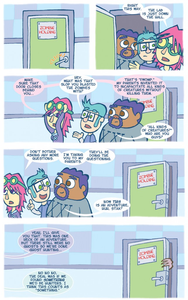
Ah, the wonder that is Photoshop! This graphics editing program has definitely expanded the possibilities of comic creation. As I created Flabbergast, I was still quite the newbie when it came to Photoshop. Heck, I’m still learning new techniques to bring more punch to my art style. But during the production of this comic I started to view my page differently when laying it out and penciling it. Not only did I think about line weight and word balloon placement, I also took into consideration what I could do with Photoshop. In this post, I’ve included the original scan of this page before Photoshop. I knew the background had to remain exact for the bottom three panels, so instead of drawing it behind the characters in each panel, I just drew it once, copied it, removed the zombie hand, copied it again and placed it behind them. I’m not sure why I drew the panels out of order though…
I do know I drew the door and background first to make the placement of the characters easier to estimate. I could have just drawn the “background panel” down at the bottom first then the ones above it. I was probably super-hyped to Photoshop this page and didn’t care about panel order. Bottom line: Photoshop RULES. Be careful, though – incorrect use of it could really make your comic look crummy.


