Improving the Worst Videogame Box Art Ever!
Hey! It’s me again!
As you may recall, earlier today I made fun of some of the worst stuff that came out in 2010. It’s fun to make fun of crappy stuff! The only problem is sometimes some jerk will say something like, “Hey, do you think you could do any better?” My answer is usually no. But when it comes to box art from the early days of console gaming, sometimes I see stuff I myself could probably actually improve upon! It feels good.
So I solicited some opinions to find out what people considered to be the worst videogame box art of all time, and did what I could to improve them. I think maybe this will help sell some extra copies of these games and improve the economy! Everybody wins!
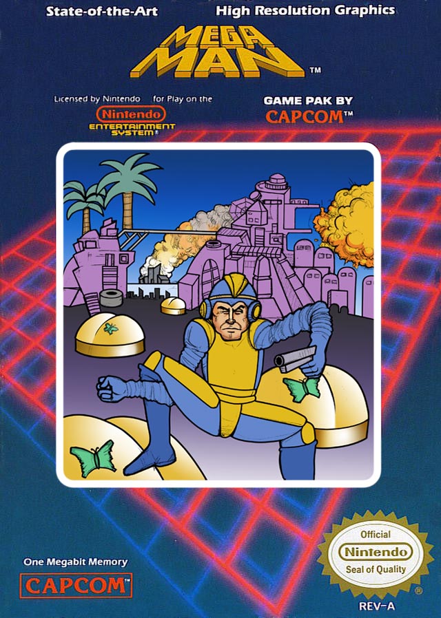
First up, the widely-hated cover art from the original Mega Man for NES:
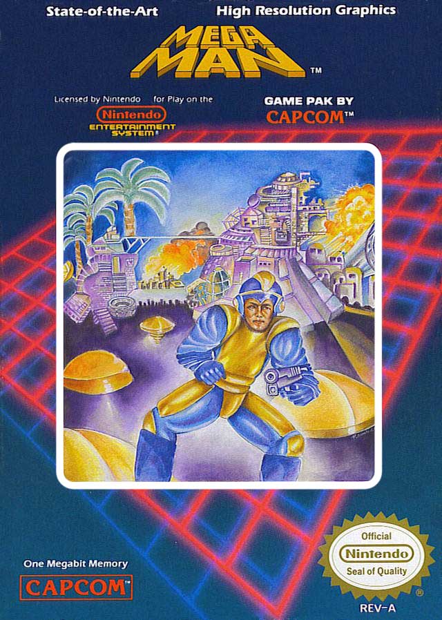
Well, to be honest with you, at first I wasn’t sure what was so wrong with this artwork. I mean, I love Mega Man’s pose, I love his strained expression and, of course, I love the palm trees! But after looking at it for a while, I figured out what was awry: they didn’t take it far enough. Mega Man’s face should look even more haggard and he should be in an even more uncomfortable-looking position! Also, those weird yellow butt things surrounding Mega Man should have little butterfly tattoos, like on Cher’s butt! Feast your eyes on the new and improved artwork:
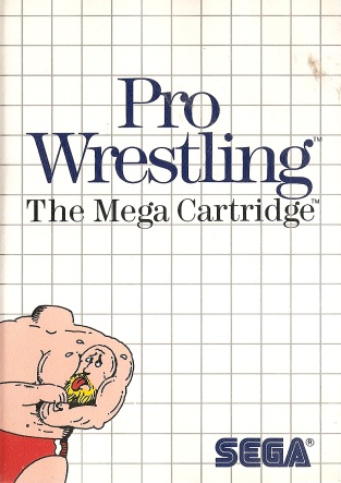
Next up, another confusing one: Pro Wrestling for the Sega Master System:
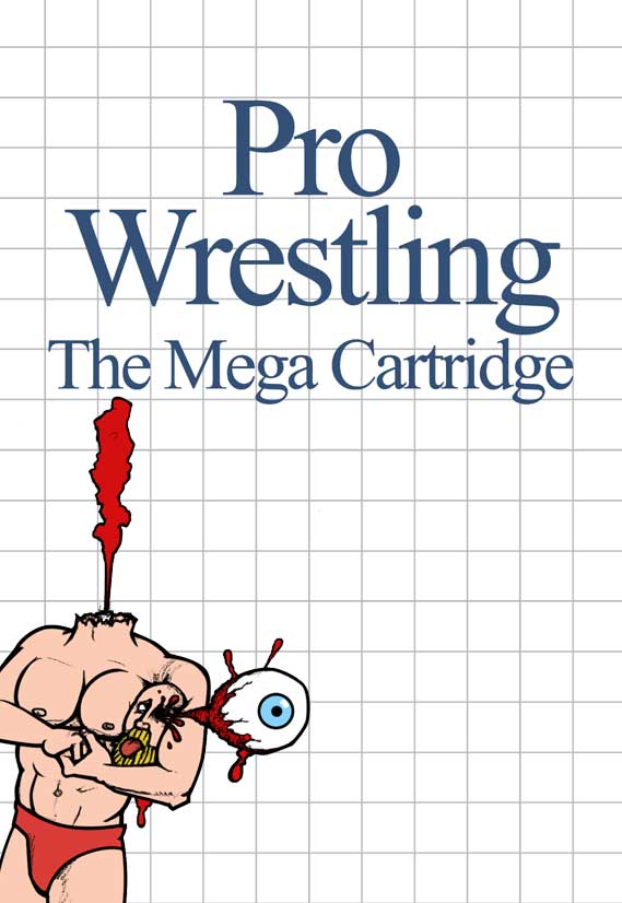
Well, I certainly can’t complain about the layout here! Love the grid, love the Times New Roman! But something’s a bit off about that drawing! The thing is, it’s a tad unrealistic. I’m fairly certain if you ripped your own head off and put it in a headlock, there’d be some arterial spray! And I know for a fact that if you squeeze a severed head between your bicep and your pectoral muscle, an eyeball will fly out dramatically:
As long as we’re picking on Sega games, let’s take a look at the awful artwork for Tommy Lasorda’s Baseball:
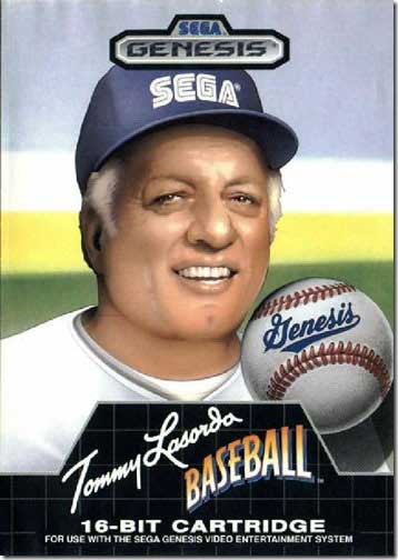
Pretty amateurish, huh? They didn’t airbrush his face nearly enough! If you want people to buy your baseball game, you need a cover model with a face that’s as smooth as a baby’s bottom. Also, I figured it wouldn’t hurt to make the stitching on the baseball a little more prominent. Check it out:

That’s more like it! Now let’s take a look at a more recent example of objectionable artwork, the cover to a game that Konami is apparently very proud of called Castlevania: Dawn of Sorrow:
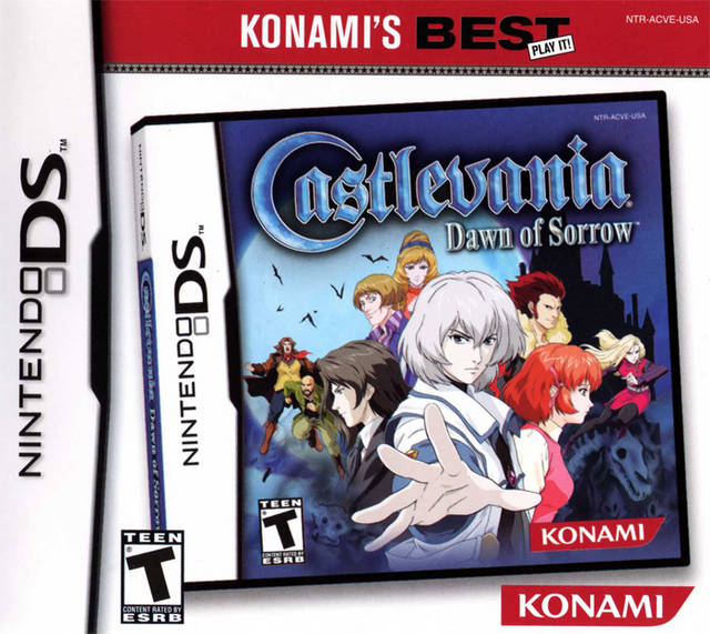
Not too bad, really! You must admit, this cover is very informative; it tells you this game is one of Konami’s best! Play it! Again, it’s a good idea, they just didn’t push it far enough! Luckily, they can always rectify things when they re-publish this evergreen classic for the 3DS!
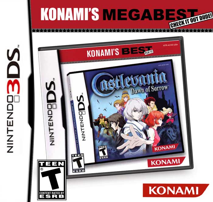
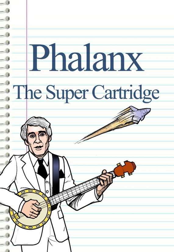
Now that’s enticing! Next, let’s look at the box art for Phalanx, a game for the Super Nintendo!
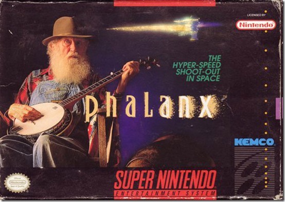
Now of course I do love the whole “man playing banjo while spaceship flies by” motif, but I can see why this cover is despised: the layout stinks! Let’s try using the winning Master System grid layout, and maybe just to hedge our bets we’ll replace that old nobody they have playing banjo on the original cover with the most famous banjo player in the world: Mr. Steve Martin!
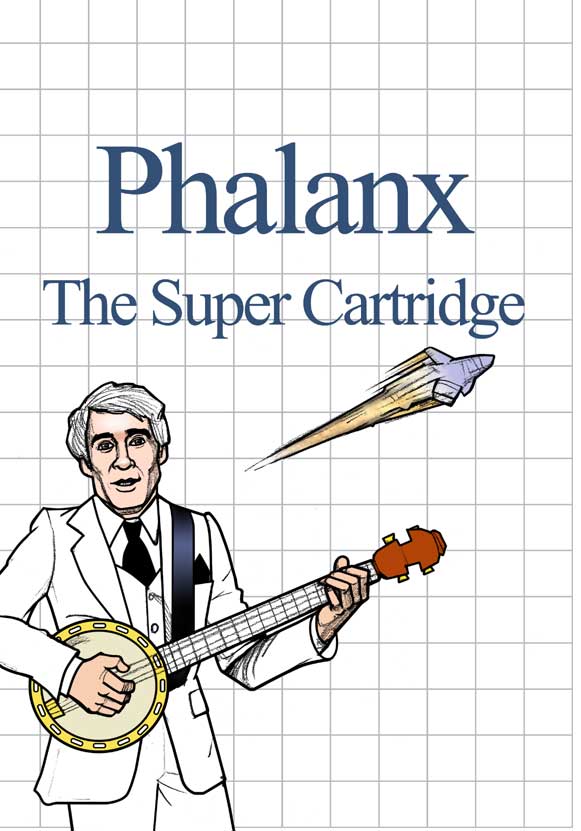
See? You just can’t beat that ol’ Master System Grid! Or can you? Graph paper is a proven winner, but perhaps some nice ruled paper would make for a good background as well. It’s worth a shot:
That’s not bad either! Well, we’re almost done with this. Just one more ostensibly ugly cover, this one from a game called Ironsword.
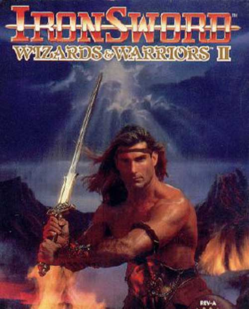
At first I wasn’t sure what the problem was! I mean, here you’ve got a nice professional-looking photograph with a celebrity model! But did they use the right celebrity? Take a look at what Ironsword’s protagonist Kuros looks like in-game:
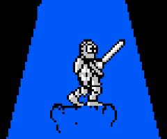
Doesn’t look like Fabio at all! If anything, he bears a much closer resemblance to Michael Emerson of Lost fame!

Well, this is getting extremely stupid. See you next week, folks!
